So the Fed is out with it’s latest monetary policy statement. It’s pretty much as expected. A continued taper, to the tune of a $10–billion-a-month reduction in the central bank’s bond-buying programs. The statement reflected some uptick in economic activity. But here’s the chart the markets are watching. It’s the Fed’s projections of where the benchmark Fed funds rate should be over the next few years. Each dot represents the prediction of one member of the Federal Open Market Committee (FOMC), the central bank’s governing board.
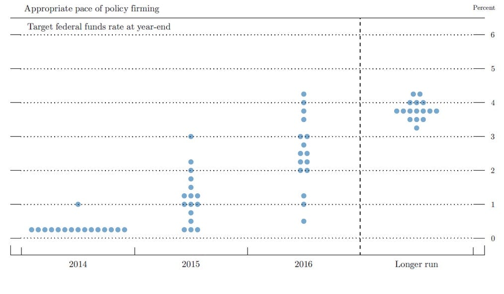
What does it show? Compared with such charts for previous months, it shows a slight uptick in the expectations among members of the FOMC for where the Fed Funds rate will be at the end of 2015. But it also shows that over the longer term, expectations for rates are falling. That might be a suggestion that the Fed thinks the US economy’s ability to grow has been permanently hampered by the impact of the Great Depression.
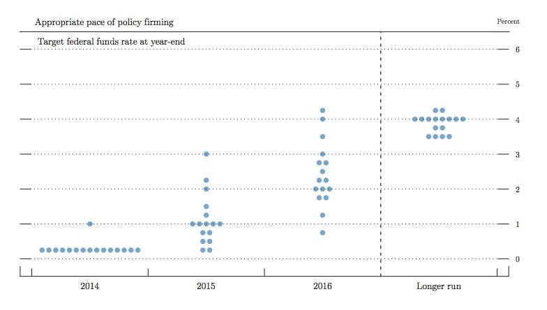
The above chart really only makes sense if you compare it to Fed’s own estimates, which it last published in March. Here’s that chart.
At any rate, the markets seem to be waiting for the 2:30 press conference to make any kind of significant move.