The most important charts from the terrific US jobs report
The jobs numbers are in. And they’re good.

The jobs numbers are in. And they’re good.
Here are some of the important charts we pulled from the guts of the report.
The US is 410,000 jobs into a genuine labor market expansion

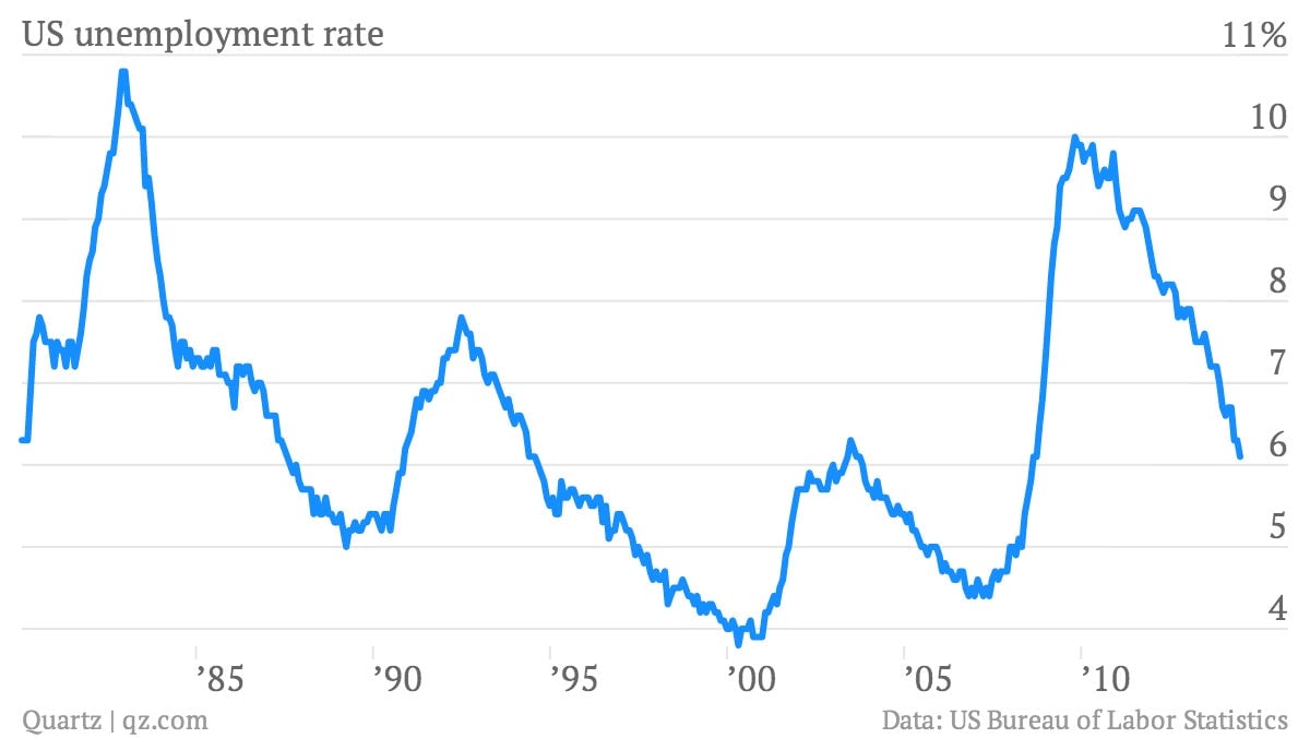
Unemployment is down to 6.1%, which is very nice to see
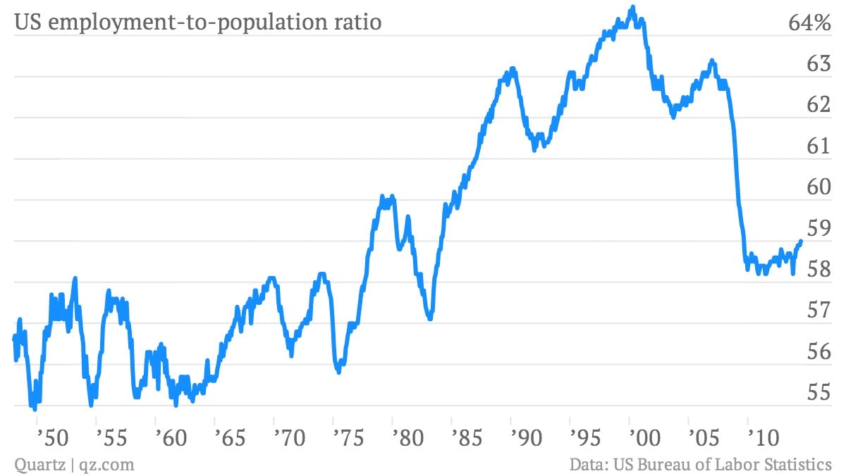
The raw percentage of Americans with jobs rose to 59%.
It’s much lower than it used to be. And there’s an ongoing debate over how much of that is due to the aging US workforce and how much is related to the weakness of the job market in recent years. It’s clearly a combination of both.
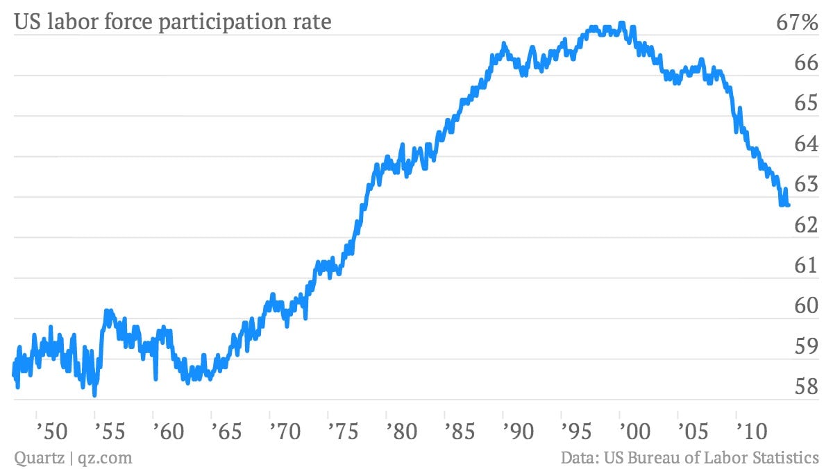
Labor force participation remains at low levels not seen since the late ’70s
The participation rate—those who are employed or unemployed as a share of the population—has likewise declined sharply since the Great Recession, due to the same mix of demographic and economic factors.
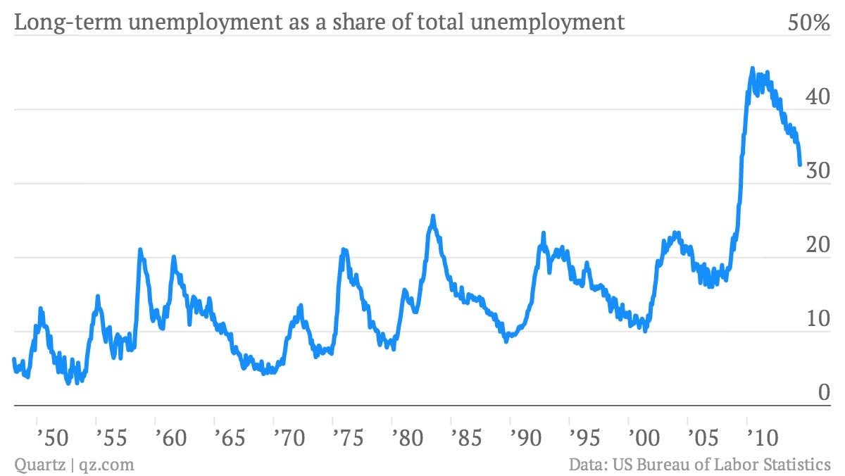
The share of long-term unemployment is coming down
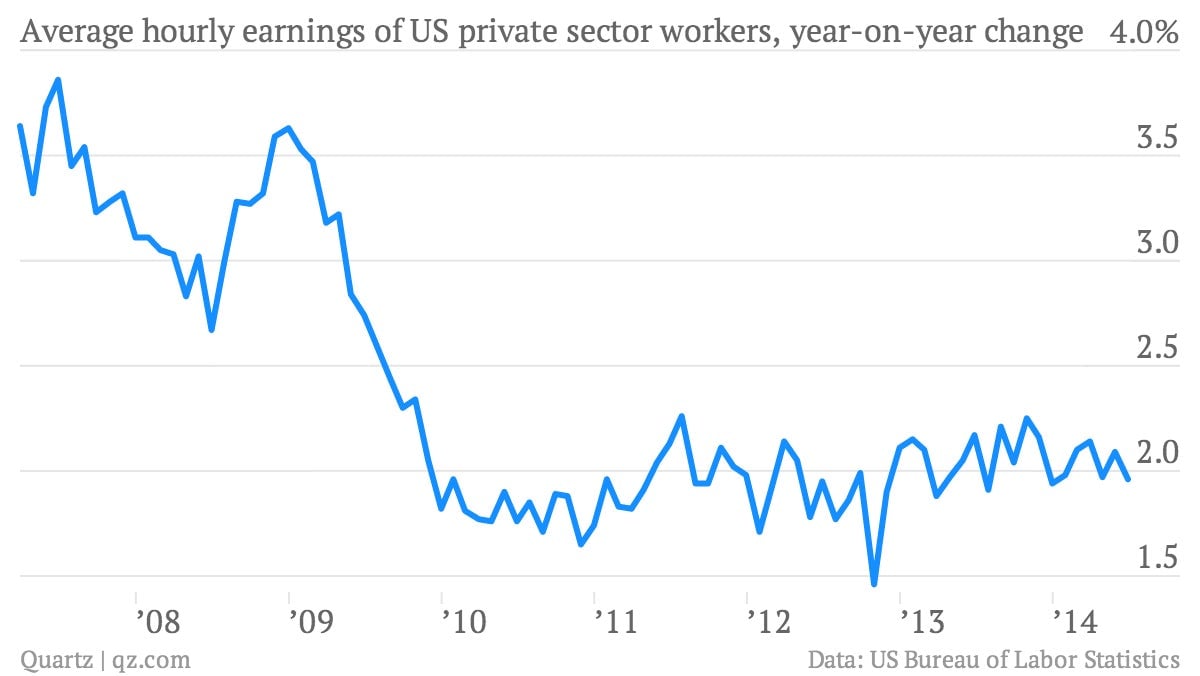
Wage growth remains muted
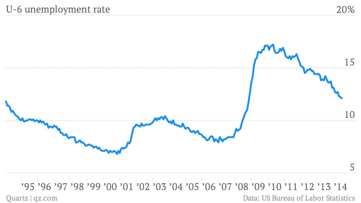
The U-6 rate, the broadest gauge of unemployment
It fell to 12.1%, the lowest since October 2008.
Spells of unemployment are getting shorter
