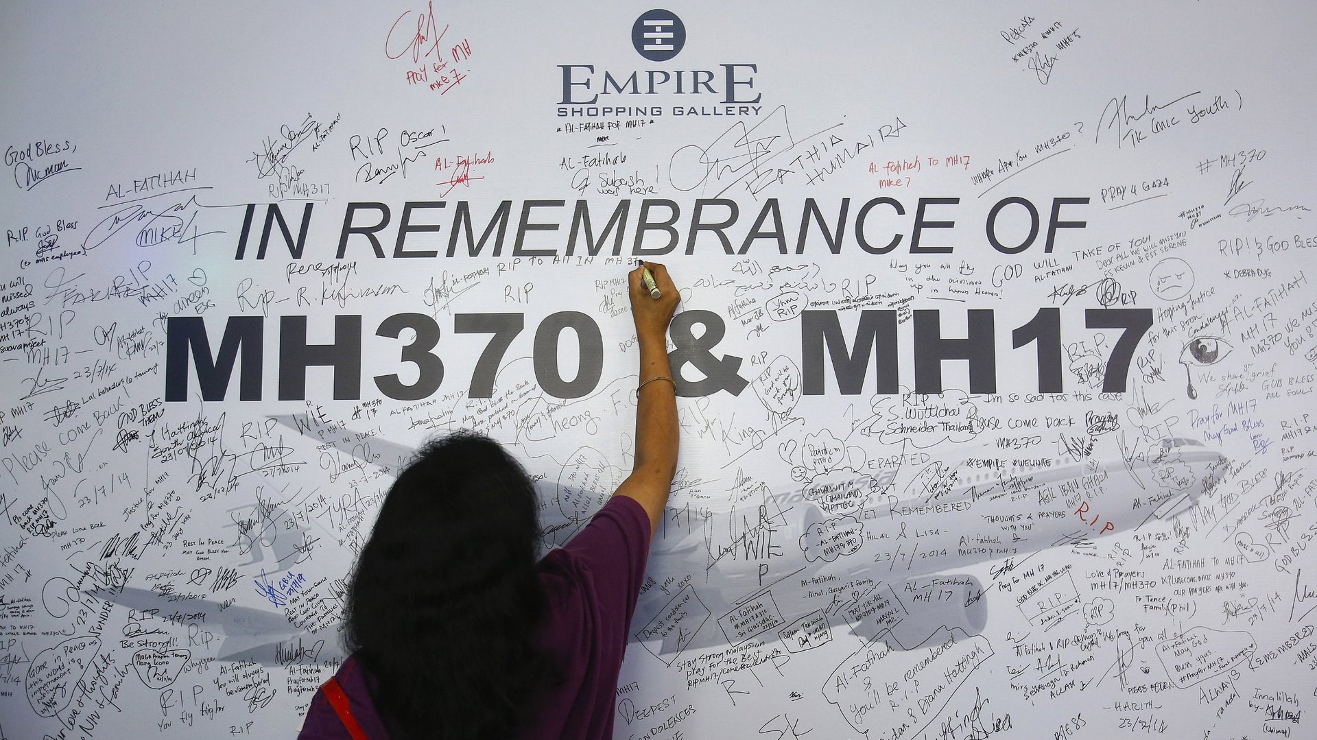
In its 41 years of flying, Malaysia Airlines had only two fatal accidents prior to 2014. With the airlines’ twin tragedies of flight MH17, being shot down in eastern Ukraine last week, just four months after MH370 went missing, it’s hard to imagine how the airline will bounce back. The airline is worth 75% less than what is was last year and is losing $1.6m a day. Following last week’s crash, it offered passengers refunds on any tickets purchased for flights to be taken this year. Now seems like a good time to act on the “sweeping change” the airline’s chief executive Ahmad Jauhari Yahya, promised in late June.
In its 41 years of flying, Malaysia Airlines had only two fatal accidents prior to 2014. With the airlines’ twin tragedies of flight MH17, being shot down in eastern Ukraine last week, just four months after MH370 went missing, it’s hard to imagine how the airline will bounce back. The airline is worth 75% less than what is was last year and is losing $1.6m a day. Following last week’s crash, it offered passengers refunds on any tickets purchased for flights to be taken this year. Now seems like a good time to act on the “sweeping change” the airline’s chief executive Ahmad Jauhari Yahya, promised in late June.
Historically, to tackle a negative image or alleviate national shame, Asian airlines go through rebranding, but in this case Malaysia Airlines will need more than just a new look.
Join 500,000+ readers who start their day with Quartz.
By subscribing, you agree to our Terms of Service and Privacy Policy.
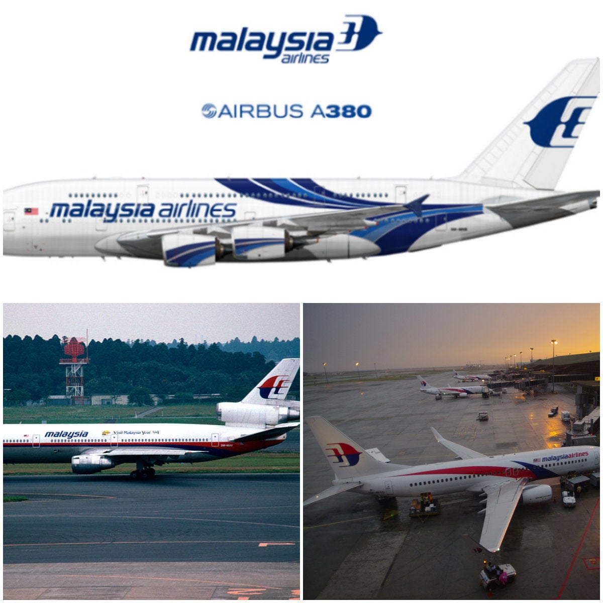
Before MH370’s disappearance, the Malaysia Airlines brand was being overhauled. Some of the fleet featured the older red and blue livery, but most of the fleet was painted in the new design, while the newer Airbus A380s have a different blue and white design without the red. Some find the array of aircraft looks confusing. “Consistency in a brand image is a must,” noted one branding blogger.
But for Jonny Clark, a commercial pilot, airline branding consultant and the director of TheDesignAir, the Malaysia Airlines brand “as a whole is very solid.” Yet he told Quartz via email that it’s imperative that the company decides quickly whether or not it will respond to the events of 2014 through branding. Clark said it should consolidate the current look of their aircraft and points out that, “Both MH17 and MH370 have occurred on older livery aircraft, which means the smart course of action would be to expedite the painting of their entire fleet to the newer scheme.”
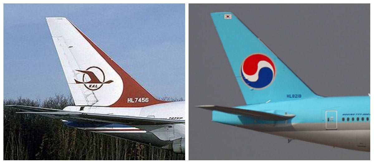
The tragedy of flight MH17 brings to mind the 1983 shooting down of Korean Air Lines flight KAL007 by a Soviet fighter jet after the commercial carrier veered into Russian airspace. A year later, the airline was remolded into its current image. Korean Air Lines, or KAL, became known as Korean Air. The all-white airplanes had the top half of their fuselage painted a light blue. The KAL tail-fin logo, a red crane enclosed in a red circle—now associated with tragedy and deemed cursed—was replaced with a stylized red and blue taegeuk, the Korean yin-yang.
Even with its new livery, Korean Air, now a top ranked airline for service and safety, had to contend for years with dredging up and restructuring an at times fatal hierarchical organizational structure which contributed to a poor safety record well into the late 1990s.
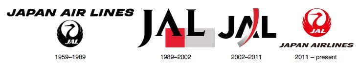
Japan Airlines redesigned its fleet after its Boeing $BA 747 crashed on a mountainside north of Tokyo in 1985, the deadliest ever airline disaster, which killed 520 people. Edwin Schmidheiny, co-owner of Zurich-based brand consultancy Accent, then worked with brand consulting firm Landor on the rebrand of Japan Airlines following the catastrophe. Initially, the airline wanted to do away with its iconic tsurumaru crane logo. “They just said we need to change that, the whole world has seen blood on our prominent tail symbol,” Schmidheiny said. But when the new design was introduced internally the clients decided they actually wanted to keep the tsurumaru. Schmidheiny’s team was then tasked with coming up with a modern look that incorporated the logo and evoked its being “resurrected.” The ensuing livery, which has since changed, featured the tsurumaru on the tail-fin as before, but had new elements: a bold red square and grey band, and the airline name in tiny letters.
Of course, rebranding is not just about shiny new livery, which Schmidheiny said, done in isolation is just a “knee-jerk reaction” to changing an airline’s image. A fleet design overhaul needs to start with clear repositioning: Start by “reviewing your corporate culture and processes, and if out of that comes a rebranding, I think that makes a lot of sense,” he told Quartz.
Malaysia Airlines airline suffers from the perceived trappings of a government-owned carrier—hierarchical, not dynamic, and stodgy—and that the name is so tarnished, a new company might need to be formed, possibly under new name, says Schmidheiny. However, he sees the latest incident as a chance to jumpstart the brand by showing a more human side to the victims’ relatives and to the public. The motto: “Malaysia, Truly Asia” could develop into an “emotional approach to branding” an international carrier that many Malaysians consider a national pride.
“No matter how bad things are,” said Mohshin Aziz, a Kuala-Lumpur-based aviation analyst with Maybank Investment Bank, “it’s part of our identity. We grew up with it so we’ll still support it by and large. I think the greater part of the population will still fly with Malaysia Airlines. I know I will.”
For now Malaysia Airlines appears to be taking steps to show its human side. The airlines told Quartz that its focus now is on supporting the families of the passengers and crew of MH17.
While it’s too early to say what will happen to the airline, Clark, the pilot and airline branding consultant, said the company needs to focus on finding answers to both incidents. “Answers are of the most paramount importance to help repair and strengthen Malaysia Airlines’ reputation,” he said.
You can follow Annette on Twitter $TWTR at @evakillen. We welcome your comments at [email protected].