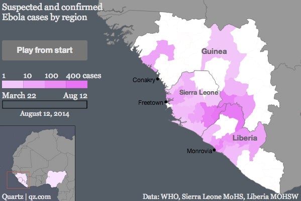
The map above attempts to provide the most detailed possible visualization of the ongoing Ebola outbreak that has infected over 1,800 people and claimed more than 1,000 lives.
The map above attempts to provide the most detailed possible visualization of the ongoing Ebola outbreak that has infected over 1,800 people and claimed more than 1,000 lives.
The outbreak first surfaced in forested regions of southeastern Guinea near the borders of Liberia and Sierra Leone. Patient zero, a two-year-old boy, died in Guéckédou, Guinea, in December 2013, but news of the disease failed to reach a large international audience until a World Health Organization announcement that 49 cases had been identified as of March 22, 2014.
Join 500,000+ readers who start their day with Quartz.
By subscribing, you agree to our Terms of Service and Privacy Policy.
In the following weeks, suspected cases were identified across all three countries, including in Guinea’s capital, Conakry. Guéckédou remained the worst afflicted. By mid-May, the city accounted for over 60% of the total number of deaths and cases in the epidemic.
Though fear of the disease ran rampant, it appeared, at least, to be contained. New diagnoses stabilized in Guinea, and a May 18 report stated optimistically that in Liberia and Sierra Leone, where no new cases had been identified since early April, the outbreak “could be declared over.”
It was not. Diagnoses surged in Kailahun, Sierra Leone and Lofa County, Liberia, which border Guéckédou and one another. By the end of June, the outbreak had become the worst in history.
International fervor ignited when American Patrick Sawyer died in Lagos, Nigeria, on July 24 after contracting the disease in Liberia. (As of August 9, a total of 13 suspected and confirmed cases had been identified in Nigeria.) But as Quartz’s Gwynn Guilford explains, fears of the epidemic migrating to the first world are misdirected: Although there is no proven cure, hospital conditions in the developed world can effectively contain the disease from spreading.
As of August 12, new cases continue to emerge, with numbers in Liberia increasing at the fastest rate. Measures to stymie Ebola’s spread continue to grow more extreme. Sierra Leone declared August 5 a military-enforced “stay-at-home day,” while Guinea closed its borders with both countries on August 9.
The map above uses data released by the WHO and the health ministries in Liberia and Sierra Leone health to show how the number of cases per region has increased. At times, data was inconsistent, reporting regional incidence of Ebola in one press release and absence in the next. For a given date, we chose to display information from the most recent release, so that the chart shows the best picture of the disease’s believed distribution at that time. Some suspected cases were later determined not to be Ebola, which explains why some of the disease’s reach appears at times to retract.