The Financial Times reboots print even as readers flock to digital
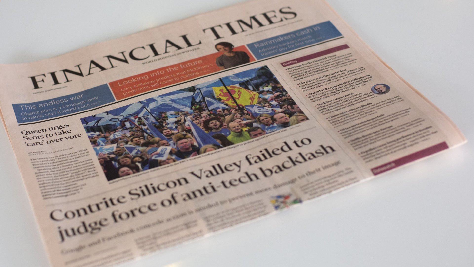
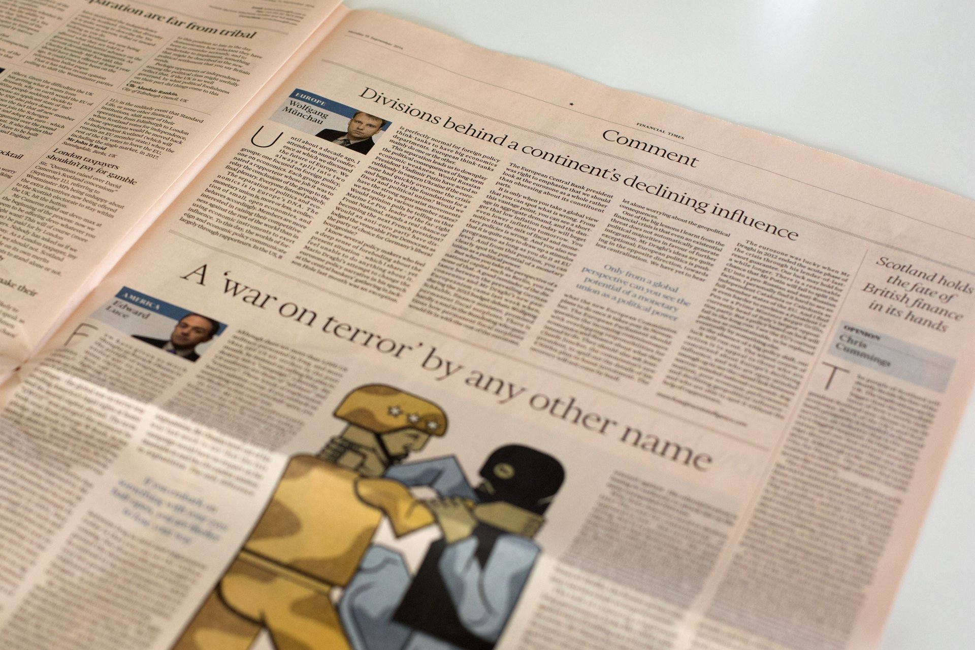
Today, Financial Times readers woke to the newspaper’s first redesign in seven years. It’s a much less cluttered layout: The columns are wider, the stories have more breathing room, and the text is set in a new custom typeface meant to evoke the paper’s British heritage; appropriately, it’s called Financier. The salmon hue is untouched.


Today, Financial Times readers woke to the newspaper’s first redesign in seven years. It’s a much less cluttered layout: The columns are wider, the stories have more breathing room, and the text is set in a new custom typeface meant to evoke the paper’s British heritage; appropriately, it’s called Financier. The salmon hue is untouched.
The last time FT “refreshed” (in the corporate-branding parlance) was in 2007, when the paper had a circulation of 445,756 subscribers. Today, it has 677,000 subscribers—but only 222,000 of those buy the paper edition; the others have digital subscriptions, reversing the heavy print majority that prevailed just seven years ago.
Given the halving of its print readership, and the paper’s own pronouncement that it is a digital-first newsroom, why is FT now making a new £100,000 ($162,000) investment in print?

“We increasingly define ourselves as a digital operation, but we still have a successful print newspaper with a good readership, providing valuable ad revenue,” Kevin Wilson, FT’s head of design, tells Quartz. “And we thought it was time to show we still cared about that product. But also to redefine some of our priorities—what is the print newspaper, what can it deliver best, and what is its relationship to digital?”
That means, in the print edition, a focus away from breaking news and toward more analysis and longer reportage. The new, six-column grid, which replaces a dense, eight-column page, gives those kinds of stories a bit more breathing room. (The design team, led by Wilson and Mark Leeds, an outside design consultant, found the extra space by corralling the advertising into just a handful of possible placements.)
There are web-influenced details that point to the increasingly blurred lines between digital and print: a featured chart on the front page, along with new prominence for the Briefing, a column of short takes on the day’s news. The redesign will see graphics being standardized, which helps maintain FT’s signature as they’re shared on social media. Metric, a sans-serif font by Kris Sowersby, the same type designer who created Financier, already is being used in graphics both in print and digitally.
Sowersby also created web fonts of Financier, though they haven’t been deployed on the website yet. John Thornhill, FT’s deputy editor, says not to expect a full redesign of the site anytime soon. “I don’t think we’ll have it like a big bang in the way we have with the newspaper, but yes, you will see new elements coming out on the web.”