
We’ll be honest, the US consumer price index isn’t our favorite economic report. While there’s almost always a little bit of inflation, prices have been incredibly stable in the aftermath of the global recession that followed the global financial crisis. So the CPI usually meanders up a basis point or two, but not much is happening. It was the same old story in October, when the CPI rose 1.7% from the same month a year ago.
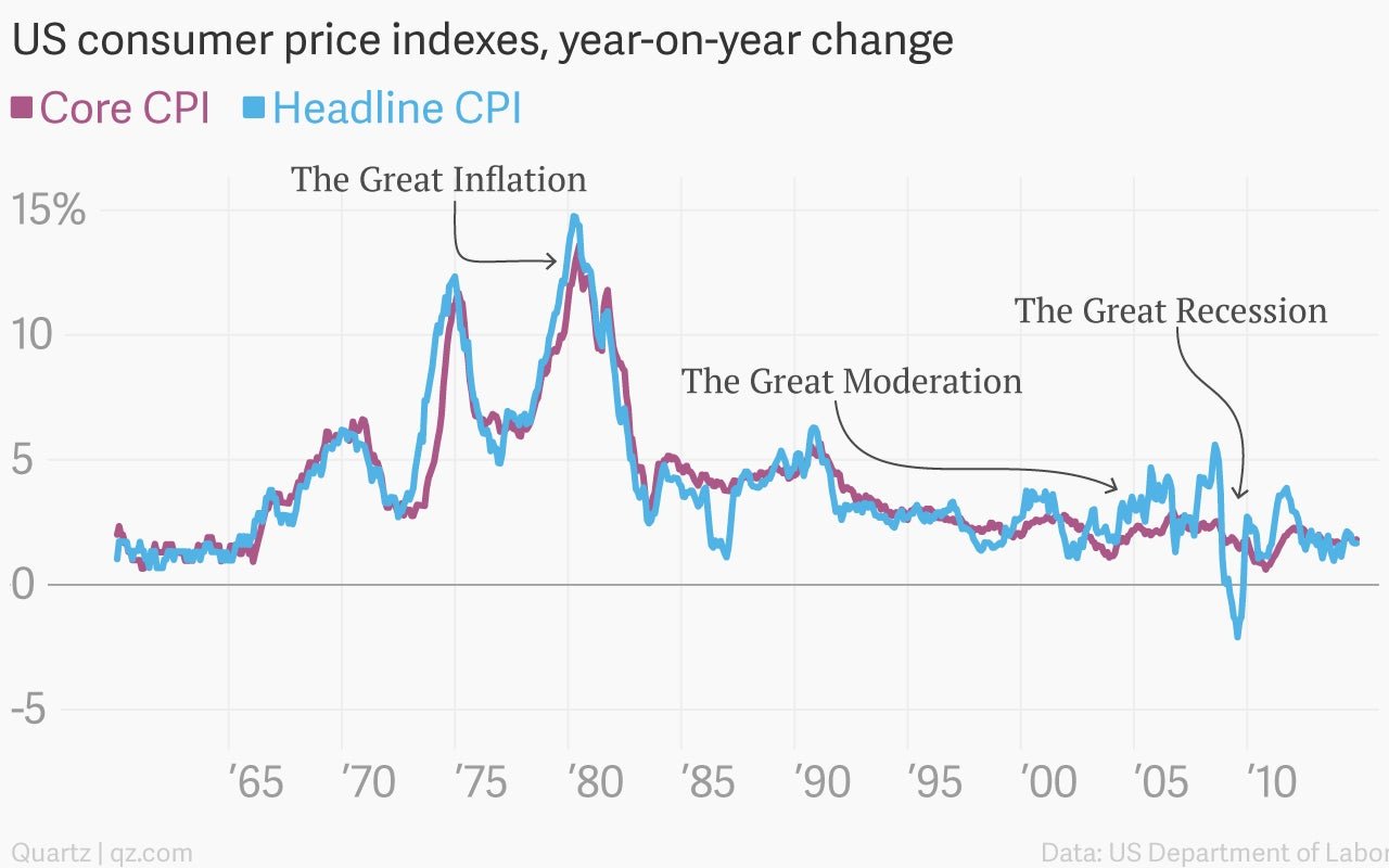
But the story of US inflation is actually really interesting, if you stretch the data back far enough. In fact, it’s peppered with “great” events. There was the Great Inflation, the spiral of wages and prices that undermined US economic confidence in the late 1970s. Then came the so-called Great Moderation, when increasing technological productivity allowed the US economy to run rather hot in the 1990s without setting off price increases. And of course there was the Great Recession, probably the scariest moment for the global economy since the Great Depression of the 1930s.
It was during the Great Recession that prices actually began a broad-based, outright decline. That might sound like a good thing. But if such a deflationary mindset takes hold, it’s quite debilitating for an economy, as it prompts people to continually defer purchases in the expectation that prices in the future will be lower. If an economy were a car, this would be like trying to drive with the emergency brake on.
And that makes the little upticks we’re seeing now a lot more satisfying.