The Quartz Chart of the Year™ candidates continue to pile up
The chart-making community is a-flutter.


The chart-making community is a-flutter.
As the Dec. 15 date grows nearer, the flow of submissions for Quartz Chart of the Year™ honors gathers apace. If you know of a particularly telling bar graph, fever line, pie chart, histogram, scatter plot, or good, old-fashioned map—or type of graphical data display—it’s not too late to send it in. Tweet them (@matthewphillips) or email them ([email protected]) to us with the subject line “Chart of the year.”
As a reminder, we’re open to any type of chart: Ugly ones. Aesthetically pleasing ones. Newsy ones. Odd ones. They need not be just business and economics. In fact, they can be about anything so long as they have been published in calendar 2014. Keep them coming over the transom.
Here is the freshest crop of the submissions (plus some new ones we found ourselves) that are in the running. And the previous batch is available for your perusal here.
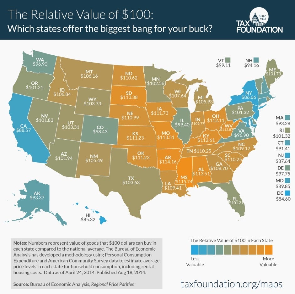
US costs of living. (Tax Foundation)
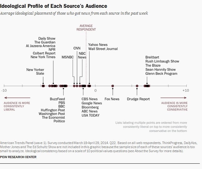
The US media spectrum. (Pew Research)
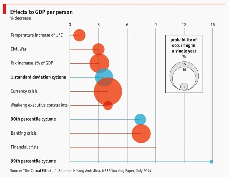
Catastrophic costs, natural and financial. (The Economist/Solomon M. Hsiang, Amir S. Jina)
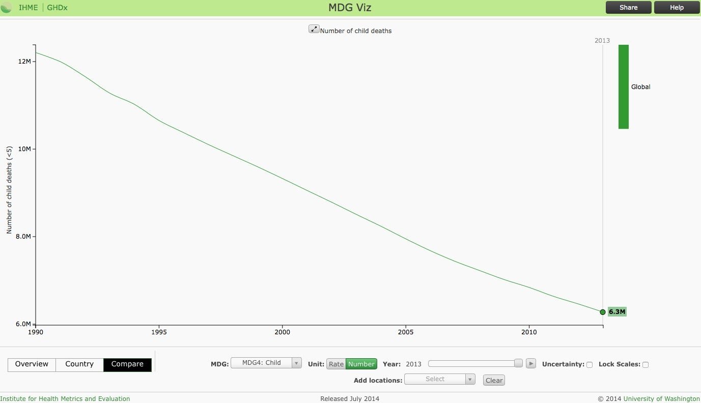
A decline in child deaths. (Institute for Health Metrics and Evaluation, University of Washington)
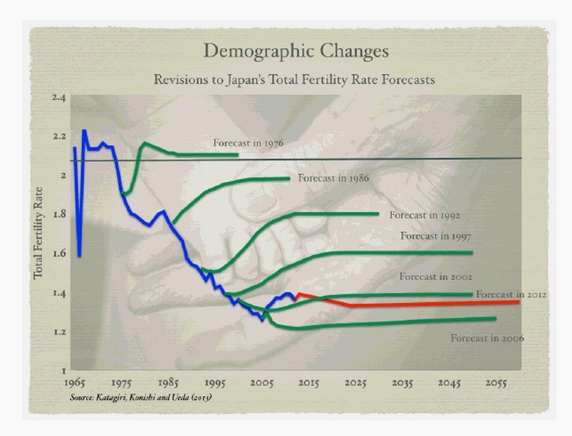
The expected rebound in Japanese fertility that never came. (Vitor Gaspar | IMF)
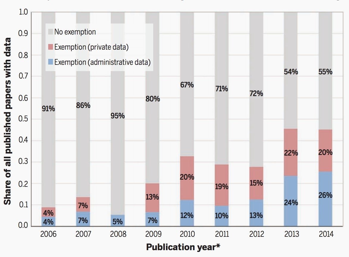
The rise of big data economics. (Science | Liran Einav, Jonathan Levin)
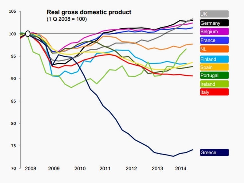
Greece’s great depression. (Robin Wigglesworth)
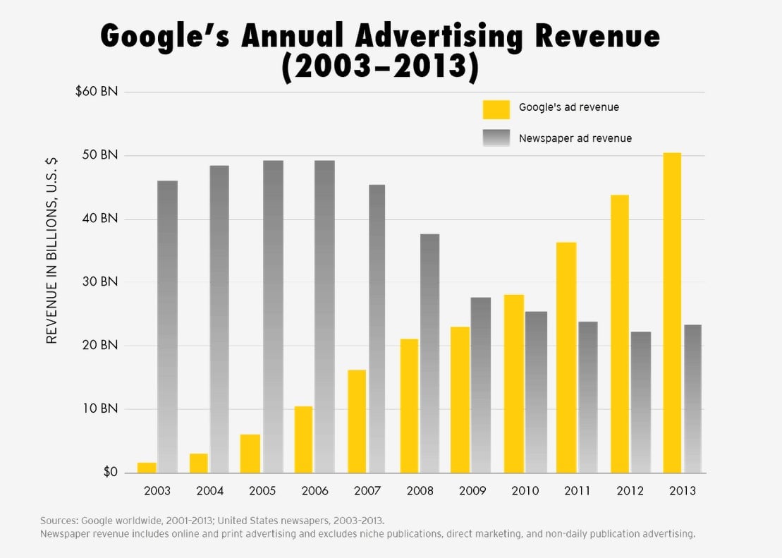
Google and the US newspaper business (Brookings Institution | Robert G. Kaiser)
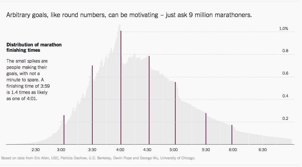
Impact of seemingly arbitrary numbers. (The Upshot)
