Five favorite charts of 2012 you won’t see in other year-end round-ups
Admittedly this is a bit meta. But amid all of the robust roundups of tale-telling charts, here and here for example, there have been a few near-and-dear to our heart that we feel were forgotten. So here they are, in all their glory.

Admittedly this is a bit meta. But amid all of the robust roundups of tale-telling charts, here and here for example, there have been a few near-and-dear to our heart that we feel were forgotten. So here they are, in all their glory.
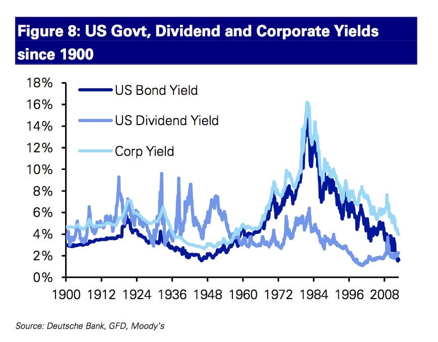
Yields on US Government debt, corporate bonds and US stocks, going back to 1900. Amid economic sluggishness in the US and the Federal Reserve’s focus on keeping rates low, the yield on the 10-year Treasury note has tumbled below that of the US stock market, as measured by the S&P 500-stock index. This is the first time that’s happened since the late-1950s/early 1960s. In a sense, that was when the US finally managed to shake off the last of the lingering bad feelings from the Great Depression, and investors again began to buy stocks, leading to the go-go days of the Nifty 50. (The Dow Jones Industrial Average didn’t get back to its pre-crash peak of 381.17 until 1954.)
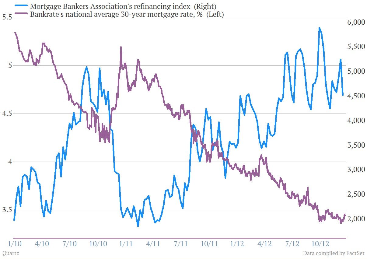
Yes, Ben Bernanke is indeed bending the US economy to do his bidding. We’ve said it plenty of times, but folks who said that the Fed can’t do much to affect the “real economy” have been proven dead wrong. The Fed’s effort to keep rates low, especially via its program of buying mortgage bonds, has pushed mortgage rates in the US down to some of their lowest levels ever. And consumers are responding. Here’s a look at the US national average mortgage rate versus the Mortgage Bankers Association’s refinancing index.
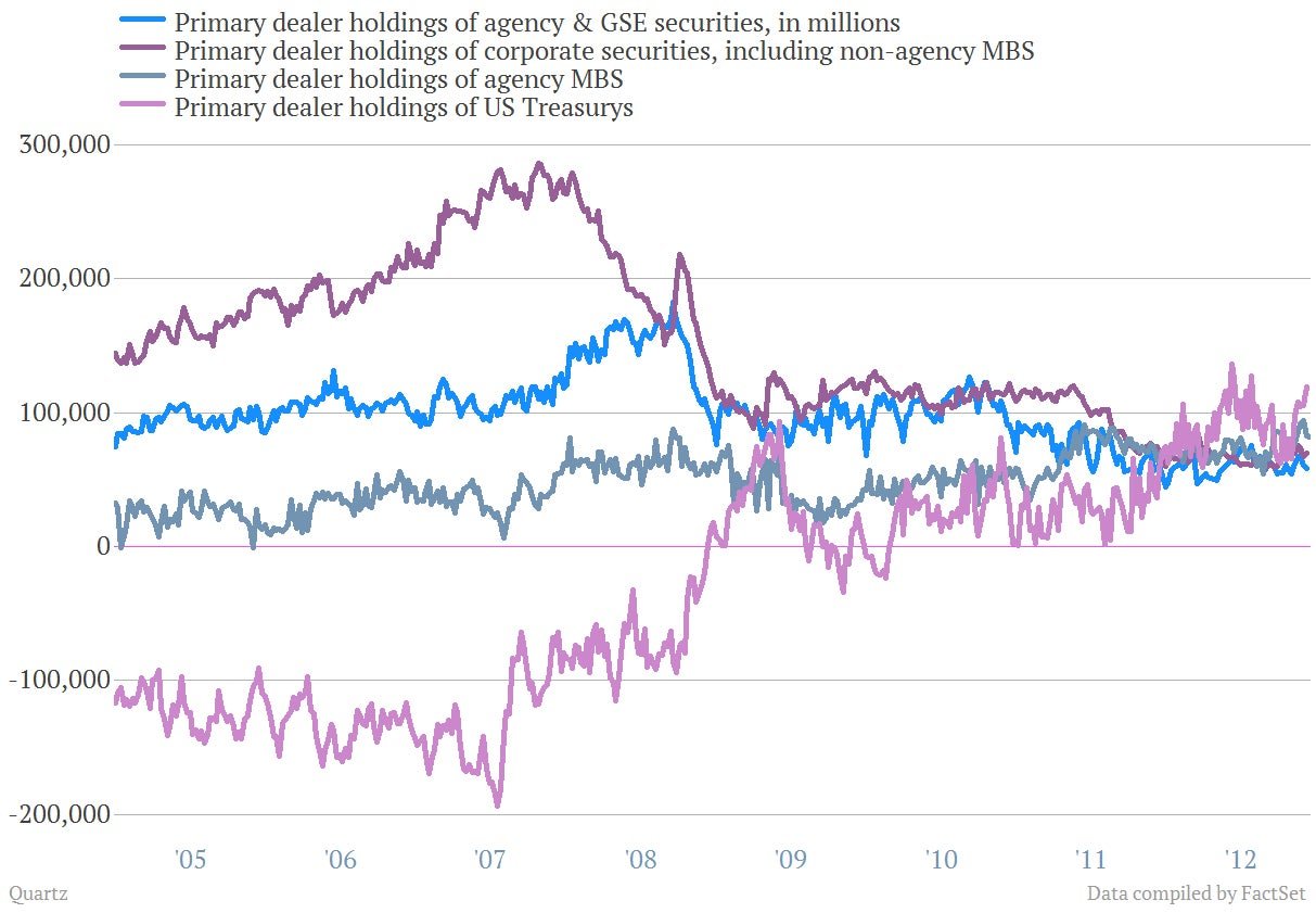
Wall Street officially got boring in 2012, and that’s a good thing. This chart shows the holdings of a range of bonds by large Wall Street banks going back to 2005. You can see that the dark purple line—which represents the holdings of riskier corporate bonds, including subprime mortgage debt—peak out in 2007 before falling sharply as the financial crisis took hold. At the same time, holdings of US government bonds—essentially the world’s most boring, safest investment—surged and in recent years have continued to rise, as Wall Street’s bond traders and the clients they serve have looked for price safety. Also rising have been holdings of mortgage bonds guaranteed by US government agencies, another nearly risk-free investment.
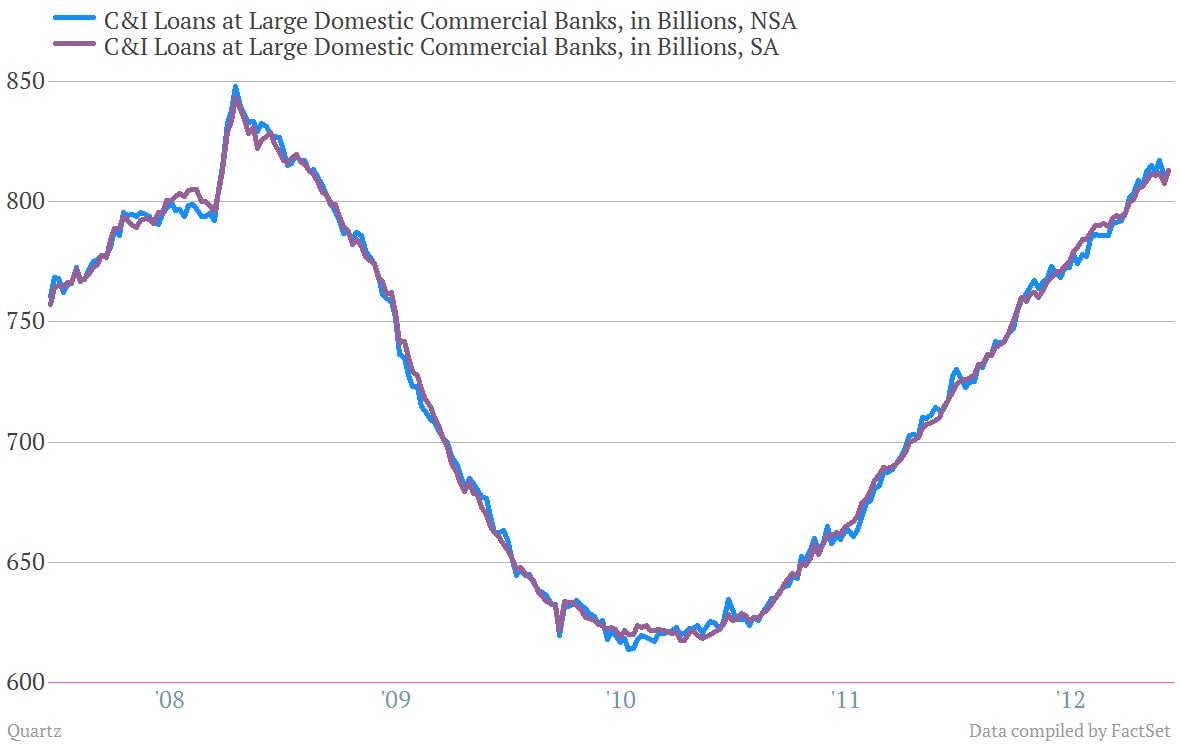
Banks have been lending like crazy to companies. This is something to appreciate. Essentially the financial crisis threatened to entrap the US economy in an economic vortex where banks stopped lending, companies stopped investing and hiring and, as a result, consumers stopped spending. Banks have sprung back into the lending business over the last two years, posting strong growth through 2012. This chart shows commercial and industrial (C&I) loans by large US banks, using Federal Reserve data. The fact that there appears to be demand for cash suggests that at some point those companies plan to spend the cash, which would be a good thing for the economy.
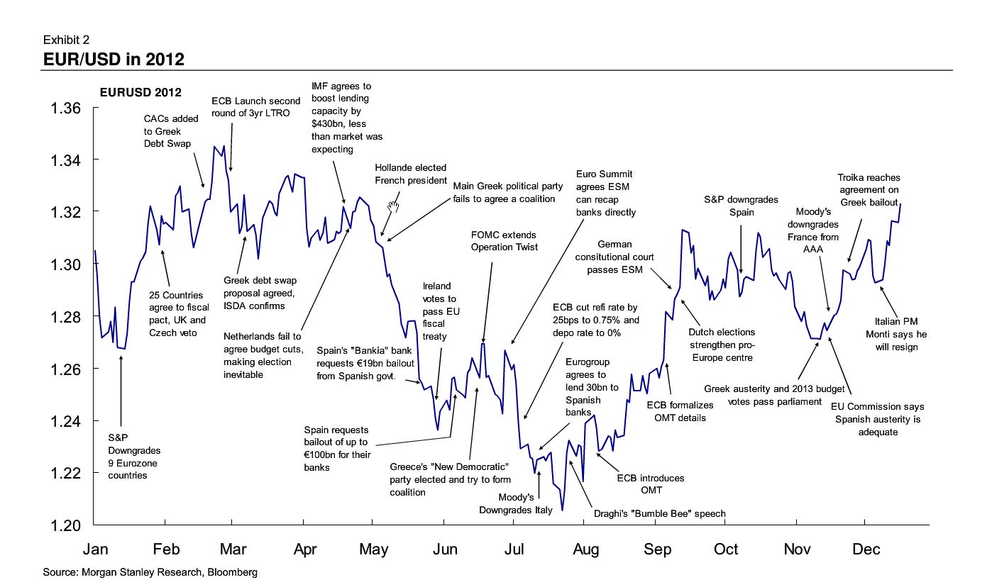
Let us relive the ridiculous journey of the euro in 2012! Here’s an awesome chart from Morgan Stanley FX research whiz kids.
