The formula to go from zero to VC-funded in seven slides
After last week’s Monday Note, “Three Slides Then Shut Up—The Art of The Pitch,” I was subjected to a bit of email ribbing. My honorable correspondents, many of them entrepreneurs themselves, questioned my rationality, insisting that it’s psychologically and emotionally impossible for entrepreneurs to be so boldly concise as to limit their presentations to three slides. Indeed, how many three-slide presentations had I actually seen in a decade plus of venture investing? Upon the fourth slide, is the presenter sent packing?


After last week’s Monday Note, “Three Slides Then Shut Up—The Art of The Pitch,” I was subjected to a bit of email ribbing. My honorable correspondents, many of them entrepreneurs themselves, questioned my rationality, insisting that it’s psychologically and emotionally impossible for entrepreneurs to be so boldly concise as to limit their presentations to three slides. Indeed, how many three-slide presentations had I actually seen in a decade plus of venture investing? Upon the fourth slide, is the presenter sent packing?
True, I know how difficult it is to restrain yourself when you’re given a chance to present the breadth and depth of the miracle that you’re but one investment away from realizing. I know, because I’ve been there…but thanks to the pressure of an IPO Road Show and the robust ministrations of investment bankers, I crossed the threshold into frugal enlightenment.
Sadly, I’ve not seen more than a dozen three-slide pitches during my VC career, but I’ve been part of the decision to fund many dozens of others. Clearly, prolixity isn’t an insurmountable obstacle to getting funded. Perhaps I am just an irrational, impatient purist.
Instead of a terse trio, seven slides might give the presenter more breathing room. The extended template goes like this:
1. Who we are
Same as before.
2. How we’ll change the world
Ditto.
3. Our market
This one’s new, and here we hit a double bind…
If you pose your product as a breakthrough in an established market, investors may worry about the capital required to battle the incumbent giants. On the other hand, if your pitch proposes a whole new genre, your audience could question the wisdom of investing in a market that currently has no customers, even though the segment may be poised to explode (of course!).
The choice you make in how to position your product, and the response it elicits, will sort the visionary sheep—investors who merely follow—from the ones who believe in technology and have faith in the entrepreneurs who create new markets. Huge returns are only made by catching a nascent wave at just the right angle (the product/technology) and the perfect surfboard (the founding team). Uber and Airbnb come to mind.
But no matter how ardently an investor believes in technology, you can’t assume a blind faith. As retroactively obvious as Uber and Airbnb are now, these companies demanded a tremendous amount of trust on the part of their investors. It’s the job of the pitch to engender this trust.
You could present your Fortune Teller vision in a manner similar to this beautiful, if ill-fated, Wattage pitch deck:
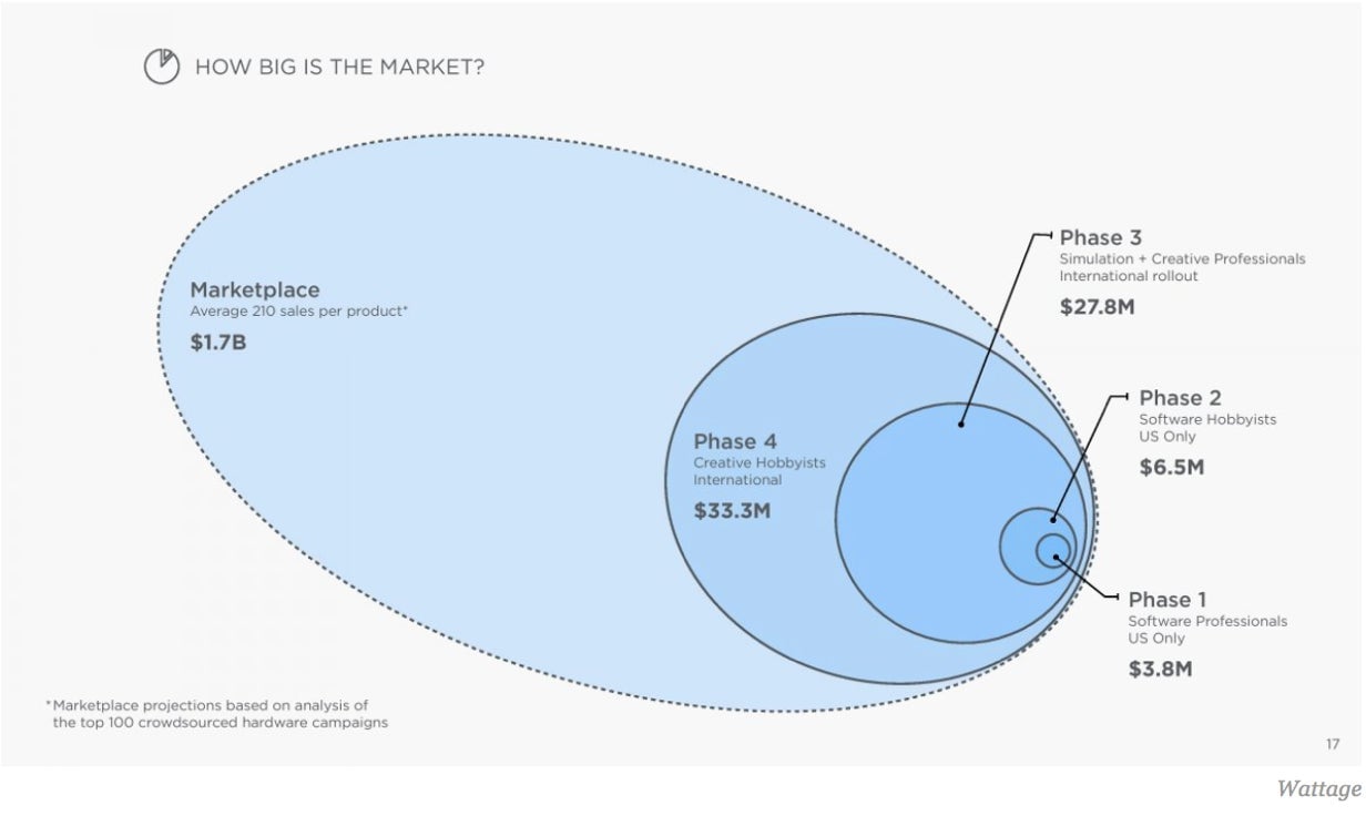
(I prefer the more traditional lower-left-to-upper-right to right up to signal a bright future, but I’m an irrational purist.)
4. Our competition
Another new one.
Don’t tell us you have no competition. It’s a bad way to start a conversation and, in any case, there’s always competition, even if you’re simply competing with the ways in which consumers currently spend their money.
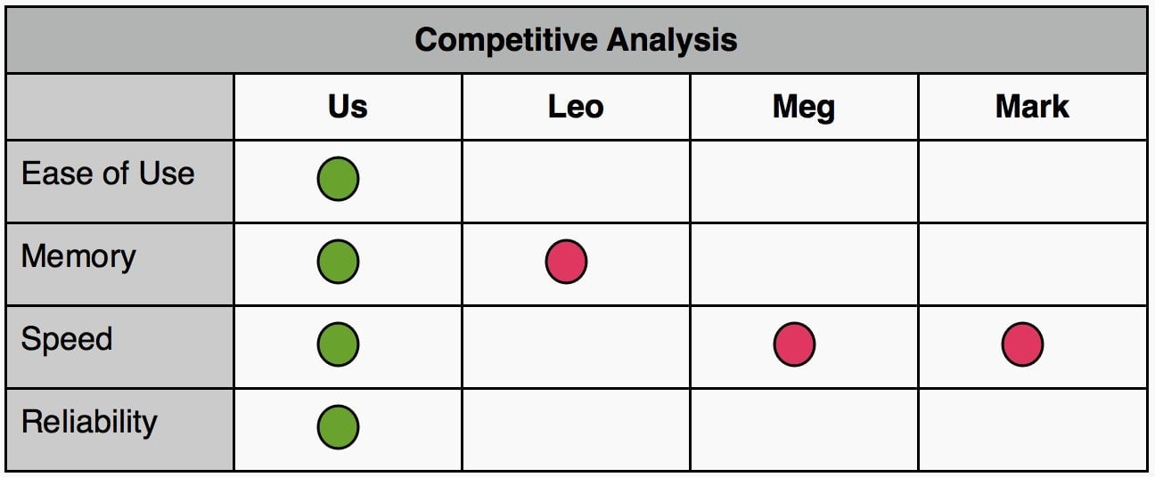
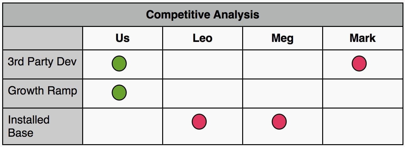
But, please, spare us charts like this:
Just tell us which of your adversaries concerns you the most, where they could hurt you, and how you will win.
5. What you own
This can be your IP (patents, trade secrets) or your exclusive access to Unobtainium suppliers… but we don’t place too much stock in any of that. The most important thing that you own is your team of gifted, energetic people—the alchemists who will magically transform easily obtained, common ingredients. Uber is a good example again: The Uber team built a huge business using technology that was available to all, including the lazy incumbent taxi companies.
6. The money pump
No change from the three-slide deck.
7. The overview
This is another Fortune Teller chart. Over a series of three-month increments, it describes parallel company activities ranging from product development to financing:
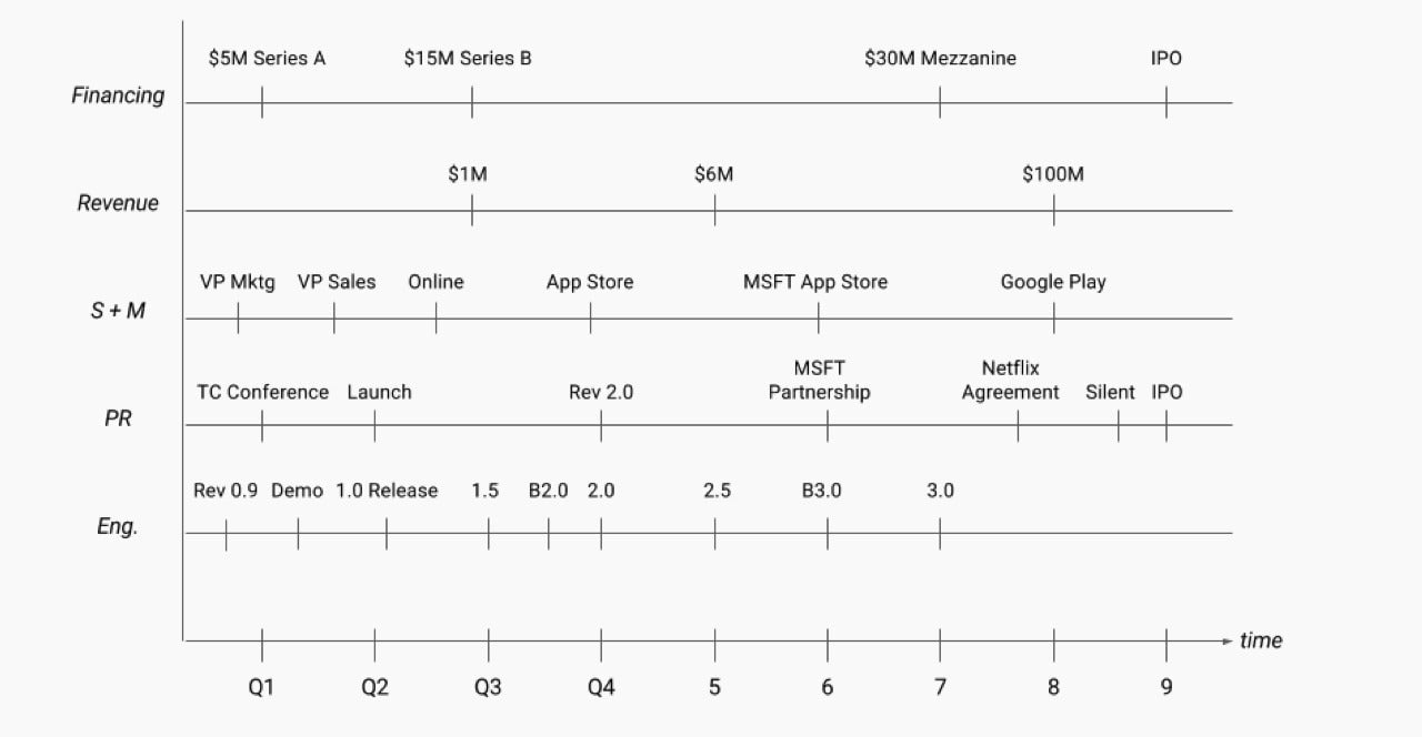
This is more than a lot of noisy detail: It outlines your command of your project’s universe. The explicit checkpoints show your willingness to take authority and responsibility. It belongs at the end of the presentation so it can be left on the screen when you shut up and look at your hands or shoes. The minutiae of schedule, partnerships, and financing plans are yummy bait for questions and arguments.
So which is it? Three slides or seven?
I still prefer the three-slide version because it’s easily memorized and can be delivered on a white board or performed on air guitar. Certainly, the concluding overview in the seven-slide format is attractive. It provides a strong, natural coda and caesura, but it’s much more difficult to recreate on the spot from thin air.
Either way, neither format will induce the “First Seventy Minutes of The Hour“ blight mentioned last week. Neither provides enough breathing room for you to bore your audience by dumping all your knowledge and wisdom on them. You decide.
Lastly, I’d be remiss if I didn’t mention:
The demo
First, If you have a spectacular demo, lead off with it. It will act as the action sequence before the screen credits in a James Bond movie. Sufficiently adrenaline rushed, your audience will be ready for some calm exposition.
Second, your demo should require little or no explanation. Don’t tell us what you’re about to do, what you’re doing, and what you’ve just done. We’d rather see the demo twice to better get the point than be submitted to laborious explanations.
A demo that does the selling by itself will get you way ahead of the fundraising process. If your demo is a poor salesman, rework it… or don’t give it at all. An old VC joke contends that there’s no better time to raise money than when you have nothing but words, no prototype to break at an embarrassing moment during the demo:
“What does your software run on? PowerPoint.”
This post originally appeared at Monday Note.
