Apple is reportedly set to refresh its upcoming mobile and desktop operating systems with a new font called San Francisco.
Apple $AAPL is reportedly set to refresh its upcoming mobile and desktop operating systems with a new font called San Francisco.
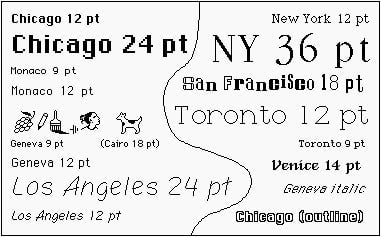
But turns out this isn’t Apple’s first font named for the city by the bay. When the company debuted the Macintosh computer in 1984, it came with a font called San Francisco created by legendary designer Susan Kare. (Steve Jobs told Apple’s typeface designers to name the system fonts after major cities—hence Chicago, New York, and Geneva.)
Join 500,000+ readers who start their day with Quartz.
By subscribing, you agree to our Terms of Service and Privacy Policy.
A reflection of early Mac aesthetics, the San Francisco of 1984 emulated the ransom note effect, with each character distinctly different, like cut outs from a magazine or newspaper.

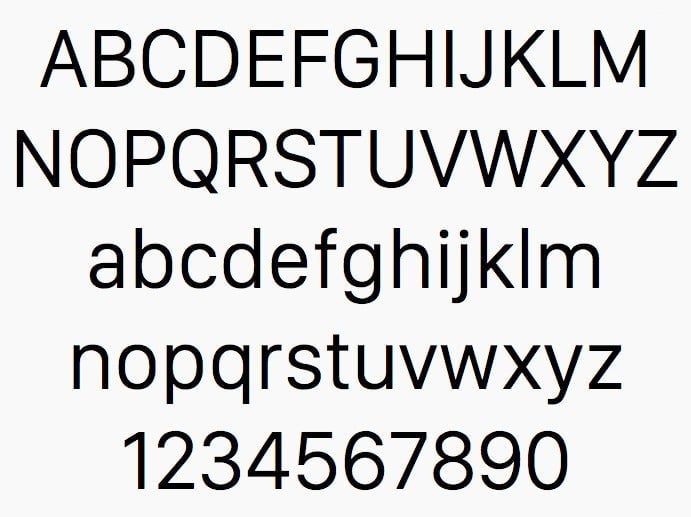
But the San Francisco of 2014—released to developers in November and designed specifically for the Apple Watch’s small display—eschews the playfulness of a ransom note for a more polished and modern look. It will reportedly replace Helvetica Neue, the system-wide font currently used in iOS 7, iOS 8, and OS X $TWTR Yosemite. With more space between the letters, the modern-day San Francisco makes text in long passages easier to read and improves legibility on small screens.
For Apple, the use of this new font will not only provide a consistent look, but also a subtle visual cue for all its products released post-Apple Watch.