Indian startups are going nuts designing new logos.
Some of the biggest brands in the country’s startup ecosystem—one of the fastest growing in the world—seem to be fixated with logo experimentation.
Here’s a look at several startups that have tried various logos over the years in a bid to reflect their (ever) evolving identities.
Flipkart
India’s biggest e-commerce company started in 2007 as an online book seller. As the company grew in size, it has experimented with a range of logos.
Here are the first five, which it introduced (and then withdrew) between 2007 and 2015:
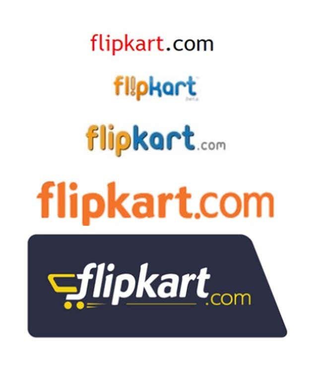
On May 28, Flipkart launched its sixth logo in eight years, which is also its mobile app icon.
“Flipkart has evolved into a pretty much mobile-centric platform,” said Mukesh Bansal, the head of commerce at the company. “This will be our identity across all touchpoints, whether it is desktop, mobile, online, offline, print, everywhere.
Zomato
Zomato began as Foodiebay in 2008 and renamed itself in Nov. 2010. Even though the restaurant discovery website has settled on that name, it has not stopped fiddling with its logo.
Here are the various logos the company has used and discarded since 2008:

By the third quarter of 2014, Zomato opted for the “heart logo,” which combined the two things it stood for—food and people

Between July 2014 and April 2015, Zomato has been on an acquisition spree, picking up nine companies.
And after its acquisition of Urbanspoon in January this year for $52 million (Rs330 crore), Zomato changed its logo yet again to retain the existing users of the Seattle-based company.
The new logo takes the spoon from Urbanspoon’s logo and Zomato’s trademark red background.

It’s rate of experimentation is so prolific that it even got trolled by Amazon.
(#AurDikhao is a campaign launched by Amazon India, referring to the variety of options the e-commerce platform offers.)
Myntra
Myntra’s first logo, which the company used before 2011, reflected its areas of focus back then—personalised gift items.

By 2011, Myntra started focusing on online retailing of fashion and lifestyle and changed its logo.

Last month, when Myntra decided to become app-only, the company launched its latest logo.
Housing.com
Founded by a group of 12 students from Indian Institute of Technology, Bombay in June 2012, the online real estate website Housing.com made headlines earlier this year with its new campaign “Look Up”.
The company, headed by 26-year-old Rahul Yadav, is estimated to have spent around Rs50-80 crore during its eight-week campaign, which ended in April.
In March, Housing.com launched its new logo, and flooded newspapers with jacket ads and lined the streets of several cities with billboards.
Before launching its “Look Up” campaign, the company used the same logo for nearly three years.

InMobi
Mobile ad network, InMobi, is among the most successful enterprise software startup in India. The company, backed by Softbank and Kleiner Perkins Caufield & Byers, competes with Google in mobile ads category.
The company has changed its logo once since its inception in 2007.
Snapdeal
Started in Feb. 2010 as a daily deals platform, Snapdeal has seen several shifts in its business model. Japan’s Softbank-backed online marketplace has also tweaked its logo once in the last five years.

From its earlier tagline “Bachatey raho”, Snapdeal has moved to its latest slogan “Dil Ki Deal!”, and hired actor Aamir Khan for this campaign. Khan is known to charge Rs4-5 crore for product endorsements.

