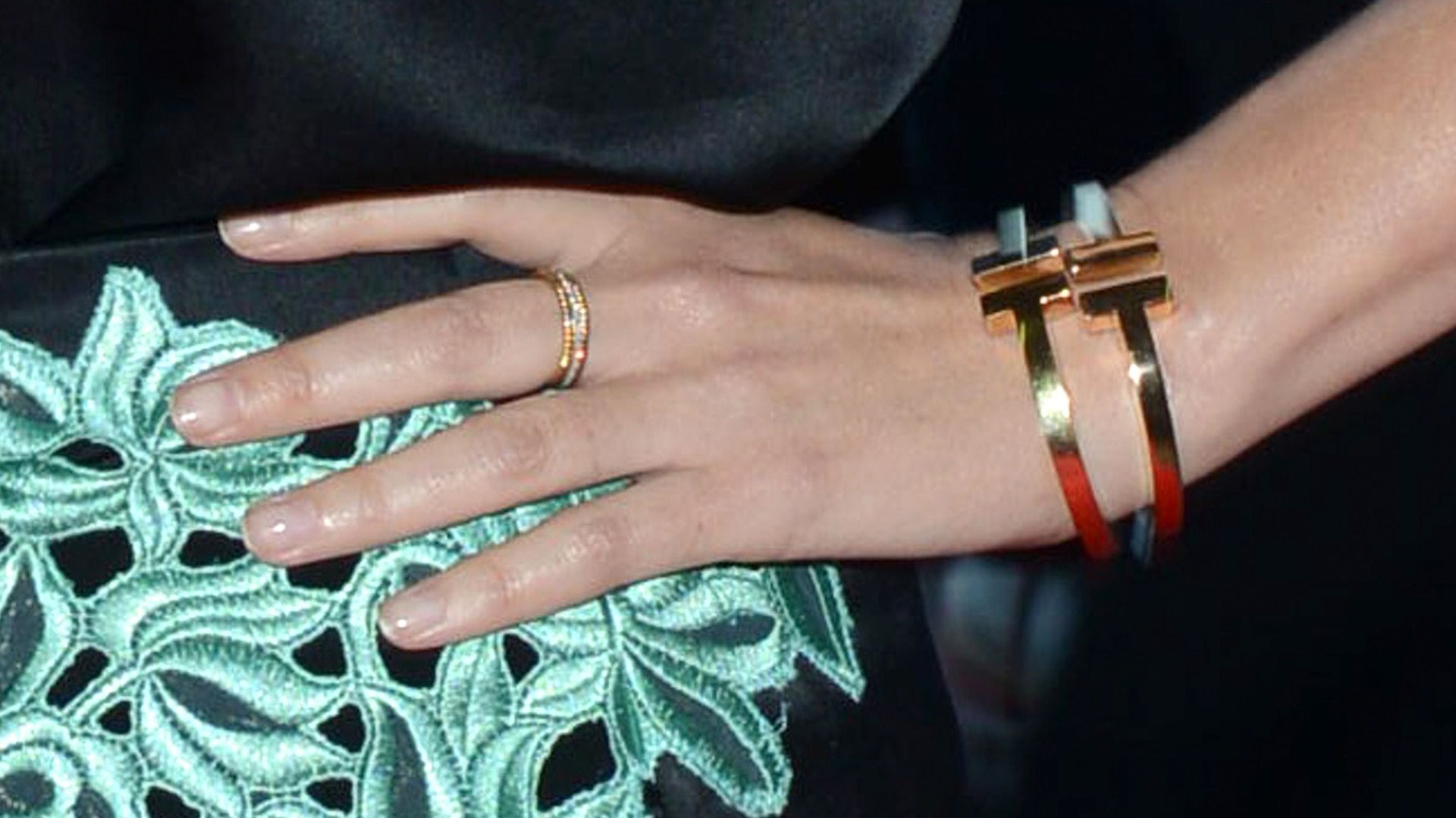
Tiffany’s has found the way to sell logo-emblazoned jewelry: quietly
In an era of fashion-logo fatigue, Tiffany’s decision last year to launch a new collection with logos all over it looked like a pretty bold move. But it seems to have paid off.


In an era of fashion-logo fatigue, Tiffany’s decision last year to launch a new collection with logos all over it looked like a pretty bold move. But it seems to have paid off.
The jewelry company’s T Collection, which features the letter “T” repeated in the form of chain-links, cutouts, and horizontally-topped cuffs, was its response to the problem evident in its earnings this time last year: The company’s high-priced bling was selling well, but its “fashion jewelry”—pieces with fewer, if any, gemstones, and prices averaging below $500—was doing sluggishly. Francisca Amfitheatrof, recently appointed as Tiffany’s design director, needed to get customers excited about the cheaper end of its range.
She appears to have done just that. Customers have, on average, been spending more on the T collection than any fashion collection in the brand’s history, said Mark Aaron, the company’s head of investor relations, on a conference call this week to discuss this quarter’s stronger-than-expected earnings (paywall).
Amfitheatrof appears to have taken a page from the luxury accessories handbook. She used the letter T as a design element and quiet signifier—in contrast with the more overt branding on the Tiffany charms engraved with the company’s name. To the untrained eye, a gold necklace of T-links just looks like a strong, beautiful chain; only someone who knows Tiffany’s would recognize it as branding. (The same cannot be said for some of the cutout cuffs, which incidentally and unfortunately, recall the accessories of another designer, Tory Burch.) One could even imagine a slim gold T cuff as an entry-level alternative to the perennially popular Cartier Love bracelet, which may be just what Tiffany’s needs to get shoppers in the door.
Call it coded luxury. For now, Tiffany’s customers seem be getting the message.