The story of Chinese characters begins with, of all things, turtle bellies.
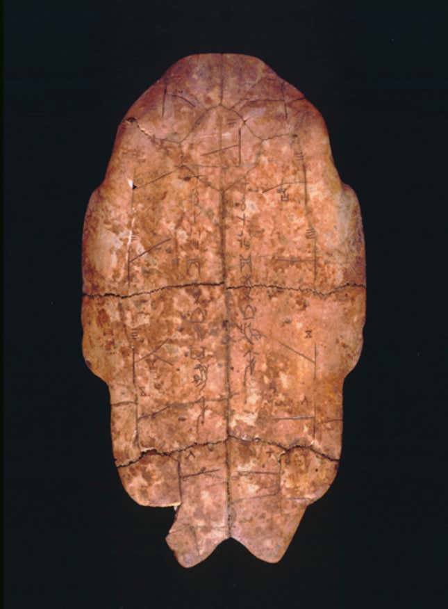
The kings of the Shang Dynasty—which ruled from the 16th to the 11th centuries BC—had questions. Questions about what the king should do, like whether to “perform a ritual for Father Ding and offer to him thirty captives from the Qiang nomad tribe as well as five penned sheep,” according to one translation (pdf, p. 5). As with many ancient human-rights abusers, the king turned to his royal soothsayers to decide the lives of these captives.
The soothsayers etched these pressing questions directly onto the shoulder blades of oxen and the under-shells of turtles, which are also known as plastrons. They then poked the inscribed animal parts with hot metal rods until cracks formed. The shapes of the cracks served as omens, telling the king whether offering captives was a good idea or a very bad one. Often, the answers were etched directly onto the bones and shells, right next to the prophetic cracks.
Tens of thousands of these etchings, known as “oracle bones,” have survived all the way to today. They are a resilient source of ancient etymology and the earliest-known Chinese characters. Archaeologists date oracle bones to at least the 13th century BC, around the time of the Trojan War, and the characters can still be made out.
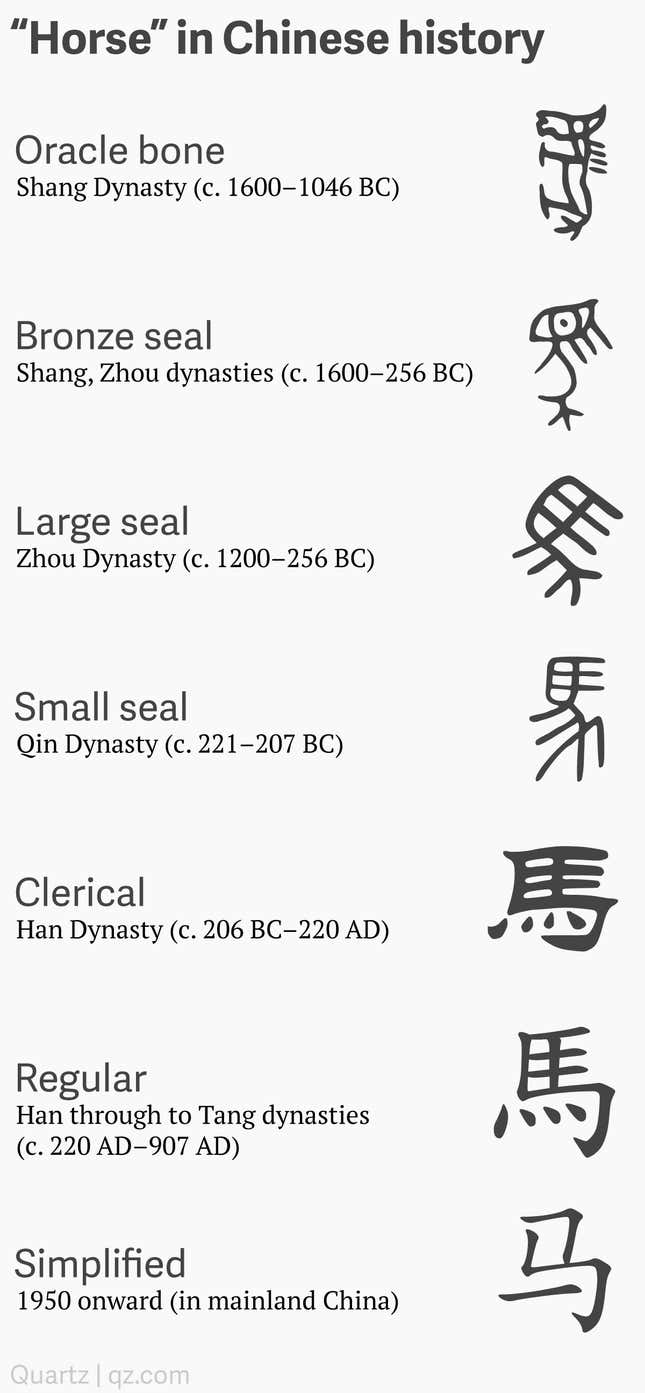
Chinese characters have changed considerably in the centuries since, but the biggest transformations are long in the past. The most significant historical shift happened way back in the Qin Dynasty, which ruled in the second century BC. The Qin is celebrated for unifying disparate Chinese writing systems into a single structure. Yet since the time of “regular script”—established over the first several centuries AD and fully mature by the 700s—the characters have remained largely the same, barring numerous calligraphic and stylistic flourishes. The only major development since then came in the 1950s and 1960s, when newly communist China simplified the writing system, hoping to make it more accessible.
Now another big change is afoot, and it’s called fonts.
Part of the reason Chinese writing has changed so little is that China firmly established the writing system by standardizing the script early on, and by inventing a thing called printing. The other factor, though, is that the Chinese writing system is huge.
The conventional wisdom is that a reader needs to know around 2,000 characters to understand a newspaper, and about a thousand more for the average novel. One of the most comprehensive Chinese dictionaries, the Zhonghua Zihai, contains 85,568 characters (though you won’t encounter most of them unless you are really into ancient Buddhism or Song Dynasty calligraphy).
The sheer scale of the writing system has made any innovation ambitious and expensive. It took the communist government over 10 years of dedicated work to complete its character simplification scheme, and even now it is not without controversy. For the same reason, there has not been much innovation in fonts. Raw numbers of fonts are hard to come by, but suffice it to say that there are far fewer for Chinese than there are for Latin languages; there is no Chinese equivalent of those sites that offer 10,000 fonts for $20.
But that is changing. Better technologies for the design, display, and transmission of fonts mean more and better Chinese fonts are on the way. And, increasingly, people want variety, sick of seeing the same fonts over and over.
This is the story of how a Chinese font gets made. It is a story not only of the Chinese writing system itself, but of its limitations, and its frontiers.
Chinese will blow your mind
“Chinese-script projects are crazy. The scope is mind-blowing.”
So says font designer David Březina, chief type officer at Rosetta Type, a Czech firm that specializes in designing custom typefaces for multiple scripts (a font is a digital representation of a typeface).
To see what Březina means, consider a letter: e. Deciding what an e looks like is the job of typeface designers. To design a typeface for English, a designer needs to create symbols for each of the 26 Roman letters in upper and lower case, as well as punctuation, numbers, and so on. Each of these symbols is called a “glyph.”
Each Chinese character is a glyph, too—for instance, 水 (that’s shui, which means “water”). Behind the e glyph and the 水 glyph, however, are two very different processes. The main difference is scale.
The default set for English-language fonts contains about 230 glyphs. A font that covers all of the Latin scripts—that’s over 100 languages plus extra symbols—contains 840 glyphs, according to Březina. The simplified version of Chinese, used primarily in mainland China, requires nearly 7,000 glyphs. For traditional Chinese, used in Taiwan and Hong Kong, the number of glyphs is 13,053.
An experienced designer, working alone, can in under six months create a new font that covers dozens of Western languages. For a single Chinese font it takes a team of several designers at least two years.
Laying the groundwork
“It all starts with research,” says Winston Su, co-founder of Justfont, a Taiwanese startup that focuses on delivering fonts through the web. In most cases, the research phase lasts an entire year.
The goal of this year-long process is to take a fuzzy idea for a hypothetical new typeface, and develop it into a set of a few hundred “representative characters.” These set the tone for the thousands of characters to follow. Latin typefaces are designed in a similar way, but the scale is entirely different. In an interview with Fast Company, venerable designer Steve Matteson said he always starts a new Latin typeface with just a handful of glyphs—capital H, O, and V, and lowercase n, o, and d.
The research phase is part design, part calligraphy, part grammatology, part market research.
Everything may begin with some vague notion of the feel a typeface should have. In his interview, Matteson adds that a typeface generally starts with an adjective, like “approachable, friendly, feminine, masculine. All of these adjectives play into the detailing that we would do to the letter forms to help emphasize those attributes.”
Similarly for Chinese; “modern but not boring” is how Su described the idea behind JinXuan, Justfont’s first font designed in-house, still in development. The difference is that, because of the vast amount of work involved, a Chinese typeface cannot be created by a single designer with a singular vision, as is often the case for Latin scripts. Instead a collaborative team has to start with this fuzzy notion and then settle on a uniform design. That’s what the research stage is all about.
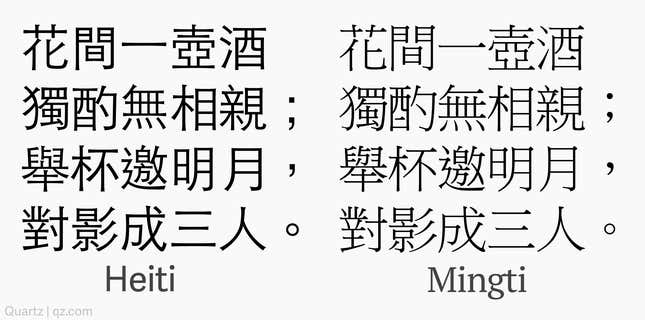
As with Latin fonts, a crucial initial decision is to determine which font “style” to use. Chinese has two main styles, called Mingti and Heiti, akin to the serif and sans-serif of Latin. Heiti is a bit like sans-serif: clean, straight lines without extra ornamentation at the ends, common on the web. Mingti is similar to serif, with extra embellishment at the end of strokes that give it a more bookish feel.
Here’s the same passage from a Tang Dynasty poem, in both Heiti and Mingti.
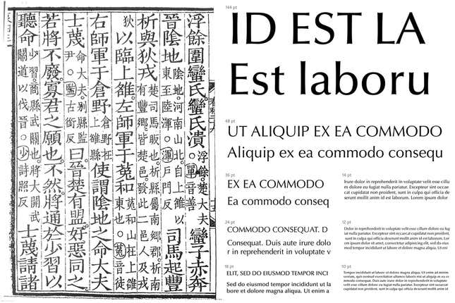
After deciding whether to go in a Heiti or a Mingti direction, designers hone the typeface design further by looking for inspiration from sources as wide-ranging as calligraphy, ancient lettering, and other Chinese and Latin fonts. For JinXuan, Justfont is attempting to apply the feel of the Latin typeface Optima—which blends the simplicity of sans-serif fonts with the extravagance of serif ones—to the writing style they found on an ancient scroll. (Su, the co-founder, studied Chinese literature in university.)
Underlying all of this thought is the goal of identifying a font-shaped hole in the market. “We design a font because we think users need it,” says Jeff Wu, general manager of Arphic Technology, a 25-year-old Taiwanese font shop and one of the biggest names in Chinese typography. “And because we think it fits with how people are using our other offerings.”
The first sketches
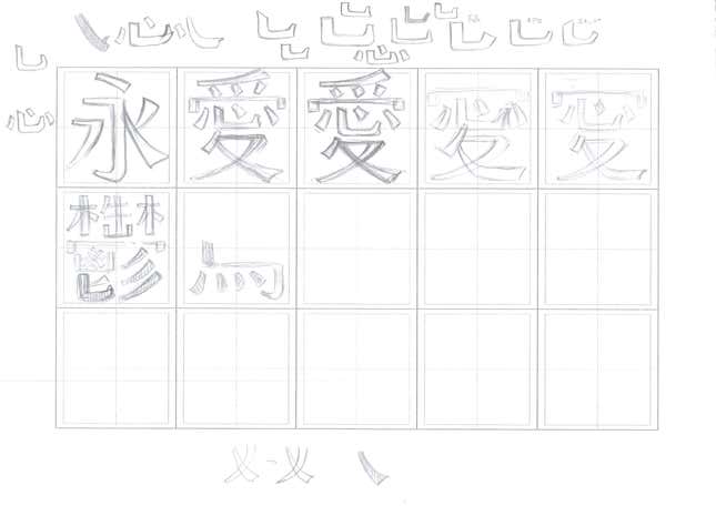
With all this in mind, designers begin to actually draw the font as they imagine it. They put pencil to gridded paper, sketching out initial passes at characters.
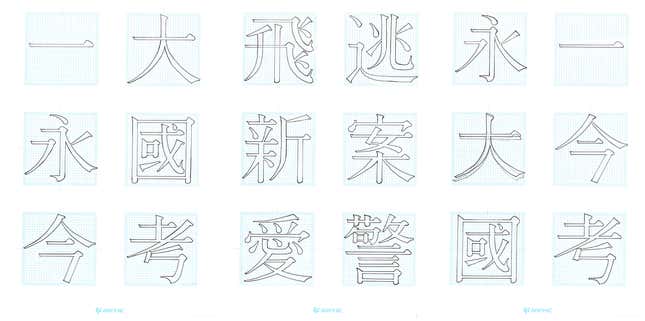
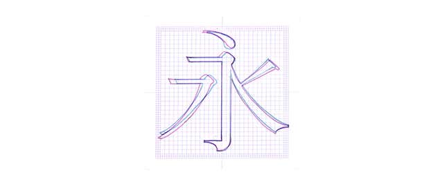
At this point they are already exploring subtle variations. For example, the character 永 (yong, eternity) is drawn twice above. Yong is one of the most crucial representative characters, because it contains eight of the most common strokes, known as the “Eight Principles of Yong.” Here the two versions from above are superimposed, one in pink and the other in blue.
But the Eight Principles alone are not enough to represent the entire writing system. To understand why the rest of the representative characters are important, we need to know a bit about Chinese characters themselves.
What is a character? Is it just a picture of that thing or…?
A few Chinese characters are no more than pictures of the thing they represent—門, which looks like a door, means “door.” Most characters are not like this.
The most fundamental unit of a character is the “stroke.” Think of a stroke as a single motion during which the writer does not lift her writing implement. The character for “two” is 二 and, intuitively, contains exactly two strokes. A more complicated character is 灣, the wan in Taiwan, which is made up of 25 strokes.

These strokes come together to form the 214 “radicals” of Chinese. These are usually components contained within larger characters, and each has its own meaning, like “water” (氵) or “fur” (毛) or “speech” (言). A character is usually one or more radicals—which give it meaning—along with other parts that suggests how it should be pronounced. You might notice that the wan (灣) character mentioned above contains the “water” radical on its left side; that’s because this character means “bay,” which is a very watery thing.
So if the tens of thousands of Chinese characters are really just re-combinations of a few dozen basic strokes (the exact number is in dispute), why is creating a font so difficult? Surely it’s just a matter of designing the strokes and then arranging them into every necessary combination? This is true for many glyphs in Latin fonts, but Chinese is not so forgiving.

“There are many glyphs in Latin which are basically just combinations of basic letters with accents,” says Březina. “Once you get the basic letters and accents right, getting the combinations is very easy.” The Czech “ř” in Březina’s very name is a perfect example. The little upside-down chevron on that “r” is a háček—or “hook”—and it is identical in both ř and č.
But in Chinese, “every character has to be adjusted,” says Su of Justfont. “Each one is its own image, with its own design needs.”
Diff’rent strokes
So as designers tweak these representative characters, they also pay attention to how each individual stroke looks, because that will be important for other characters down the line.

For instance, just have a look at the various uses of the radical 言 (yan, speech). Even in cases where it is in the same position, such as the left half of the character, the stroke weights and shapes are slightly different (the characters shown below are the exact same font and size).
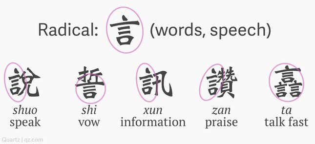
This is all about “balance,” one of the main principles of Chinese calligraphy. Arphic actually has software that automates collecting the necessary components for a character, but that alone is never enough. A simple stroke may fit nicely in one character but upset the balance of another, maybe by being too thick when there are many thin strokes, or vice versa. A stroke or radical’s placement could make the character look crowded, or loose, depending on the strokes around it, and need to be adjusted accordingly. These are the kinds of things happening with 言 (yan, speech) above.
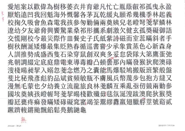
A Chinese reader would be put off by such mistakes as readily as an English reader would be by a lowercase “l” that looks too much like a “1.” Here an Arphic edit suggests aligning the bottom of the character 蹉 with its top part, writing in red ink, “bottom shifted right.” The character, as it happens, is cuo, and means “error.”
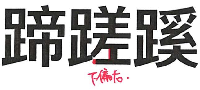
This means that, as Chinese typeface designers continue to add to the set of representative characters, they find cases where the stroke and radical designs they were once quite proud of do not hold up to the range of contexts they need to be used in. These assumptions must be constantly challenged and revised.
“There can be a lot of discussion at the research stage,” says Gwen Yeh, a designer at Arphic. The revisions are harsh and numerous. Yeh shuddered when she was shown a first-draft page of her designs—it had more red ink than black.
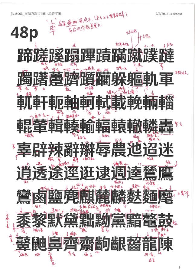
These revisions can become especially numerous because designers do not focus only on individual characters, but must also pay attention to how all of the characters come together to create the whole typeface. “You can’t really say that any character is harder than another to design,” said Yeh. “The hardest thing is creating a uniform experience that is pleasing to the reader.”
To create this uniform experience, designers must apply the style established for the representative characters to the thousands of rare and strange characters that are left. They can finish anywhere between 10 and 100 characters a day, getting faster as the style becomes more concrete.
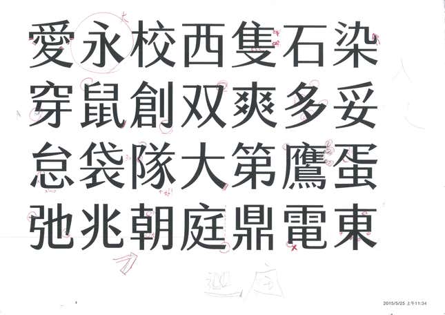
“The simpler the character, the harder it is to design,” says Teresa Mou, senior designer at Arphic. The hardest, then, may be 一 (yi, one), which has only a single stroke.
And each round may always come back with lots of red ink.
The power of demand
The sheer scale of the work involved has made it difficult for the Chinese language to enjoy the typographic diversity of Western ones, where there are varieties for every mood, style, and feel.
But the world’s hundreds of millions of Chinese-speaking internet users are getting sick of seeing the same fonts over and over. Increased demand for new ones is changing the equation, as it has for other non-Latin scripts. One piece of evidence: Justfont went to a local crowdfunding site to solicit NTD$1.5 million ($45,000) to create a new font (link in Chinese). It raised 16 times that.
“Demand has shifted completely, and people want fonts with more personality,” says Jeff Wu, Arphic’s general manager. Thanks to greater interest in personalization and improvements to technology, he says, “Now we can create them.”
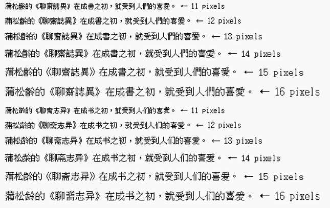
One technological change is screen resolution. Until recently, screens were not able to handle the subtle curves and loops of more calligraphic Chinese. In fact, in the early days of computers, all but the simplest Chinese characters could not be represented accurately or even legibly. The low resolution of early 8-bit Japanese video-game masterpieces, like those on the Nintendo Famicom, forced developers to use hiragana, the phonetic representations of characters, instead of kanji, the complex characters themselves, which come from Chinese. Even when displays improved beyond 8-bit, lower-resolution Chinese fonts, like Arphic’s Firefly, are barely readable. Now, Justfont can assume people’s screens have higher resolutions, allowing them to give JinXuan more intricate curves than earlier Chinese font designers.
Those curves can be seen in this message on Justfont’s Taiwanese Kickstarter campaign, which uses text in JinXuan to assure potential funders—with a slightly nationalistic subtext—that their money will be used to make Taiwan more beautiful.

Another big change in technology is the ability to distribute fonts through the web. Both Justfont and Arphic offer services that deliver fonts to web pages, so they will show even if users don’t have the font installed on their computer. This has been possible for a number of years, but Chinese always posed a particular problem: with so many glyphs, the fonts require huge downloads for users that have not visited the site before, putting a strain on bandwidth both for user and provider. (A Chinese font can run up to 6 or 7 megabytes for a single style and weight. Compare that to PT Serif—Quartz’s body font, which covers over 100 Latin languages—which is just 1.4 megabytes for four styles.) Now Chinese webfont providers cleverly scan through a webpage’s text to identify which glyphs are required, and send only those to the user instead of all 13,000-plus.
Because they are so much more complex, Chinese fonts may never be able to compete with their Latin counterparts on variety. Still, Chinese typographers are increasingly taking advantage of the higher demand.
It helps that customers are used to paying a lot more for Chinese font licenses. For instance, Monotype (the typography behemoth responsible for ubiquitous fonts such as Arial and Bodoni) charges $600 for 20 styles of the Latin font Quire Sans on its fonts.com shop. That includes bold, semibold, italic, semibold italic, semibold light italic, and other permutations. M Yuen, one of its Traditional Chinese fonts, costs $1,500 for just three styles. These high fees also apply to Chinese webfonts—a growing source of income, as they become faster and more appealing to web developers.
Both Justfont and Arphic often draw inspiration from Latin typefaces, and that may point the way forward. Gerry Leonidas, professor of typography at the University of Reading in the UK, says font designers are trying to implement style innovations from Latin fonts that have thus far been uncommon in Chinese and Japanese—such as wide variants, often used to fill up horizontal space. “So things are bound to get more interesting in the coming years,” says Leonidas.
And the interest Justfont generated at home shows that the people demand better fonts.
“Most people think fonts appear out of the computer,” says Arphic’s Mou. They don’t. The process is long and painstaking. “But making them is a lot of fun.”
We’re a long way from the turtle shells.
