Donald J. Trump just gave internet logo critics a gift this Friday: A new WASPy logo ripe for mockery.
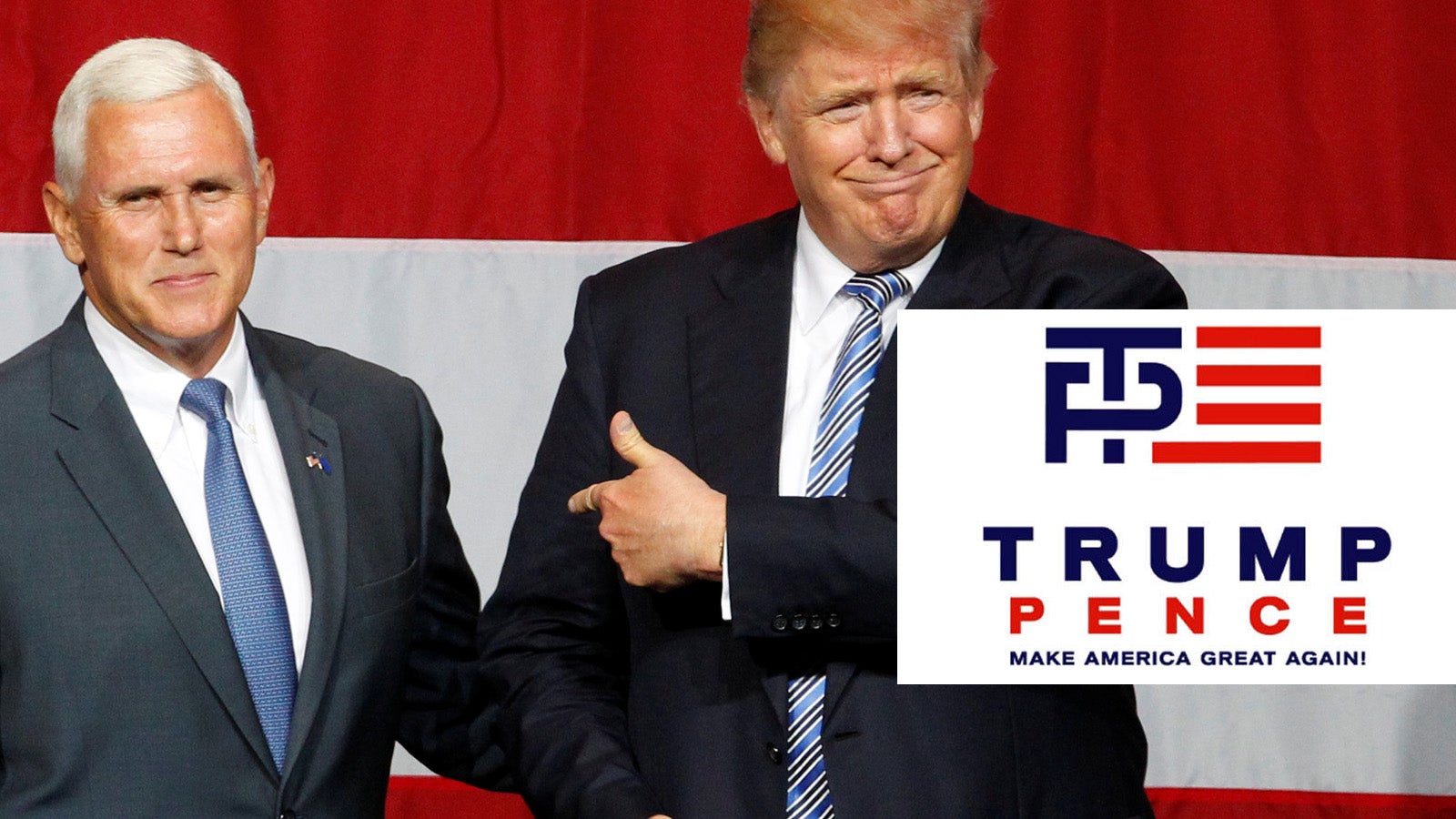
Within a few hours after the presumptive GOP candidate announced Indiana Gov. Mike Pence as his pick for vice president and unveiled a new campaign logo, pranksters quickly fixated on the emblem’s interlocking “T” and “P.” The logo has already inspired gifs riffing on the various kinds of sex acts commenters read in the mark.
A dark blue monogram wedged with five red stripes to suggest the American flag, Trump’s campaign logo recalls the aesthetic of fashion brand Tommy Hilfiger, Nautica or other labels that milk Americana motifs for their advertising. The use of the monogram is a particularly snooty WASPy touch, meant to evoke a privileged east coast class of pastel polo shirts with up-turned collars, custom letterpress stationery, and embroidered towels. The typography—characterless bold sans serif letters kerned loosely—is in every other mundane banking brochure, deadening corporate flyer, or humdrum billboard that clog the American visual landscape.
There’s actually nothing surprising about the Trump–Pence emblem. In fact, the logo is so boring that it almost doesn’t merit criticism. If the logo was a comp presented by a design intern, an art director would’ve glimpsed at the clunky graphic, flipped the page and asked, “what else?” Yawn.
But the Trump design team is not entirely to be blamed. They simply followed tradition and went by the unwritten formula for US political campaign logos. “The Presidential election year is a special time in American politics when the public sees just how ineffectual graphic design can be,” writes design critic Steven Heller in a 2004 essay The Dreary Art of Presidential Elections. “Regardless of who the candidate is, there appears to be bipartisan consensus that a limited color palette–red, white, and blue–and very few symbols–stars and stripes–are the best way to signal a candidates’ Americanism.”
As long as Trump’s logo is legible in all necessary applications—signs, broadcast, banners, bumper sticker, brochures, shirts, buttons, websites, and social media—it’s an adequate mark, much like his opponent’s straightforward campaign logo. Compared to company logos that tend to have more longevity, election campaign logos are temporary. In this case, a four-month nuisance that will be forgotten after the November elections.