You’ve heard the parable of the blind men and the elephant. Each man grabs a handful of the giant beast in an effort to learn its true nature, but none has the perspective to garner the whole picture.

You’ve heard the parable of the blind men and the elephant. Each man grabs a handful of the giant beast in an effort to learn its true nature, but none has the perspective to garner the whole picture.
There’s something similar going on in the economics world, with a debate over a chart that looks like an elephant—one that shows the relative change in income between 1988 and 2008 for everyone around the world, from the poorest to the richest. Many people see this account of globalization’s winners and losers as the reason for recent political fractures in the world’s wealthiest countries, a justification for the rejection of trade deals and migration.
Join 500,000+ readers who start their day with Quartz.
By subscribing, you agree to our Terms of Service and Privacy Policy.
But is globalization the real culprit behind the economic discontent? A new analysis of the data attempts to counter this idea.
It doesn’t quite succeed in exonerating global integration completely—especially when it comes to the case of the United States. But it offers a useful reminder that economic stories are rarely simple, especially on a global scale.
The original chart comes from a data set assembled by the economist Branko Milanovic. It is known as the “elephant chart” because, generously, you can discern an elephantine trunk curve:
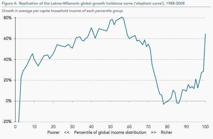
What we’re seeing here is how income has changed for people across the income scale over a 20-year period. Someone in the bottom 10% of global earners in 2008 made 40% more than someone in the same spot in 1988. The very top earners in 2008 were making 60% more than the top earners two decades prior. And median global income grew 80%.
But not everyone has done well over this time period: In 2008, people in the 80th percentile (wealthy by global standards but squarely middle-class in rich countries) had a slightly smaller real income than those in that spot in 1998.
This has reinforced a number of common narratives about the way the world is changing at a time of massive global integration. After all, the 1988 to 2008 period saw the fall of the Soviet Union, the founding of the World Trade Organization, and the integration of China into the international trade system.
Narrative one: The boost in export-led growth has increased prosperity in poorer countries, which we see in the global lower class’s big income gains. Narrative two: The rich are getting richer, which we see in the big rise in average incomes of the world’s top earners. Narrative three: The hollowing-out of the middle class in wealthy countries, that bend in the elephant’s trunk, is a sign of economic distress caused by competition from workers in poor countries and unequal distribution of gains in rich ones.
That third narrative has been used to justify—or excuse—populist and xenophobic movements rejecting globalization around the world, from Donald Trump’s campaign for president in the US to the Brexiteers of the UK. It also has been used to question the pro-globalization policies embraced by establishment politicians in wealthy countries.
It’s enough to make the defenders of the global economic system ready to finally push back.
Now, a new report (pdf) refutes the anti-globalization narrative. It comes from the Resolution Foundation, a UK policy shop founded by an insurance billionaire and focused on the living standards of low- and middle-income residents of the United Kingdom. There, analyst Adam Corlett has taken Milanovic’s chart and corrected it to account for distortions he sees in its presentation.
He makes two important observations about the way in which the income information was aggregated, noting that new countries had been added to the dataset over time, and arguing that population growth, which is particularly high in poor countries, has shifted the composition of the world population in such a way that average wages look smaller than they otherwise would be.
Here’s what that elephantine curve looks like when you correct for those two things:
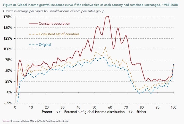
The major change is that income for folks in the 80th percentile is no longer stagnating. Instead, it has risen quite a bit.
“The divide implied by the elephant curve—between stagnation for most and boom for those at the top—is certainly not apparent,” Corlett writes. In other words, income gains in the last 20 years have likely been more broadly shared, even if some—the global poor and global rich—have done better than others.
Yet it’s important to recognize that this aggregation, just as it did before, still disguises a lot of important nuance. Corlett himself concedes that in the US particularly, income growth was “notably unequally shared, with low (but not zero) growth for poorer deciles meaning that the US comes closest to matching the stagnation and inequality narrative.”
The report also notes that the original elephant curve is skewed because “advanced” economies include former Soviet republics, which suffered in the wake of their empire’s collapse, and Japan, which has long suffered from slow growth. In Corlett’s view, these are unique cases that don’t reflect the ideal advanced economy. Indeed, removing them, and the United States, with its unequal gains, suggests that mature economies have done quite well for their low-income citizens during this time of unprecedented global connection. And if you take China out, the outsized gains for the global poor fall off the curve as well.
The problem? After China, the US, Japan, and the post-Soviet states have been taken out of the equation, you’re not really talking about the global economy anymore.
The new analysis stresses one key takeaway: “[W]e should be cautious about assuming that there is anything inevitable about stagnant incomes for the lower middle class of the rich world or that domestic policy choices do not play a big role.” This is also a conclusion that is true with the original data.
Milanovic noted many of the divergences among mature economies in his original paper (pdf), and he has underscored that nothing about his analysis is normative—rather, each country is responsible for its own domestic policies, and how it distributes (or not) the benefits of trade.
The one major difference in the new analysis is its finding that incomes for the poorest of the rich didn’t stagnate but instead grew. This is indeed positive news, but is positive in the same bittersweet sense as the recent boost in US incomes, which still leaves many families earning less than they might have in the 1990s.
But does this make Trump’s claim about trade with China—that it has been better for the Chinese than for middle-class Americans—less true? In the updated elephant chart, the global “losers” are still the global losers; they just haven’t lost as much as we thought.
Aggregated data can reveal patterns like the elephant chart, but it isn’t always useful for tailoring appropriate policy responses.
After all, we didn’t need Milanovic’s data—aggregate global incomes—to know that as the US has benefitted from trade, the costs have been shared disproportionately. In the US, we have community-level econometric analysis showing how trade-driven job losses drive political polarization, and tax-level data that shows income inequality at levels not seen since early 20th century.
As Corlett writes, “changes to trade policy, even where desirable, are not a substitute for progressive taxes and benefits, fair wage policies and sufficient house building.” This is intended as a rebuke to anti-trade activists, but the criticism goes both ways.
In the US political establishment, there is deep reluctance to link domestic economic policy explicitly to free-trade deals, and so the ultra-ambitious Trans-Pacific Partnership is virtually dead, another sign that the repeated assurances that trade is beneficial isn’t convincing the public. (You were warned.)
When it comes to measuring the global economy, we’re all blind men grappling with an elephant. The question is whether you’re getting a lift from the trunk, or a poke from the tusk.