
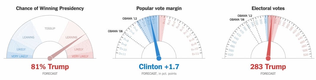
Election night in America has had two surprise successes: Donald Trump and the New York Times’ addictively nerve-racking live presidential forecast. Anxious election watchers have been glued to the news organization’s constantly fluctuating dashboard of speed dials that show each candidate’s chances of winning the presidency.
Here’s the thing, though: Most of those tiny needle movements are not based on real data. They are random variations from the underlying prediction, which only updates once every 30 seconds, as this guy found when he dug into the code:
Jeremy Bowers, a journalist and developer at the New York Times, explained on Twitter $TWTR that the jitter in the needles reflects the prediction’s margin of error, moving between the 25th and 75th percentile of expected outcomes.
Demonstrating the margin of error for a prediction is a difficult problem. It is well-known that readers will tend to misinterpret a single number—like an 80% likelihood, for example—as hard-and-fast, even if the prediction includes a wide margin of error.
The New York Times dashboard jitter was a clever way to incorporate that error into the design. But the fact that those finely adjusted numbers aren’t totally real all the time has no doubt confused many readers, who have likely been discovering non-existent trends in their random movements.