The Trump transition team’s new website has an embarrassing design oversight
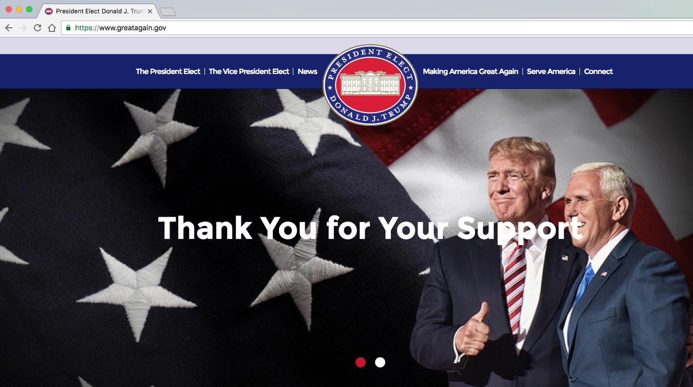
Americans were just getting used to the reality of a Donald Trump presidency when his team launched GreatAgain.gov, a new presidential transition website administered by the Trump for America campaign. The website, unveiled yesterday, serves as the official information portal for the president-elect and his team until they move into the White House and take over its official website on January 20.


Americans were just getting used to the reality of a Donald Trump presidency when his team launched GreatAgain.gov, a new presidential transition website administered by the Trump for America campaign. The website, unveiled yesterday, serves as the official information portal for the president-elect and his team until they move into the White House and take over its official website on January 20.
In keeping with the branding of his campaign, the design of Trump’s transition website is pretty straightforward, featuring the squat, sans serif typography that he also prefers for teleprompters. GreatAgain.gov isn’t great, but it’s adequate for a first day effort—putting aside the sloppy Photoshop work on Trump’s mane on the feature image (what happened to the feathery wisps?), the headline rudely impinging on vice president-elect Mike Pence’s face (the letter t appears to be attacking his nostrils), or the cloying pastel purple dominating the site.

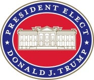
The website also hints at the color scheme of Trump’s presidency. Based on the president-elect’s new seal, America will see a lot of his signature gold in addition to the usual red, white and blue of employed by previous administrations. In contrast with president Obama’s blue-on-blue scheme, Trump’s emblem features Republican red as the dominant color. This makes sense given that red was the dominant branding color of his presidential campaign—from his ties to the now iconic “Make America Great Again” caps.

But this color choice turns into a glaring blunder when Trump’s presidential seal is repurposed as the website’s favicon. Short for “favorite icon,” the tiny, customizable graphic element is found on the tab of websites and appears when you bookmark a page. When shrunk to a small size, Trump’s presidential logo looks like a red circle with a white bar, reminiscent of the universal symbol for “No Entry“.

This is likely a simple oversight by the Trump for America design team, but it oddly underscores Trump’s exclusionary, enforcement-driven policies, which are prominently featured on this very website. Under the “Make America Secure Again” tab, a 10-point plan promises to “build a wall,” and “end,” “block,” “cancel” or “suspend” many privileges extended to US immigrants.