A Brexit passport proposal offers the perfect design metaphor for the UK’s fading influence
In or out? Staying or leaving? Blue or burgundy?


In or out? Staying or leaving? Blue or burgundy?
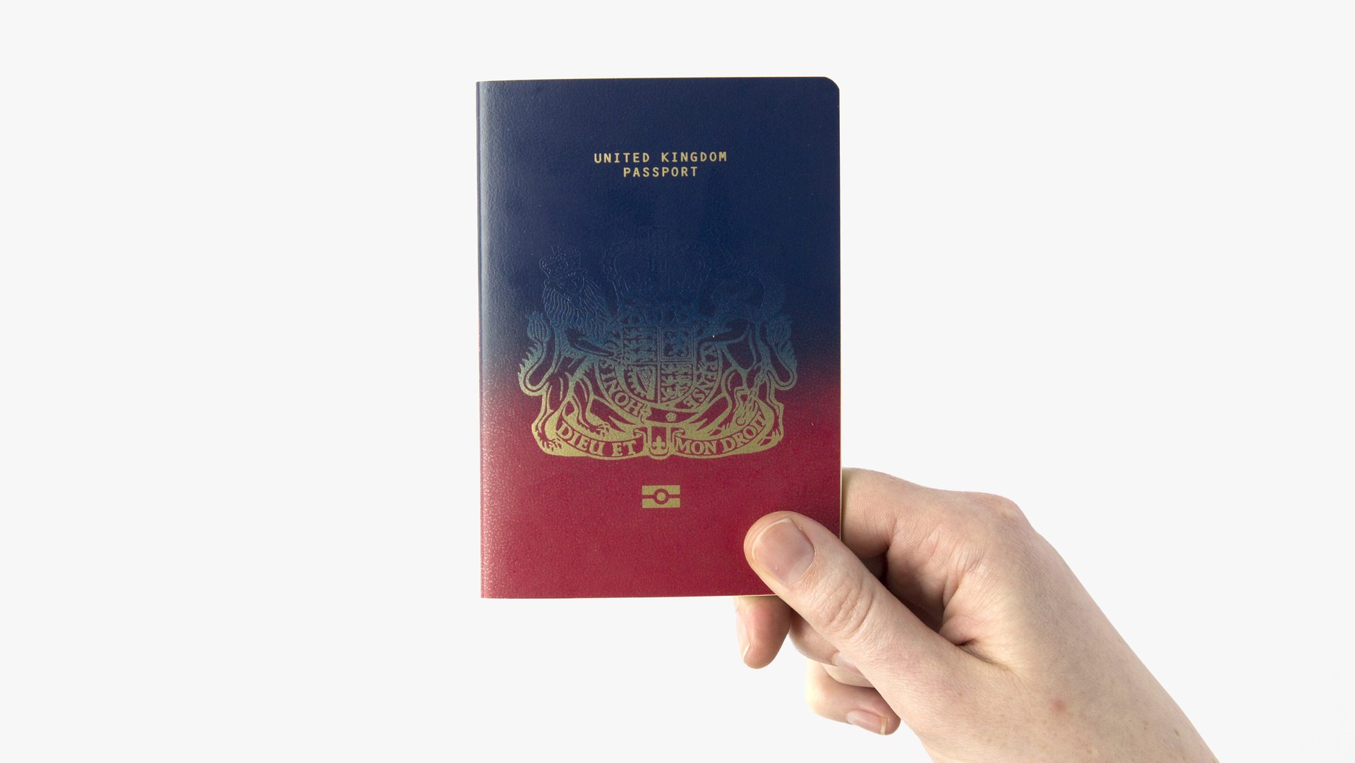
These ambivalent times in the UK have inspired an apt graphic pun by the winner of a Brexit passport design contest: a booklet with a gradual blue-to-burgundy color transition, symbolizing the return of the UK passport’s original color as the country exits from the European Union. Scottish graphic designer Ian Macfarlane won £1,000 ($1,250) for his mock-up in a contest sponsored by the online design magazine Dezeen.
Dezeen’s thought experiment challenged graphic designers around the world to send in suggestions to improve on the UK’s current passport design. Mocking the “British mess” of nationalistic symbols, watermarks, and security flourishes in the passport’s 2015 version, organizers encouraged designers to go simple. They held up the Swiss and Norwegian passports as hallmarks of great design.

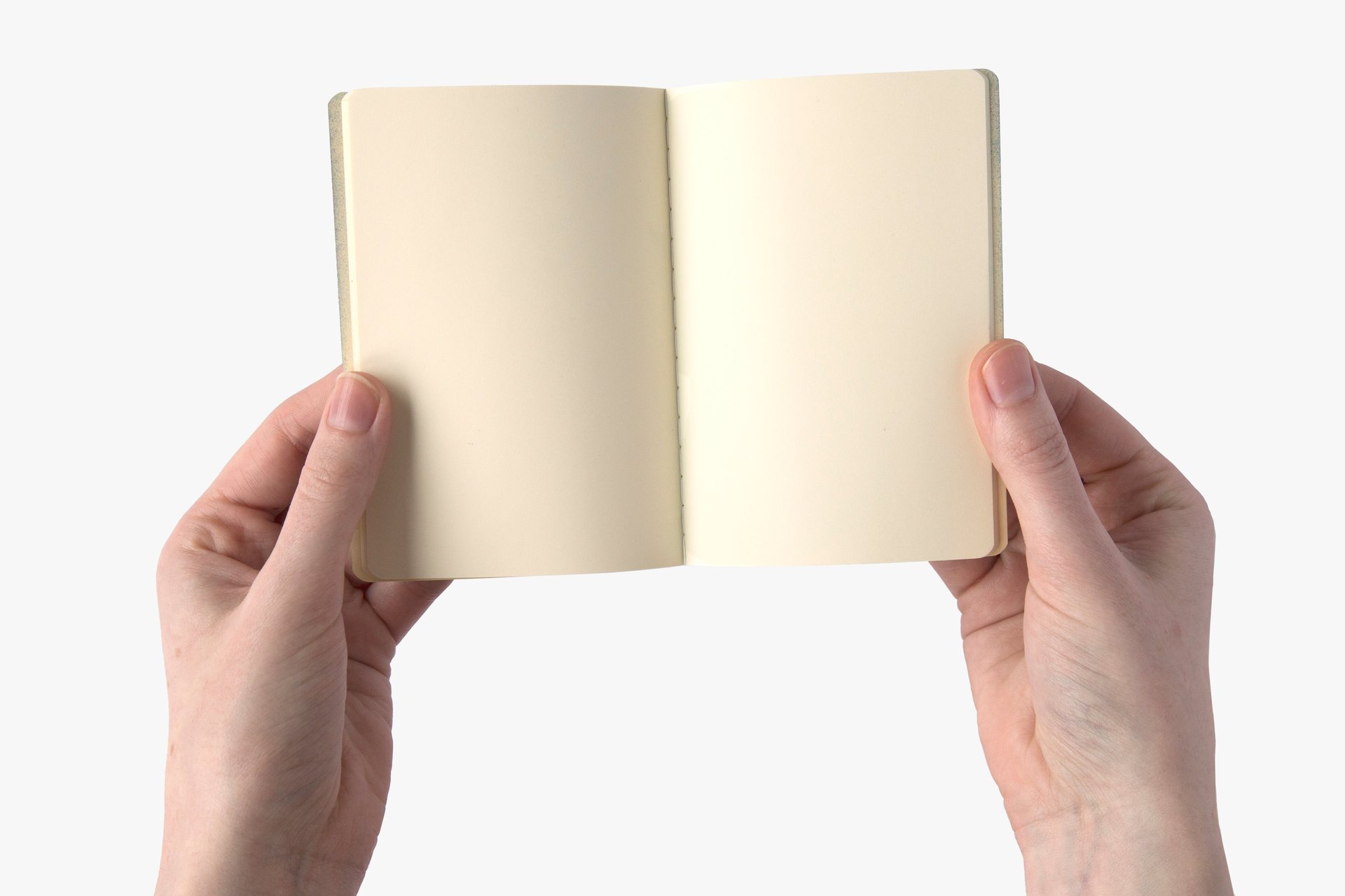
Indeed, the winning proposal had the plainest idea. Macfarlane’s concept had blank interior pages and looks exactly like an official EU document, save for the creeping blue gradient and the considerably smaller sans serif lettering on the cover. The UK switched from a navy blue passport to a burgundy, machine-readable one in 1988.
Seeing the official document as a metaphor, judges said they loved the ambiguity of Macfarlane’s provocation.”It can be read as representing a smooth transition, a nostalgic return or an ominous darkening,” said Marcus Fairs, Dezeen’s editor-in-chief, who chaired the jury. Another judge, the Guardian’s architecture critic, Oliver Wainwright, joked:”It represents the 52% spray-painting over the interests of the other 48%.”
In terms of color theme, perhaps the two-tone passport mockup has something to do with Pantone’s twin colors of the year in 2016—Rose Quartz and Serenity Blue. And whether he intended it or not, Macfarlane’s design reflects an unshakable graphic cliché: the ombré. The tonal gradient between two colors has infiltrated fashion runways, dip dye hair-coloring, home interiors, even wedding cakes. Ombré is the reigning symbol of compromise, blurred allegiances, and indecisiveness.