Apple teased its Singapore customers yesterday by partially lifting the curtain on its long-rumored retail debut in the island state. It revealed its glass store-front, but the contents were obscured by a facade plastered across it, showing a Apple logo in red emblazoned against a white background.
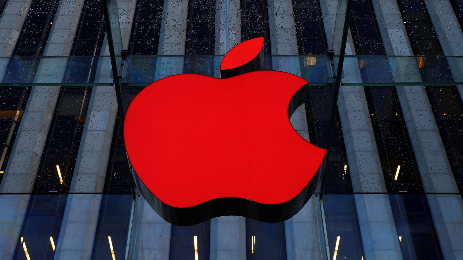
Apple $AAPL teased its Singapore customers yesterday by partially lifting the curtain on its long-rumored retail debut in the island state. It revealed its glass store-front, but the contents were obscured by a facade plastered across it, showing a Apple logo in red emblazoned against a white background.
The logo was placed alongside two other symbols, forming a slightly cryptic message: 🍎 ❤️ 🔴
Join 500,000+ readers who start their day with Quartz.
By subscribing, you agree to our Terms of Service and Privacy Policy.
It’s clear that Apple means to say it hearts something—but what, exactly? Something about a traffic light? It’s enthusiastic about the “recording” symbol? It’s removing the ‘b’ from the Beats logo?
No, it’s an attempt by Apple to show its appreciation for its new hosts. One of Singapore’s monikers is the “little red dot,” a title derisively bestowed on the tiny nation, which measures just 50 km at its widest, by then Indonesian president BJ Habibie in 1998 as the region was in the throes of a currency crisis. The symbols are meant to read: “Apple loves the little red dot.”
Singaporeans have self-deprecatingly embraced the term. The current premier, Lee Hsien Loong, then a deputy prime minister, said in a 2003 speech: “The little red dot has entered the psyche of every Singaporean, and become a permanent part of our vocabulary, for which we are grateful.”
The three-symbol motif is repeated on a smaller scale. Twelve dots representing Singapore personalities—so-called “Red Dot Heroes”—ranging from tech startup founders to filmmakers, are printed on the facade.
Singapore will appreciate Apple’s arrival. Its malls are suffering from their lowest occupancy rates in a decade, as e-commerce and a weaker economic outlook has shrunk footfall. A splashy new Apple store on Singapore’s famous Orchard Road may bear fruit for struggling retailers.