This week in membership: Navigating the data deluge
{{section_end}} {{section_start}}

{{section_end}} {{section_start}}
🤔Here’s Why
1️⃣ Covid-19 has resulted in a deluge of data. 2️⃣ The pandemic is a reminder to beware of the seasonality of data. 3️⃣ Learning how to tackle percent change can help us understand the ups and downs. 4️⃣ The pivot table is a powerful tool. 5️⃣ And comparing data over time can make it easier to parse trend from noise.
📝 The Details
1️⃣ Covid-19 has resulted in a deluge of data.
Since the pandemic started, Quartz has spent a lot of time confronting difficult data questions. How do we know if a trend is caused by the novel coronavirus, or if it would have happened anyway? How do we appropriately describe the massive economic dip and recovery caused by the pandemic without misleading readers? We wanted to share some of the answers we’ve conjured to these questions, which have helped us get a grip on the data deluge. We hope these answers can help you, too.
Before you can start analyzing what’s happening, the first step is finding the right data. By combining the new and the old, we put together a list of the very best coronavirus-related data on the internet.
2️⃣ The pandemic is a reminder to beware of the seasonality of data.
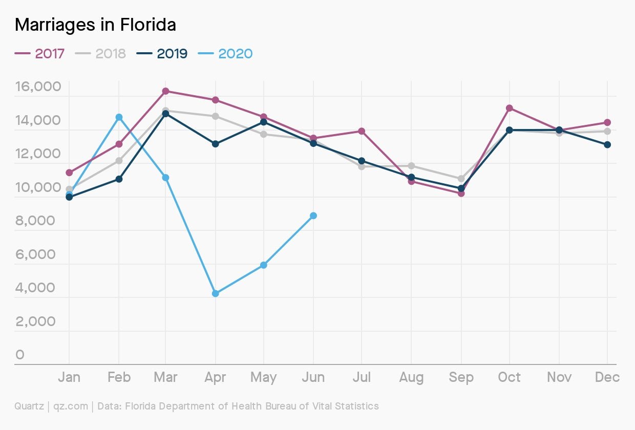
It hasn’t even been a year since the first case of Covid-19 was confirmed. For data analysis, this means it is essential we watch out for seasonal fluctuations. Did US computer sales shoot up in the second quarter of 2020 because of Covid-19? Or was it simply because computer sales always go up this time of year? Not accounting for seasonality is one of the easiest ways to find an erroneous trend. We explain how to avoid that pitfall, using marriages in Florida as an example, along with a video tutorial.

3️⃣ Learning how to tackle percent change can help us understand the ups and downs.
In many countries across the world, Covid-19 caused a sudden decline in economic activity, followed by a rapid, or sluggish, recovery. As a result, staggering statistics became the norm. For instance, France’s industrial production fell by more than 20.6% in April from the previous month, but then rose by 19.9% in May. This yo-yo economy has made it more important than ever to understand how to calculate and interpret percent change. We made a comprehensive guide to understanding statistical ups and downs.
4️⃣ The pivot table is a powerful tool.
There is no simpler way for the average person to analyze a large dataset than the pivot table. Perhaps the most powerful tool in the spreadsheet wizard’s toolbox, the pivot table allows anyone to summarize thousands of rows of data in just a few clicks. Our history and explanation of the tool, including a video tutorial, will help you understand why Steve Jobs thought pivot tables were the “coolest thing ever.”
5️⃣ Comparing data over time can make it easier to parse trend from noise.
From the number of hours people are working in different countries to changing company stock prices, it’s often necessary to compare numbers on very different scales. The key to doing this well is indexing. When data points are indexed, they are all compared to their level at some particular point time. We wrote an explanation of why indexing is so essential, along with a final video tutorial by data editor Dan Kopf, to show how you can do it yourself.