A design historian explains why the Cleveland Indians’ offensive logo survived for so long
Soon, baseball fans won’t have to bear with Chief Wahoo.


Soon, baseball fans won’t have to bear with Chief Wahoo.
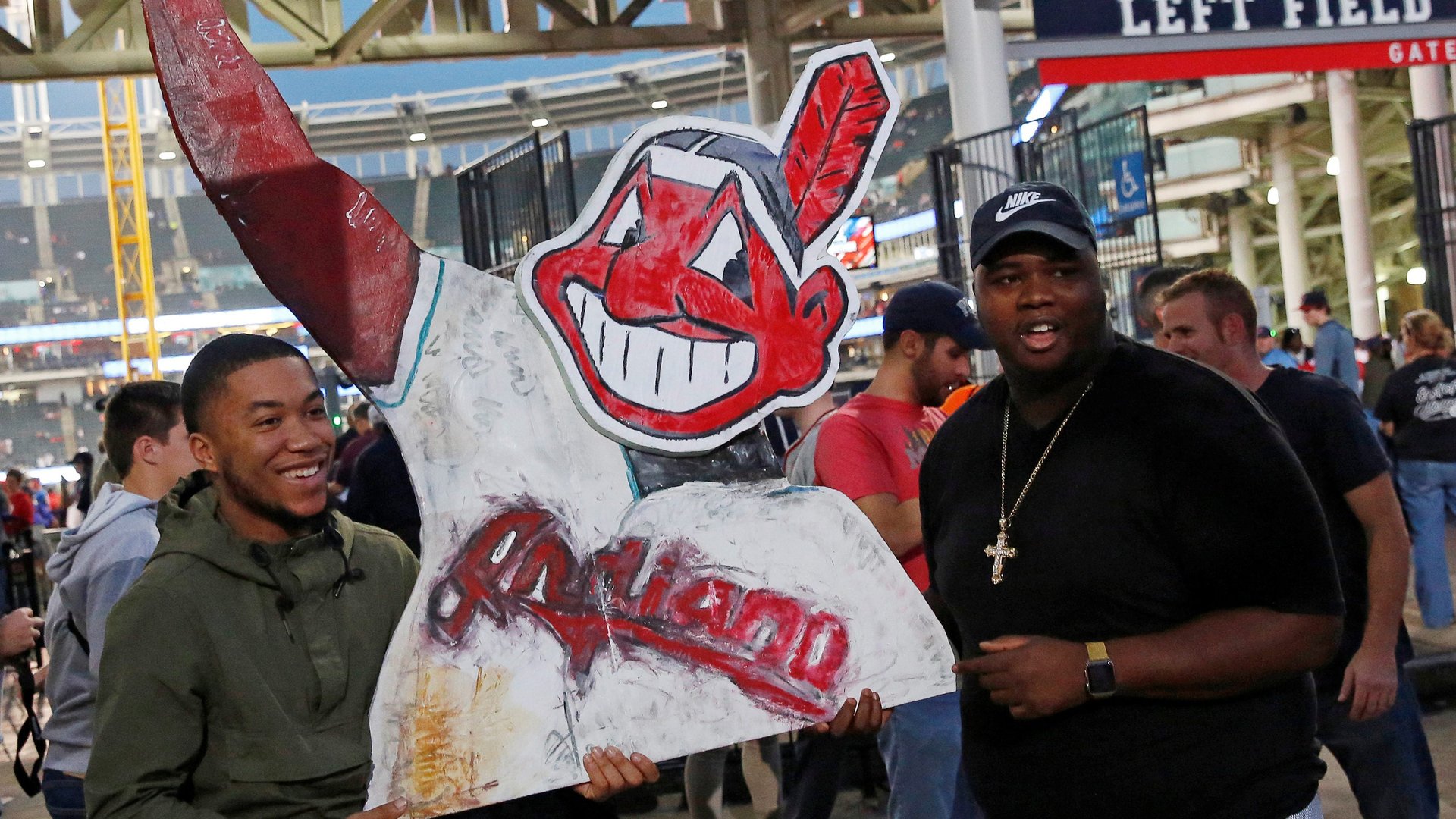
Heeding pressure from the Major League Baseball’s commissioner, the Cleveland Indians announced this week that it will phase out the red-faced mascot from its uniforms by next season. Like the name and branding of the equally controversial Washington Redskins football team, the Indians’s 66-year old symbol has been widely condemned as an offensive, “racist caricature,” and Native American groups have been calling for Chief Wahoo’s abolition since the 1970’s.
Many cheered the Indians’s decision, but some diehard fans have expressed grief about the loss of such an iconic character from their childhood.
Washington University in St. Louis professor D.B. Dowd belongs to the tribe of Indians fans who are very happy with the decision. As director (and namesake) of the D. B. Dowd Modern Graphic History Library, Dowd has written extensively about the Chief’s origin over the years to learn why a symbol that’s caused “anguish and karmic penalties,” as he puts it, has stuck around for so long.
Dowd explains that it’s not just about nostalgia. It has to do with quality of the symbol’s graphic design.
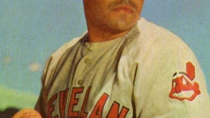
“Part of the reason why people love Chief Wahoo is that it’s actually a really nice cartoon. If you just look at it as a cartoon and drain the red out of it—the part that makes it so hideous—it’s really a nice drawing,” Dowd observes. The mascot was the handiwork of the then 17-year old draftsman Walter Goldbach, who delivered on the assignment for a emblem that would “convey a spirit of pure joy and unbridled enthusiasm” back in 1947. The symbol would be tweaked in 1951 to the version we know today.
Compared to many proforma logos today, Chief Wahoo actually brims with character. “If you look at most contemporary logo design now, they’re all done in Adobe Illustrator and it looks like it was drawn by a corporation. There’s no brush and ink and actual life in the actual drawing,” he explains to Quartz.

Dowd’s astute observation about the prevalence of computer-generated, “laser cut” logos is key. The 2017 trends report published by Logo Lounge reveals that most emblems produced today embrace the clean, sharp-edged look previously only preferred by big corporations. That’s because logos now need to transmit clearly on screens of varying sizes, so there’s a preference for clean, vector shapes and lines. The problem is that often these perfectly legible logos can appear slick, soulless and generic. “This is the legacy of Adobe Illustrator, the 21st century tool of choice for hard-edged representations,” writes Dowd.
Despite its political charge, Chief Wahoo has been an winning commercial ambassador for the Indians. The team earns millions from Chief-themed fan gear each year. The Indians will retain the trademark and merchandising rights to the symbol even after next year.
Design opportunity
With the Chief gone next year, the Indians will be left with a generic letter “C” as their team emblem. Is there a way to design a distinctive replacement for Chief Wahoo that will actually honor Native Americans?

Dowd has a suggestion: Turn to Seattle.
“The Seattle Seahawks aren’t named for Indians, but their logo is grounded in Northwest American iconography, he explains referring to the football team’s hawk symbol inspired by a mask from the Kwakwaka’wakw tribes of Alaska. That’s a way of celebrating a culture on the basis of its own artifacts,” he says.
When they’re ready to design a new mascot, Dowd hopes the Cleveland Indians will similarly study the visual language of the historical tribes of the Ohio valley such as the Chippewa, the Miami and Delaware Indians. “It’s very emblematic, it could be transformed into something satisfying graphic,” he says. “If you say you want to honor the American Indians, then look seriously on how to do that.”