There’s a scandal in the 446 pages of the special counsel’s report on interference in the 2016 US presidential elections—and it has nothing to do with Russia. Instead, it’s of the typographical kind: There’s a double space following every period.
If you’re a millennial or younger, this typesetting convention looks profoundly odd. Virtually all printed text now makes use of a single space after a sentence. Double spacing, as The Atlantic’s James Hamblin writes, feels “unsettling, like seeing a person who never blinks or still has their phone’s keyboard sound effects on.”
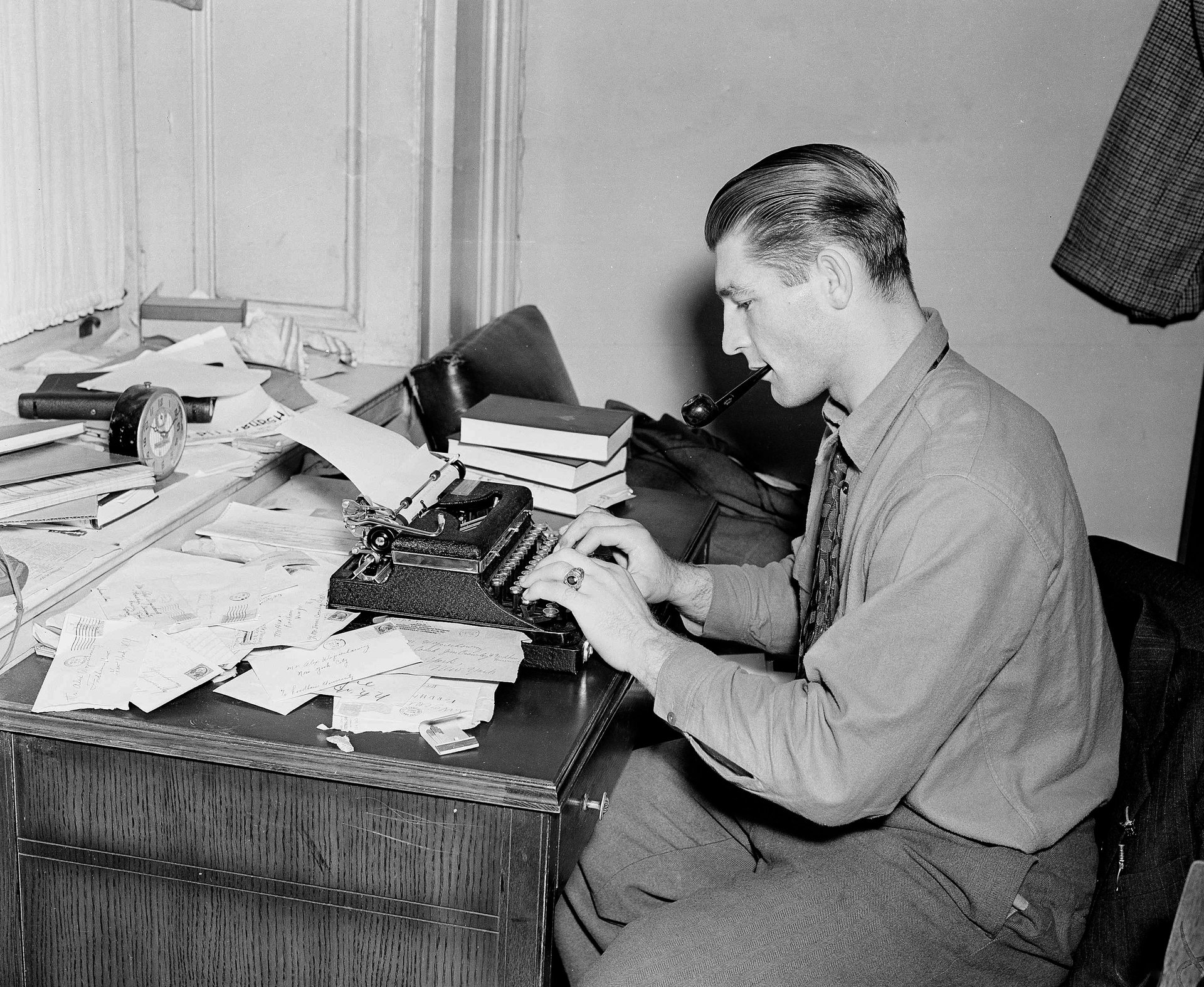
Let’s be reasonable. The convention is not a concerted effort at strangeness or willful obnoxiousness, but a holdover from a different technological time. The culprit here is typewriters, which allocate the same amount of space for each letter, regardless of width. Known as monospacing, this translates to a tighter fit around thickset bruisers like m and w, and a little cloud of white space around such skinny characters as i, l, and !. Generations of typists were taught to space-space after a period to clear a little room at the end of the sentence and show the reader that it had finished. (This typewriting tic is as incriminating as a fingerprint in revealing parental tinkering on the college admissions essays of the young.)
By the 1970s, a long age of inconsistency had given forth to a single rule, as Avi Selk flamboyantly illustrates in the Washington Post:
“The original printing of the U.S. Declaration of Independence used extra long spaces between sentences. John Baskerville’s 1763 Bible used a single space. WhoevenknowswhateffectPietroBembowasgoingforhere.Single spaces. Double spaces. Em spaces. Trends went back and forth between continents and eras for hundreds of years, Felici wrote.It’s not a good look.”
Computers put paid to all of this. The children of the digital age have pressed delete on what to them has become a quaint custom. They have a single rule, born of the glorious world of variable-width fonts, where letters and spacings get, well, about as much space as they each need. One space is fine. Two spaces is arguably more legible, but definitely not fine. Graphic designers, professional typesetters, and the titans in charge of major and minor style guides are all on the same side on this one.
Enter the Mueller report. For a document written in Times New Roman font, or something very like it, the double spaces are decidedly jarring. It’s a variable-width font: it shouldn’t need a double space after each period. Justification, where both sides of the text block have a straight edge, makes the effect still starker.
Still, there’s an upside of sorts. We now know a tiny bit more about the poor sod tasked with typing up this behemoth—and it’s definitely not a junior staffer. Whoever put those words on the page cut their typesetting teeth in days of (relative) yore. If anything, it makes it more likely that 74-year-old Robert Mueller himself may have had a literal hand in producing the physical document. Either that, or some longtime secretary knows much, much more than the average American about what’s behind those inscrutable black redaction lines.
As for the Oxford comma—well, all that reveals is that the writer has a bit of taste.