It’s in menus, wedding invitations, shop signs church flyers and heavens, even in résumés. Since becoming a system font in Microsoft Office ’97, Papyrus, a cheesy calligraphic font inspired by Egyptian writing has been a blight in the visual landscape. Along with the reviled Comic Sans, Papyrus was for desktop publishing dabblers a casual alternative from the serious sans serif and serif fonts. It’s the stand-in font to convey “primitive,” “natural” or “ancient.”
Since 1982, Papyrus has made professional graphic designers cringe—especially when used with effects like drop shadows (yuck) or 3D embossing (gross). So loathed is the font created by American illustrator Chris Costello that several dedicated design blogs have emerged to lampoon it. For font sophisticates, the only good use of Papyrus is as a punchline for jokes, and arguably the most epic Papyrus parody was was aired this weekend, on Saturday Night Live.
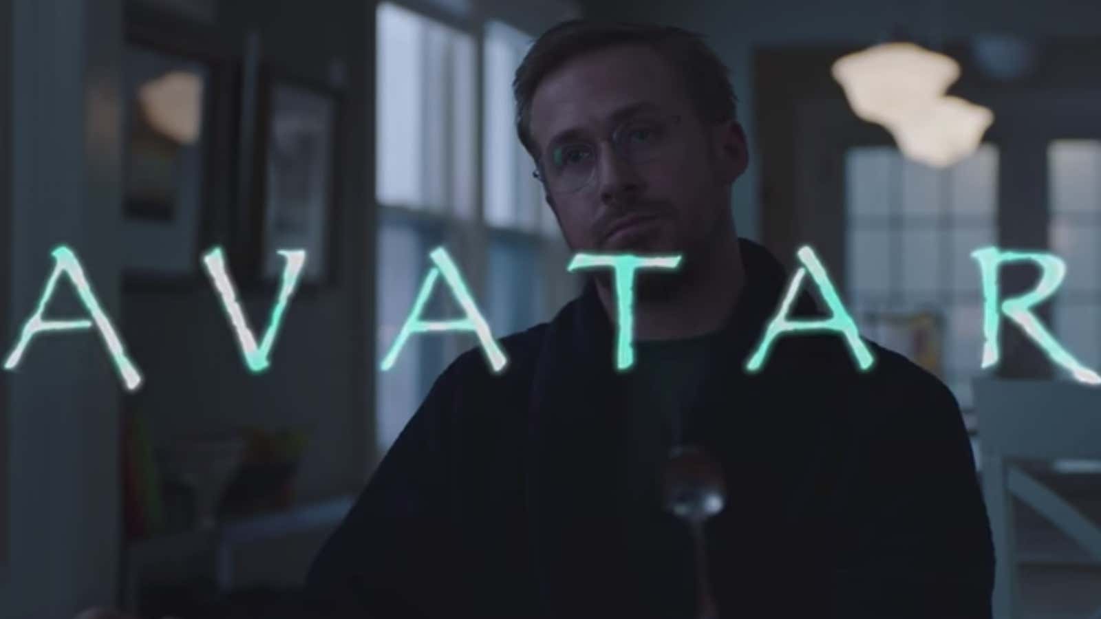
Playing a brooding insomniac haunted by the memory of seeing Papyrus in James Cameron’s blockbuster film Avatar, Ryan Gosling brilliantly mirrors the levels of angst graphic designers feel when they see Papyrus in the wild.
“[Cameron] clicked the dropdown menu and he randomly selected Papyrus—like a thoughtless child, just wandering by a garden, yanking leaves along the way,” Gosling tells his therapist played by Kate McKinnon. Gosling goes over the edge upon learning that Papyrus reappears in Avatar’s sequel slated to open in 2020.
After the SNL skit aired, Costello tells CBS that he woke up with an in-box full of messages. “I designed the font when I was 23 years old. I was right out of college. I was struggling with some life issues, I was studying the Bible, looking for God and this font came to mind, this idea of, thinking about the biblical times and Egypt and the Middle East,” he explains.
“I had no idea it would be on every computer in the world and used for probably every conceivable design idea.”
