Tuesday, along with the announcement of two new iPhones, Apple $AAPL officially unveiled its new mobile operating system, iOS 7. It comes with some major changes, the most apparent of which is a new look, devoid of skeuomorphs (such as notepad pages that look like paper notepads). It’s part of a broader shift towards “flat” design, a look—indeed a whole philosophy—that prefers plain, clear shapes instead of trying to make icons look like solid objects.
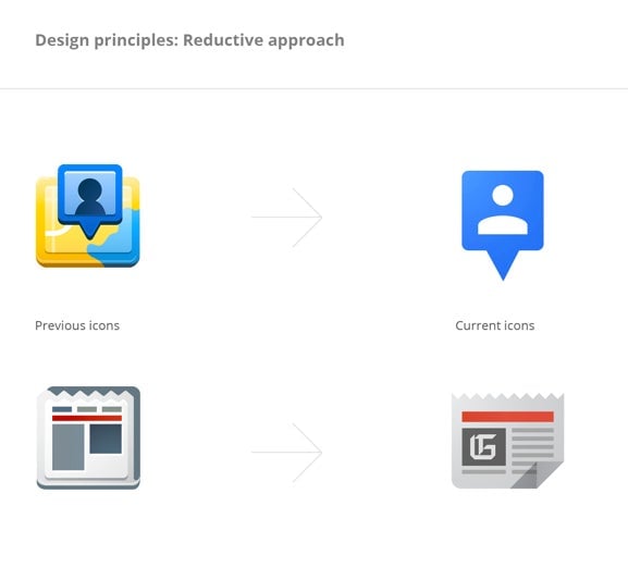
While it may be a major overhaul for Apple, and will doubtless influence many others, iOS 7 is not exactly the pioneer. In fact its design closely resembles that of a key rival—Google $GOOGL. Over the course of 18 months, starting in January 2012, some of the lead designers at Google laid out a series of principles for the company to follow in creating its own icons and logos. Some of those principles lie at the heart of Apple’s new aesthetic.
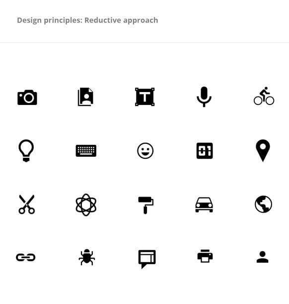
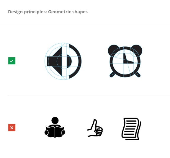
Google’s guidelines call for a move away from rounded shadows, bevels, and the other accoutrements of three-dimensional design and towards simple, straightforward icons.
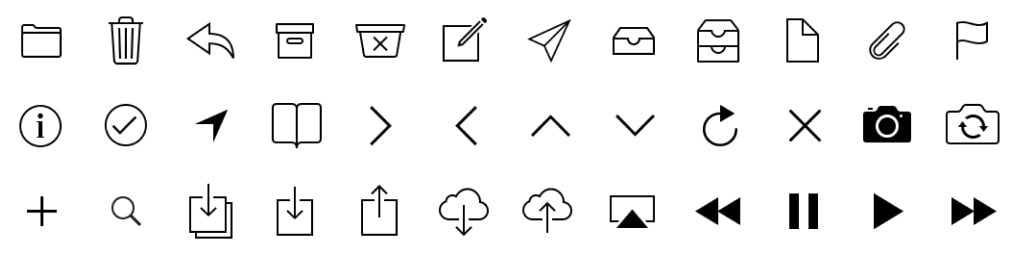
Likewise, Apple has moved away from its extremely busy icons and buttons and gone flat. In its own guidelines for iOS 7 app developers, the company asks designers to “avoid cramming lots of different images” into their icons and to “embrace simplicity.”

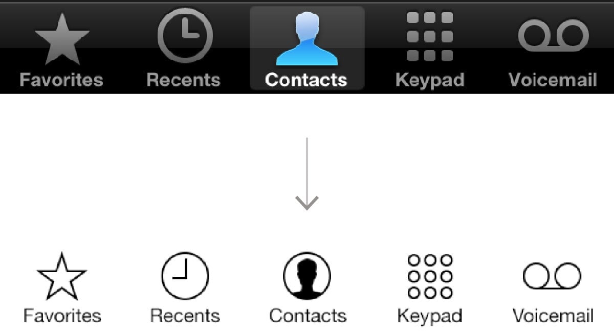
Here is a collection of many of Apple’s new button icons, all similarly reductive:
Google’s design guide contains diagrams showing how its icons are derived from basic geometric shapes:
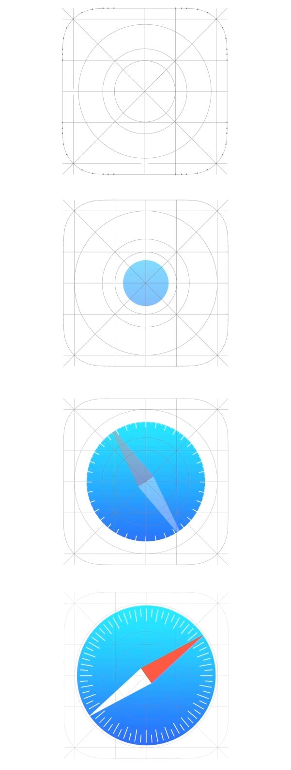
In Apple’s iOS 7 preview video there is something strikingly similar (the images below are still shots of an animated sequence):
So, is Apple just aping Google? No. Flat, reductive design is in the air, and there are clear differences between the look of Google’s icons and the look of Apple’s. But drafting behind other designers is unusual for Apple. In the past it’s led the pack.