Charts are a big part of modern life. They are increasingly essential to our work, the media we consume, and the apps we use to track the way we exercise, eat, and sleep.
Charts are a big part of modern life. They are increasingly essential to our work, the media we consume, and the apps we use to track the way we exercise, eat, and sleep.
Yet many of us don’t really understand charts or know how to use them properly. Data visualization researchers find that even people interested in science often don’t have a strong grasp basic charts (pdf). As a data journalist, I have experienced this firsthand. Even the most brilliant of my colleagues often have difficulty interpreting a scatter plot.
Join 500,000+ readers who start their day with Quartz.
By subscribing, you agree to our Terms of Service and Privacy Policy.
This isn’t a trivial matter. A lack of ability to interpret charts makes people more susceptible to being misled. For example, the ruling party of India recently tweeted a chart attempting to deceive people about trends in oil prices. In an age where truth is harder than ever to pin down, making sure people have the skills to parse data fact from data fiction is of paramount importance. And according to a set of data visualization researchers, the path to improving our relationship with charts starts in elementary school.
When do you think you first encountered charts? The data visualization scholars Basak Alper of NASA, Nathalie Henry Riche of Microsoft $MSFT Research, Fanny Chevalier of INRIA, Jeremy Boy of the United Nations and Metin Sezgin of Koc University set out to find out. They figured that if they were going to take on data visualization literacy, the first step was to find out when we learn about charts in the first place.
The researchers found that students across the world encounter a staggering number of data visualizations at a young age (pdf). They examined math textbooks for kindergarten through fourth-grade students from the US, France and Turkey. They ultimately combed through 1,500 pages of textbooks, finding about 2,600 visuals. Mostly these visuals are not line charts or pie charts, but rather, even simpler representations—like a picture of eight cows standing together to represent the number eight. These visuals are intended to help children move from counting actual objects to the surprisingly abstract concept of representing that sum with one number. Bar charts are the first more sophisticated kind of data visualization that students encounter, typically around second or third grade.
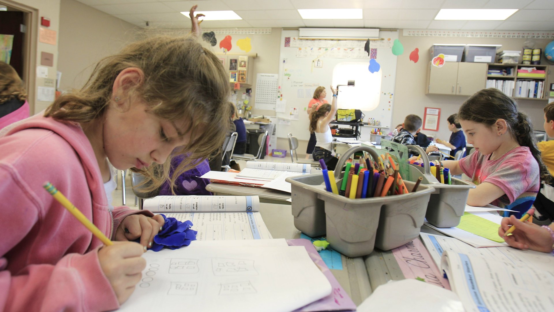
Quartz spoke with several teachers across the US teaching early grades across the US, and they echoed these findings. Charts were a central part of their teaching. “We spent lots of time explaining to kids how to find the information in a graph, particularly with bar charts,” said Anne-Marie Cordingly, who’s been teaching elementary school and high school students for 18 years in San Francisco. She said it was particularly important for teaching math to visual learners.
Although data visualization is a big part of education from an early age, it is also disjointed. The researchers discovered that while visualizations appear often in textbooks, they are not taught in a structured manner. Charts just appear inside different lessons, with the assumption that children comprehend what the chart is showing them because they have seen it before. For many kids, this may work, but others get lost.
The researchers believe that making explicit what charts actually represent can help those kids that lose the plot. To do that, they built a free interactive learning app called C’est La Vis for classroom tablets.
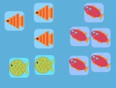
The way we learn about charts is a process of moving from the concrete to the abstract. For example, to eventually understand a bar chart, a child will first need to understand that we can group together objects and count them. The image below, from the C’est La Vis app, is called a free-form pictograph. Students should understand that there are five red fish, three oranges and two green ones, and that they are grouped together because they are alike.
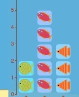
The next step is to go from this unstructured grouping to putting the objects together in an orderly manner that makes it easier to compare them. The image below, a structured pictograph, shows the same information, but now the fish are stacked vertically.
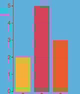
Finally, if we take away the actual image of fish, and make the grouping into bars instead, we have a bar chart.
The C’est La Vis app helps kids more easily see the relationship between the first image and the last one, and the hope is that it increases comprehension. You can play with the app at this link.
Does it work?
The researchers have yet to do an empirical study on the effectiveness of the tool, but did pilot it at elementary school in Seattle, Washington, in 2017. The tool was tested on students in kindergarten and second grade who had never encountered a bar chart before.
The response from students and teachers was positive. Kids seemed to enjoy playing with C’est La Vis, and the teachers noted that they were helping each other with the app and verbalizing concepts about the charts, like the meaning in the y-axis. Still, it’s not clear if the app is actually improving long-term comprehension. The researchers hope to run an experiment in the future that rigorously assesses the impact of C’est La Vis on data visualization knowledge.
Fanny Chevalier, one the lead researchers on the study, says her main hope for C’est La Vis, and improved data visualization literacy, is that it makes for a more informed citizenry. She fears that politicians and businesses are increasingly duping people by using misleading charts. In her mind, learning how to properly interrogate a line chart is necessary for a healthy democracy. Better tools for teaching kids how to do that are a must.