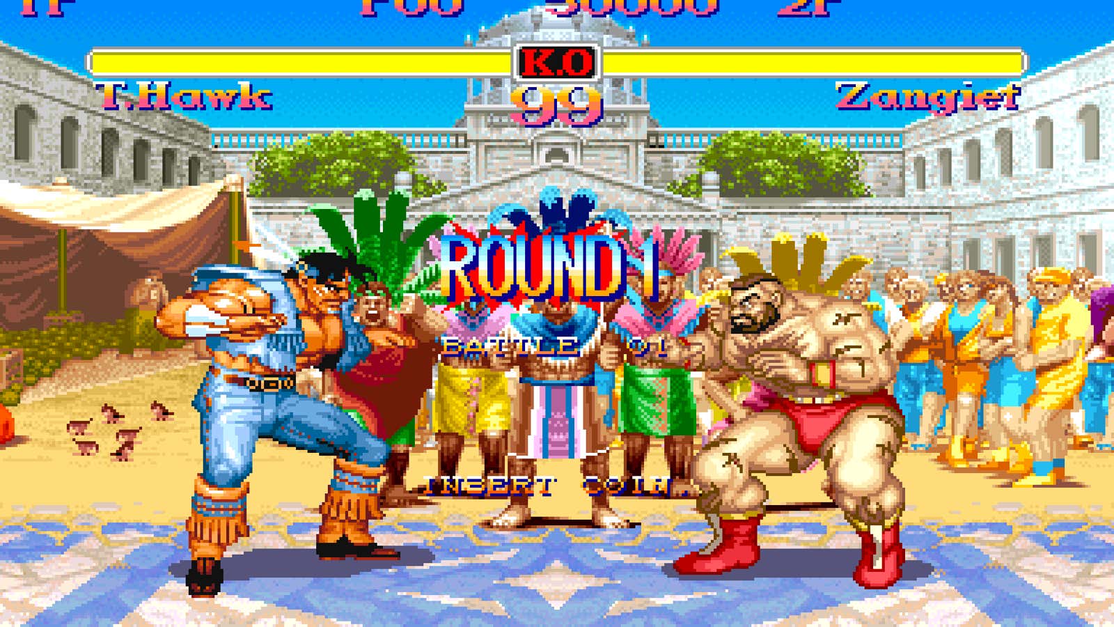
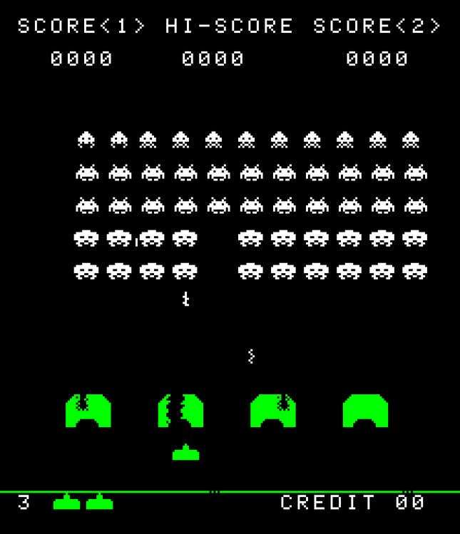
Toshi Omagari plays arcade games for the fonts. Over the last few years, the Japanese type-designer-turned-retro-font archivist has been assembling pixel-based alphabets from arcade games such as Tank 8, Space Invaders, and Street Fighter.
“There are actually so many good arcade fonts that we collectively haven’t paid attention to,” said Omagari at the Cooper Union’s TypoGraphics conference in June.
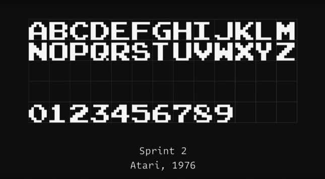
Before the industry changed to high definition graphics in 2004, early game designers had to confine each letter within an 8 x 8 pixel grid, leaving one of those pixels for spacing. Letters had to be legible and light, conserving as much memory as possible for the graphics. Most fonts were made by graphic artists or programmers who hadn’t been exposed to the rigorous, technical rules of type design.
What emerged is a canon of ingenious, “wonderfully terrible” solutions, as Omagari puts it. “They were doing whatever they pleased and that’s why they’re beautiful.”
There’s versatile Sprint 2, considered the “Helvetica of retro games;” the chunky outlined letters for Conan the Barbarian; and the Tron typeface, which signaled the “font of the future.”
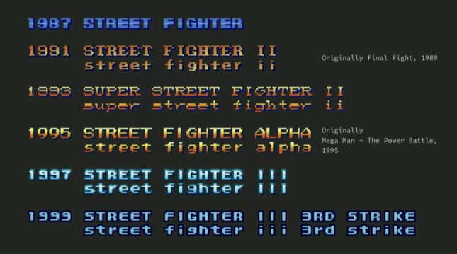
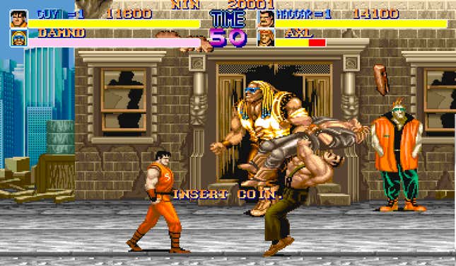
Even those tight parameters followed by amateur designers created enormous variation. They deployed drop shadows, gradation and colors purposefully and artistically, as seen in Capcom’s Street Fighter franchise.
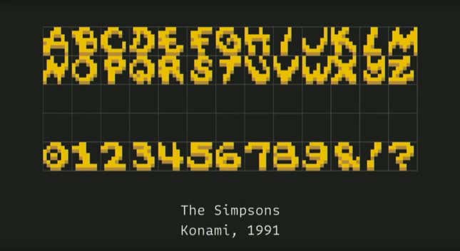
Designers were even able to create expressive calligraphic styles, such as the handwritten typeface for the Simpsons game.
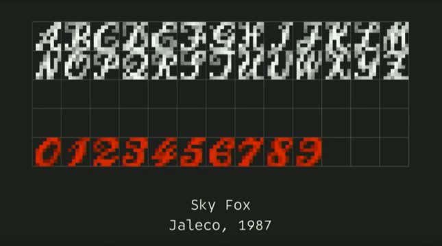
Among Omagari’s favorites is an elegant Roundhand-inspired typeface developed for an inglorious 1997 shooter game. Jaleco’s Sky Fox, which involves firing at foxy, evil space showgirls, has been criticized for its depiction of women. “The context of this typeface is really messed up,” says Omagari.
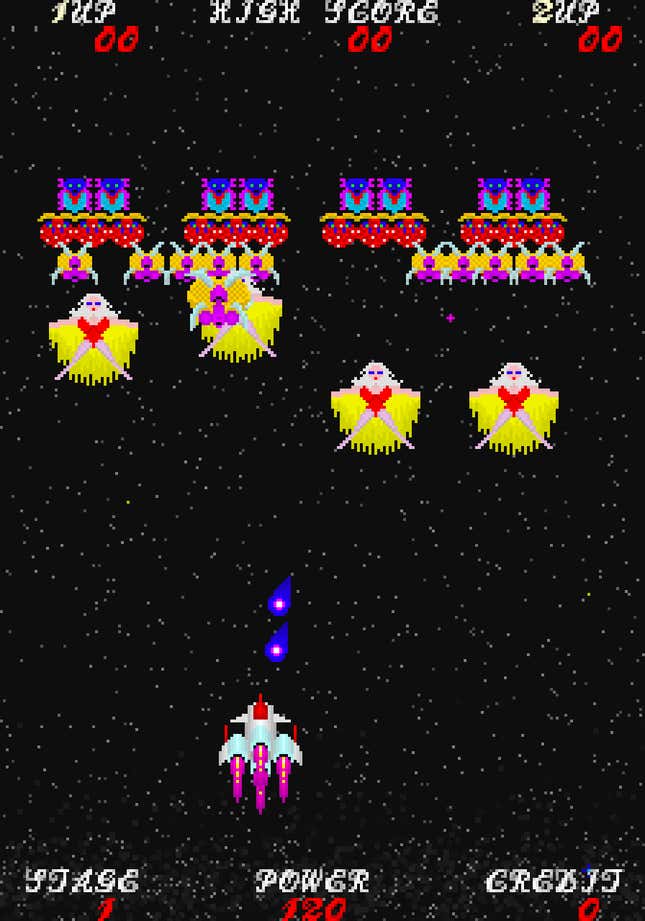
“This collection is basically my guilty pleasure. There are lots of things that are wrong to us, lots of decisions they made that make me go ‘why would they do this?!,” says Omagari, who works at the type foundry Monotype.
Omagari, who is currently compiling his research in a book, explains the challenge and delight in assembling the history of these overlooked typefaces and their unknown designers. Even tracking them down was difficult. “They were all made by outsiders, basically,” he tells Quartz.
During a time when we’re obsessed with slick, super high resolution graphics and screens, Omagari says he hopes to spotlight the artistic innovation that emerged during this storied, pixel-based era. “The research inspired me a lot and made me realize how safe of an approach we have been taking!,” Omagari reflects. “I feel I want to push my comfort zone in my future typefaces.”
