Designers are mourning the new, painfully generic Library of Congress logo
The US Library of Congress unveiled a new logo last week (Aug. 21) and the hailstorm of criticism is still coming hard and fast.

The US Library of Congress unveiled a new logo last week (Aug. 21) and the hailstorm of criticism is still coming hard and fast.
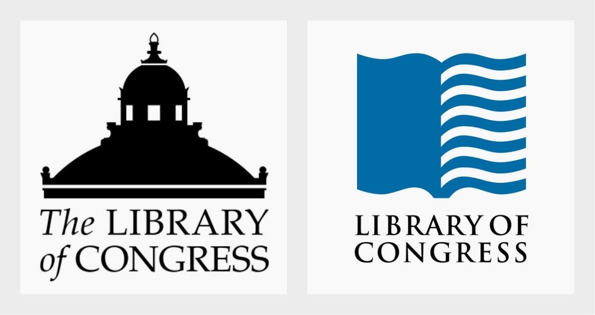
Compared to the beloved “book flag” logo created in 2008 by Chermayeff & Geismar & Haviv partner Sagi Haviv, the Library of Congress’s updated brand mark is bold, plain and, as many have noted, oddly redundant with two instances of the word “library” in the lock-up.
On the Library’s blog, several commenters complained that the generic-looking visual identity undermines the prestigious, 218-year old institution billed as the world’s largest library with 164 million items in its catalogue. The choice of soulless sans serif fonts Druk Condensed Super (originally designed for Bloomberg Businessweek) and Sharp Grotesk 20 don’t help.
“The large word LIBRARY is as bland as the sign for a laundromat or the printing on a bag of cement,” writes a commenter named David. “This is a bad re-brand. Library of Congress should have a more dignified, all-encompassing feel. Now it looks like the Walmart of libraries,” laments Jenny. “No visual interest, no message, no identity, it’s like a robot designed it,” Susan opines.
On the popular logo review forum Brand New, graphic designers are fixated on the logo’s apparent redundancy. “Repeating ‘Library’ is absolute nonsense,” writes Christopher Anderson. “The department of redundancy department approves of this update,” says Stephen Dawe.
The Library’s communications officer explains that the double appearance of the word “library” is intentional. “Casual visitors often fixate on the words ‘of Congress,’ and are unsure whether they are allowed to use the resources here. Emphasizing the word ‘library’ as a word mark helps deliver the message that the Library of Congress and its resources are for everyone.”
The idea to emphasize the word “library” originated from Dr. Carla Hayden, the Librarian of Congress and the Library’s communications unit. “The goal was to move the library from a remote governmental facility to an accessible cultural organization,” explains Pentagram partner Paula Scher, who designed the visual identity. “Before I started the process, they were already abandoning the old logo. … Dr. Hayden was anxious to use ‘Library’ instead, because it is more readily understood than an acronym [LOC].”
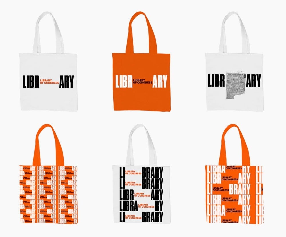
Scher explains that Hayden, who is the first person to helm the national library with actual experience working in a library, wanted to emphasize the breadth of its services for the American public instead of its ties to the US Congress as its name suggests. (The Library of Congress serves as the official research library for the Senate and House of Representatives.)
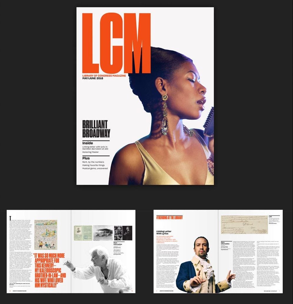
The animated version of the new logo advertises the various services and assets the library has to offer. “She [Hayden] is promoting the library on Turner Classic Movies because all of those movies are collected by the library as well as every piece of recorded music in the US; information on every artist, sports stats and sports figure; Gangland figures; typefaces; histories of subcultures; curiosities. You name it, they’ve got it,” says Scher.
“The images of what is contained within ‘Library’ are front and center, part of the logo design and infinitely changeable,” says Scher, referring to the scroll of objects within the wordmark. It’s a tactic that Scher also used in the logo for the Philadelphia Museum of Art, where the A in “art” is replaced by various images from the museum’s collection. This graphic strategy is reminiscent of Hillary Clinton’s presidential campaign logo (designed by her Pentagram partner Michael Bierut) which allows for limitless variations and of Google Doodles, where thematic images punctuate the letterforms.
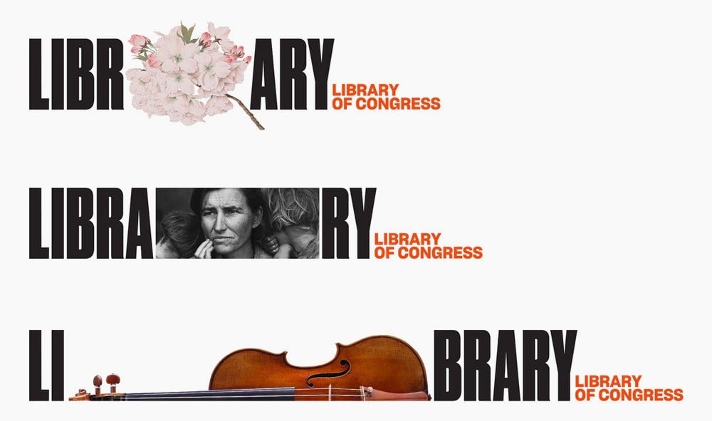
Scher tells Quartz that she’s unfazed by the surge of snarky comments on social media. ”I totally stand by this design,” she says. “I have experienced this sort backlash, now rather regularly. Give it time.”
After over four decades creating visual identities for high-profile institutions such as the New York Public Theater, Citibank, Tiffany’s, MoMA and Microsoft, Scher has developed a thick skin for logo haters. In a 2015 talk at the Brand New Conference, she warned the audience about the perils of casual logo bashing on the internet. As funny and entertaining as they may be, they tend to make clients nervous about trying anything new, which ultimately results in boring graphic design.
“What identity is is a funny combination. It’s form plus application multiplied by audience and time,” explained Scher, noting that love at first often doesn’t occur for the most effective visual identities. Her Microsoft Windows 8 logo for instance, was instantly dismissed by critics in 2012, but has proven to be a versatile and lasting mark for the software giant. “If you make the form and apply it not just consistently but also surprisingly, theoretically with the right audience and the right zeitgeist and enough time, it resonates.”