
In a recent survey of e-commerce sites, web usability research firm Baymard Institute discovered that 68% of sites were doing it wrong. Specifically, 68% had failed to implement a kind of history that appears atop the site when you’re browsing for an item, known among web designers as a breadcrumb.
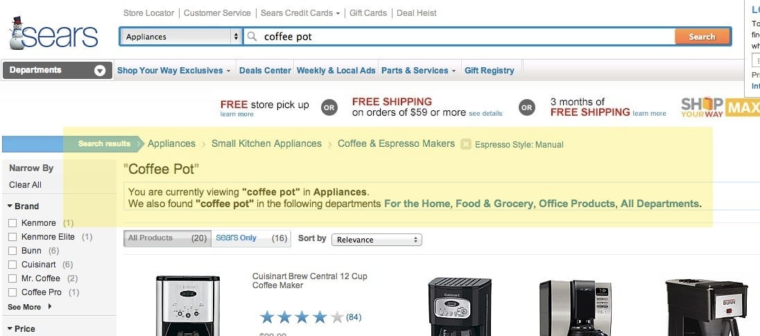
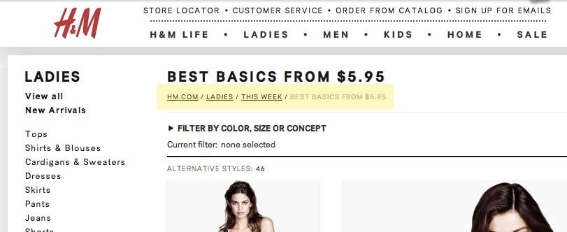
The metaphor here borrows from the concept of a trail of breadcrumbs, used to find your way home, as in Hansel and Gretel. Typically, a breadcrumb comes in two flavors, one, “historical,” that shows where you’ve been, and another, “hierarchical,” that shows where you are in the taxonomical hierarchy of a site. Baymard found that, even among major retailers like H&M, only about half of retailers are using both kinds of breadcrumbs. Nearly a quarter of the 40 retailers surveyed had no breadcrumb at all.
With only one type of breadcrumb or another, users have one of two problems: Either they can’t retrace their historical path through a site after making a wrong turn—perhaps into manual espresso makers rather than coffee machines in general—or they can’t browse laterally through a retailer’s offerings—say they were thinking about a fancy coffee machine, but, finding they can’t afford it, would rather just look at everything that’s on offer.
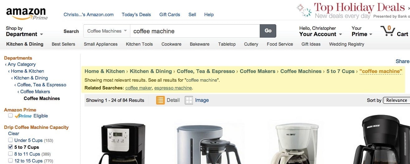
So who got it right in Baymard’s survey? Retailers with giant catalogs like Sears and Best Buy $BBY. Page through Amazon $AMZN.com and you’ll notice that the giant of e-tail also gets it right. Amazon is notorious for obsessively testing how the layout of its site can encourage people to buy, so if Amazon is using both historical and hierarchical breadcrumbs, that’s a sure sign everyone should be.