The Montessori method of teaching relies heavily on natural materials. One of the first things people notice about our classrooms, for example, is the abundance of activities involving wood. And so it made sense that as we duplicated the Montessori experience in digital form, the materials presented looked the same way. On an iPhone or iPad, the experience we offered children was largely rooted in the real world.
The introduction of iOS7—a new operating system that removes ties to the physical world in many ways—has changed everything. It’s more transparent, noticeably lighter, and seemingly faster.
We desire the same traits in a digital Montessori education. And that’s led to a rethinking of the aesthetic that is so thoroughly dependent on woodgrain—and all its shadows and textures that are now relics of Apple’s previous operating system. The new version forced us to seriously consider how our apps would look and feel, and how children would engage with them. As we’ve changed to reflect this, the question becomes, will children still interact with the digital material as they do the physical one when it isn’t grounded in their real-world experience?
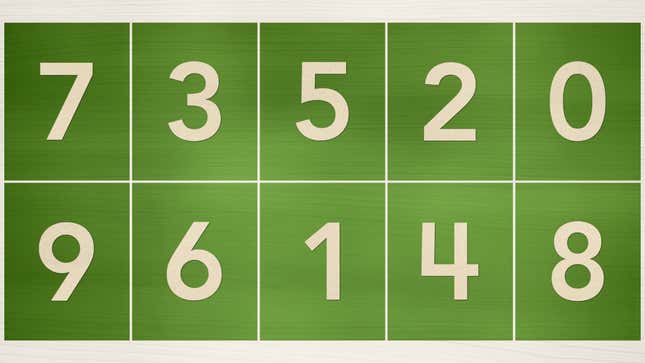
Here’s an example taken from Intro to Math 1.0. As you can see, the numbers have a strong connection to the physical “sandpaper numbers activity,” an activity that you would readily find available in a Montessori classroom. A great effort has been made to attempt to visually replicate the experience of working with wooden tablets, utilizing sandpaper, on an actual desk or table:

The idea behind this design method, broadly known as “skeuomorphism,” is pretty straightforward: by grounding the user in an experience they’re familiar with, the new, foreign environment will feel less strange and uncomfortable. Of course, the iPhone and iPad complicate this experience from the start, primarily because they immediately situate the user at a certain level of remove. This is precisely why, the argument goes, “skeuomorphism” was so important, and ultimately, timely—it placed the novel world of the digital landscape within reach of the physical.
With iOS 7, ornamentation, no less than imitation, have gone out the window.
When we sat down to work on iOS 7, we understood that people had already become comfortable with touching glass, they didn’t need physical buttons, they understood the benefits. So there was an incredible liberty in not having to reference the physical world so literally. We were trying to create an environment that was less specific. It got design out of the way.
Thinking in these terms helps take us to the core of what this new landscape means: the connections between the “physical” and the “digital” are becoming increasingly less tenuous. If we learn to reduce any unnecessary physical elements, we can better highlight, not just the digital functionality of the app, but the experience itself.
Our immediate reaction to this line of thought, however, is that having a firm basis in reality is an extremely important notion for children. Children simply do not relate to the world in the same ways in which we, as adults, have become accustomed. As adults, it’s one of our primary failures—we always think that children perceive the world exactly the same way that we do. Yet, nothing could be further from the truth.
While we might readily grasp an abstract concept, for children it’s much easier to first go through a concrete experience. Take the idea of gravity. If a child experiences a real glass object slip through their fingers and loudly shatter on the floor, they will more easily be able to grasp the concept of gravity. In a meaningful way, the bridge to the world of ideas has always gone through kneading the soil of the earth. This is one of the reasons Zach Klein and Andrew Sliwinski are on the cusp of something magical at DIY.org: they’re merging the concrete with the abstract.
With Intro to Math 2.0, then, we made the decision to drastically scale back the woodgrain, reducing the importance of the shadows (which cast a wide view on the “real world”), concentrating almost exclusively on a new set of assumptions. These are assumptions that we felt our learners would be making when they engaged with our app because we knew they would be ready for them.

This generation is growing up with an entirely different set of technological expectations. In a way, up until this precise historical, should we say, cultural juncture, we wonder if the world itself was ready to embrace what has been called the “authentically digital.” Adults needed the training wheels to take reality into digital; will children need support to translate concepts they’ve learned digital into the real world, now that the two share fewer visual cues?
Whenever we wonder if children will be able to effortlessly make the same leap when the digital world has so little resemblance to its concrete counterpart, we are reminded of Ives comments on the transparent nature of the design, “The lovely thing about translucency is you’re not sitting there going, ‘Where have I just been taken?’ because your world is still there.”
