Is the US stock market floating on a sugar high of Federal Reserve stimulus, or is it responding to fundamentals of the economy? The answer is key to determining whether the Fed’s latest efforts to fight unemployment are really having any effect.
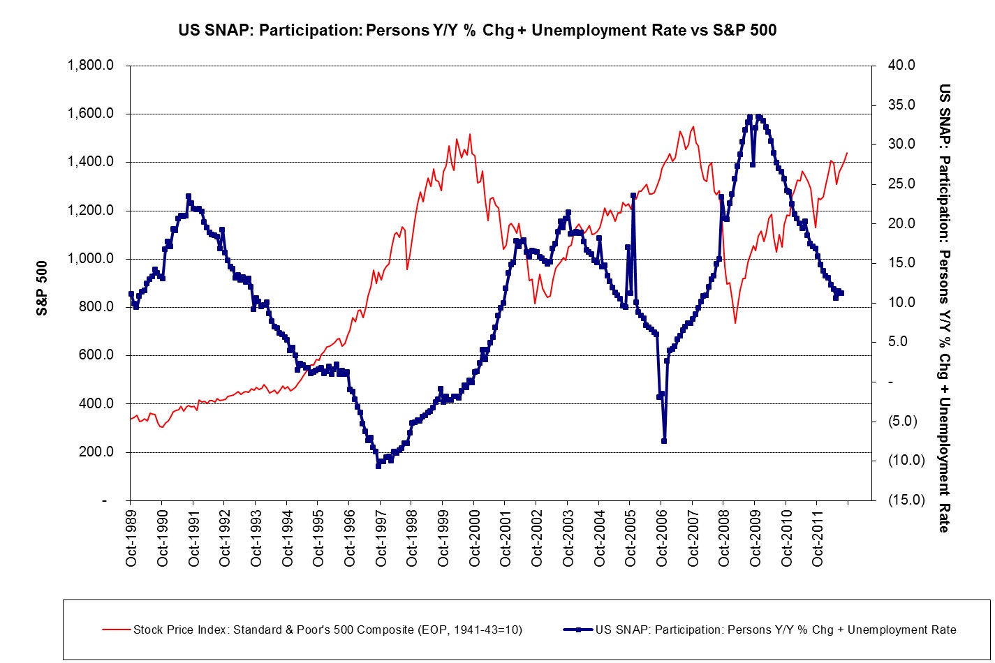
Citi’s chief US equity strategist, Tobias Levkovich, created the above chart to partially answer that question. He’s come up with a new “misery index” to compare economic fundamentals with stock prices. In the seventies, the “misery index” added unemployment to inflation to chart a sense of general economic well-being. Lekovich, recognizing that years of stable inflation expectations have robbed the old misery index of its punch, instead adds the unemployment to the change in the number of people getting food stamps (the government’s Supplemental Nutrition Assistance Program, or SNAP) to take a more modern measure of economic insecurity. When compared to the S&P 500, the index shows that rising stock prices are correlated with improving economic conditions, as fewer people require food stamps and more obtain jobs. That suggests the markets are moving on fundamentals, not being artificially boosted.