How bad Covid-19 data visualizations mislead the public
At the onset of the Covid-19 pandemic in the United States, public health authorities rushed to produce clear, concise information. Often, they resorted to some of our favorite story-telling tools here at Quartz: charts.


At the onset of the Covid-19 pandemic in the United States, public health authorities rushed to produce clear, concise information. Often, they resorted to some of our favorite story-telling tools here at Quartz: charts.
Well-designed charts and other forms of data visualization can pack a more powerful punch than words alone. But poorly-designed charts—even those that are made with the best intentions—can mislead their audience. And if we’ve seen anything during this pandemic, it’s that misinformation can spread as easily as the virus itself.
In the US, the quality of these data visualizations has varied greatly across state health departments. We pulled a few examples of the best and worst practices in data visualization, based on the same principles we use to guide our own chart-making.
Alabama
Data visualization folly: Snapshot data and cluttered numbers
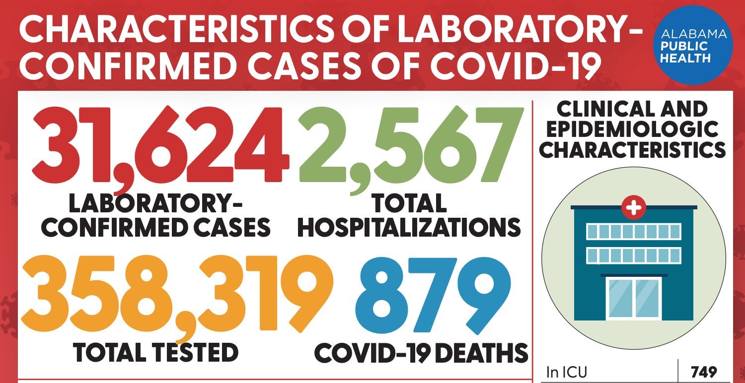
These data, which come from a fact sheet updated on weekdays (this one is from June 24), fail to show the readers any trends over time, which are more meaningful than snapshots. They’re also visually confusing because they’re so close to one another.
Secondary folly: Pie charts
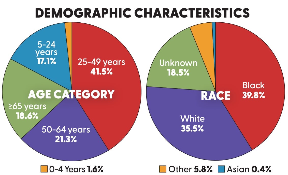
This screen shot is from the same Alabama fact sheet. In general, there’s almost never a place for pie charts in data visualization. While they can give the reader the satisfaction of seeing the slices add up to 100%, they’re usually pretty hard to read.
“Our brains have a tough time deciphering pie charts. In this case, they would be better off using bar charts, or even a simple table.” –Dan Kopf, Quartz Data editor
Arkansas
Data visualization folly: Missing context.
Arkansas, like several other states, uses software called ArcGIS to update its Covid-19 statistics every weekday. Its audience gets consistent data over time, which helps to reduce confusion.

The graphic above, from this page, shows the rate of different preexisting health conditions in patients confirmed to have Covid-19. Because all of these percentages are so low—and they’re depicted on a scale that goes up to 100%—it seems like having another condition like hypertension isn’t a big deal.
But research has shown that people with preexisting conditions are more likely to have severe cases of Covid-19. Currently, Arkansas has about 17,000 current cases; that means we’d expect that over 1,700 people who have Covid-19 also have hypertension, and are therefore at risk of having more severe cases that could result in death. Data is only meaningful if you put it in the right context.
“Making the arcs out of 100% makes it harder to compare these health conditions. Bars are simpler for cognition, so why not use them? Also, why are they in this particular order?” –Dan Kopf, Quartz Data editor
Arizona
Data visualization folly: No y-axis
This screenshot was taken from the state’s Covid-19 dashboard looking at daily new cases. The first chart here shows the total case counts across the state. The second, however, looks at a particular county.
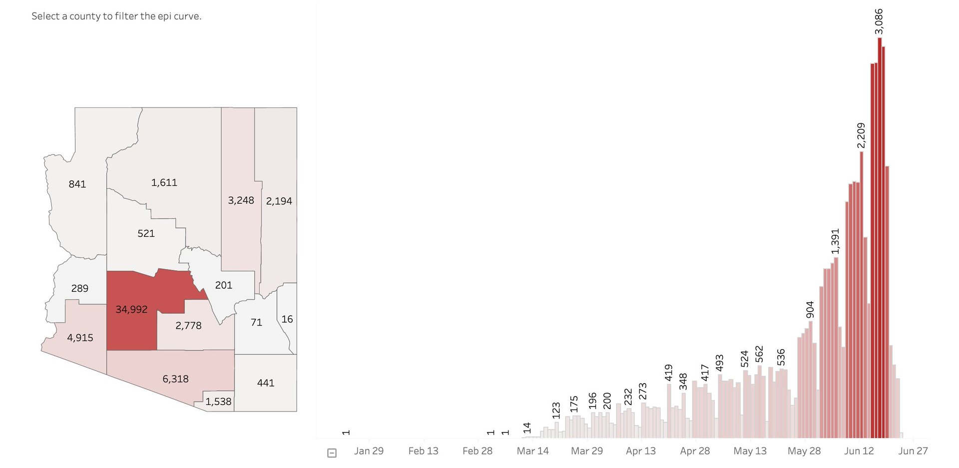
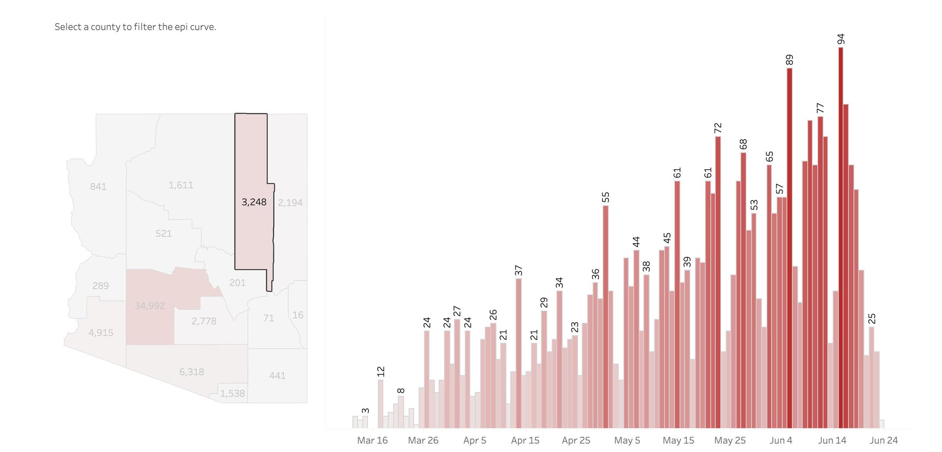
Because neither chart has a y-axis and the color gradient is not uniform, it looks like the magnitude of the case count across the state is the same as in Navajo county alone. In fact, the daily state-wide case counts are in the thousands, while they haven’t crossed 100 in Navajo country yet.
That said, the color gradient in the Navajo country case counts may unintentionally emphasize an important fact: Nearly half of the population of Navajo county is Native American, including members of the Navajo Nation. This Native American tribe has had some of the highest infection rates per capita among the country and surpassed New York State in May.
“People don’t always read charts closely, so even though there are numbers on the bars, it would definitely be helpful to more forcefully point out the scale” –Dan Kopf, Quartz Data editor
Not all data visualizations across states are bad; some are easy to understand and informative.
Washington
Data visualization done well: Clarity in labeling
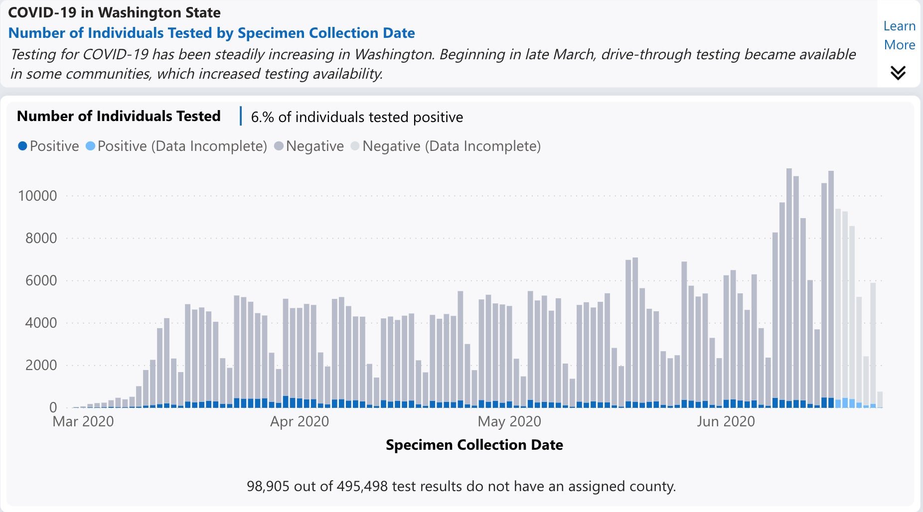
Washington is among the states whose department of health has been reporting not just the percentage of positive test results, but the total number of tests given on a given day. This metric is important to get a picture of how many people are getting tested, either because they’re symptomatic or because they need clearance to return to work or to visit a loved one. It shows that Washington’s testing capacity is increasing, which may be an important metric when making decisions about further reopening.
This chart also features a brief description of how testing has changed in Washington over time, and uses four carefully-chosen colors to show the different values. It’s easy to see that while the number of tests people are taking have gone up over time, the number of positive tests, and therefore confirmed Covid-19 cases, has remained relatively low.
New York
Data visualization done well: Exemplary use of tables

Not all data visualizations have to be charts of graphics—sometimes, tables can do great work as well.
This table, taken from New York’s Covid-19 tracker, shows that Black and Hispanic residents have had disproportionately high fatality rates. It does so by including two statistics on the same line: the percentage of Covid-19 fatalities and the percentage of the population attributed to each group. This table, therefore, tells a clear story of how Black and Hispanic populations have been underserved. Showing the percentage of fatalities by race and ethnicity alone wouldn’t suffice, because it wouldn’t contain the right kinds of context.
“I love a table. If you find yourself doing contortions to make something into a graphic, you should probably just publish the data itself.” –Dan Kopf, Quartz Data editor