Why it’s so hard to fix America’s poorly-designed election ballot
Complaining about the US ballot is centuries-old American tradition. Every election cycle, critics lament how unwieldy, ugly, or downright confusing the voting form is. With the spike in voting by mail this year amid the Covid-19 pandemic, many more are noticing how puzzling the piece of paper truly is as they fill out their ballots at home. Turns out, the ballot’s confusing design is less a weakness of America’s participatory democracy than a sign of its robustness.
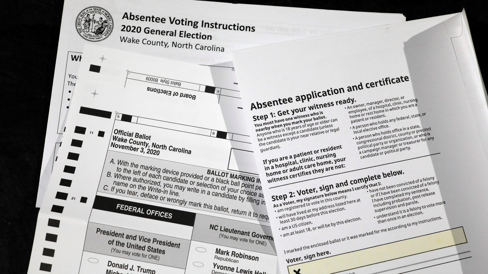

Complaining about the US ballot is centuries-old American tradition. Every election cycle, critics lament how unwieldy, ugly, or downright confusing the voting form is. With the spike in voting by mail this year amid the Covid-19 pandemic, many more are noticing how puzzling the piece of paper truly is as they fill out their ballots at home. Turns out, the ballot’s confusing design is less a weakness of America’s participatory democracy than a sign of its robustness.
Americans can cast a vote several ways. They can go to a polling station on Election Day or do it in advance via a mail-in absentee ballot; many states allow early in-person voting as well.
Voting online isn’t widely available for federal elections. This year, 32 states and the District of Columbia are accepting ballots submitted via a mobile app, fax, e-mail, or an online portal, but this method is mostly reserved for military personnel serving overseas or civilians living abroad. While countries like Australia, Brazil, Canada, Estonia, Norway, and Switzerland have have embraced some form of remote voting via the internet, experts caution that it’s not useful to compare them with the American context. That’s because the US operates on a much larger and complicated scale.
And so, old-fashioned paper is still the most common and secure voting medium in the US. An estimated 95% of voters will manually fill out and send forms by postal mail, deposit in a drop box, or feed their paper ballots to a machine that produces an auditable paper record at a voting center.
It may sound backward in age of electronic transactions, but paper is considered, as Brookings Institute puts it, “state-of-the art voting technology” in the US.
The paper trail
By many measures, the design of the American paper ballot is a disaster. Researchers point out that elements such as its layout and length make it the most complicated voting instrument in the world, and one of the most ineffective. A 2005 study published in the University of Chicago’s Journal of Politics indicates that nearly 2 million votes were rejected from each of the US presidential elections held between 1992 and 2004 because ballots were marked incorrectly.
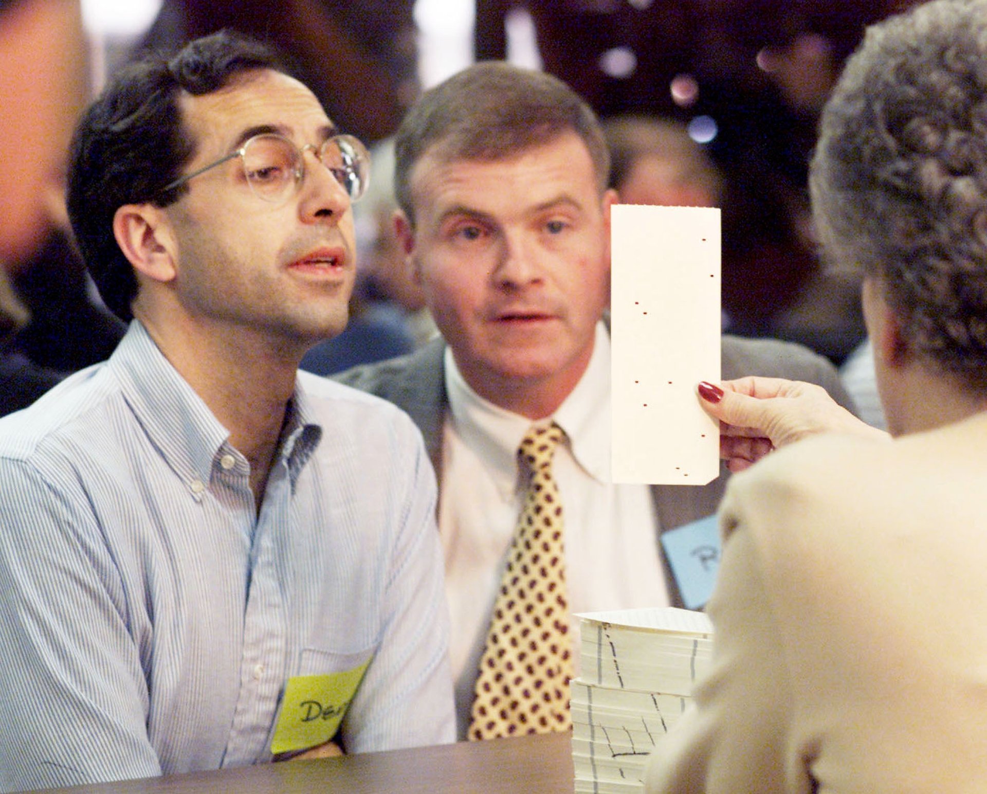
Many Americans are still traumatized by the Florida butterfly ballot debacle of 2000. For 36 days, the nation held its breath as election officials scrutinized and debated hanging, swinging, dimpled and pregnant chads—paper fragments when a hole is made in a punch card style ballot—a bureaucratic farce that eventually ended in the election of president George W. Bush. The spectacle was an indelible demonstration of how the graphic design of ballots can directly impact the results of an election.
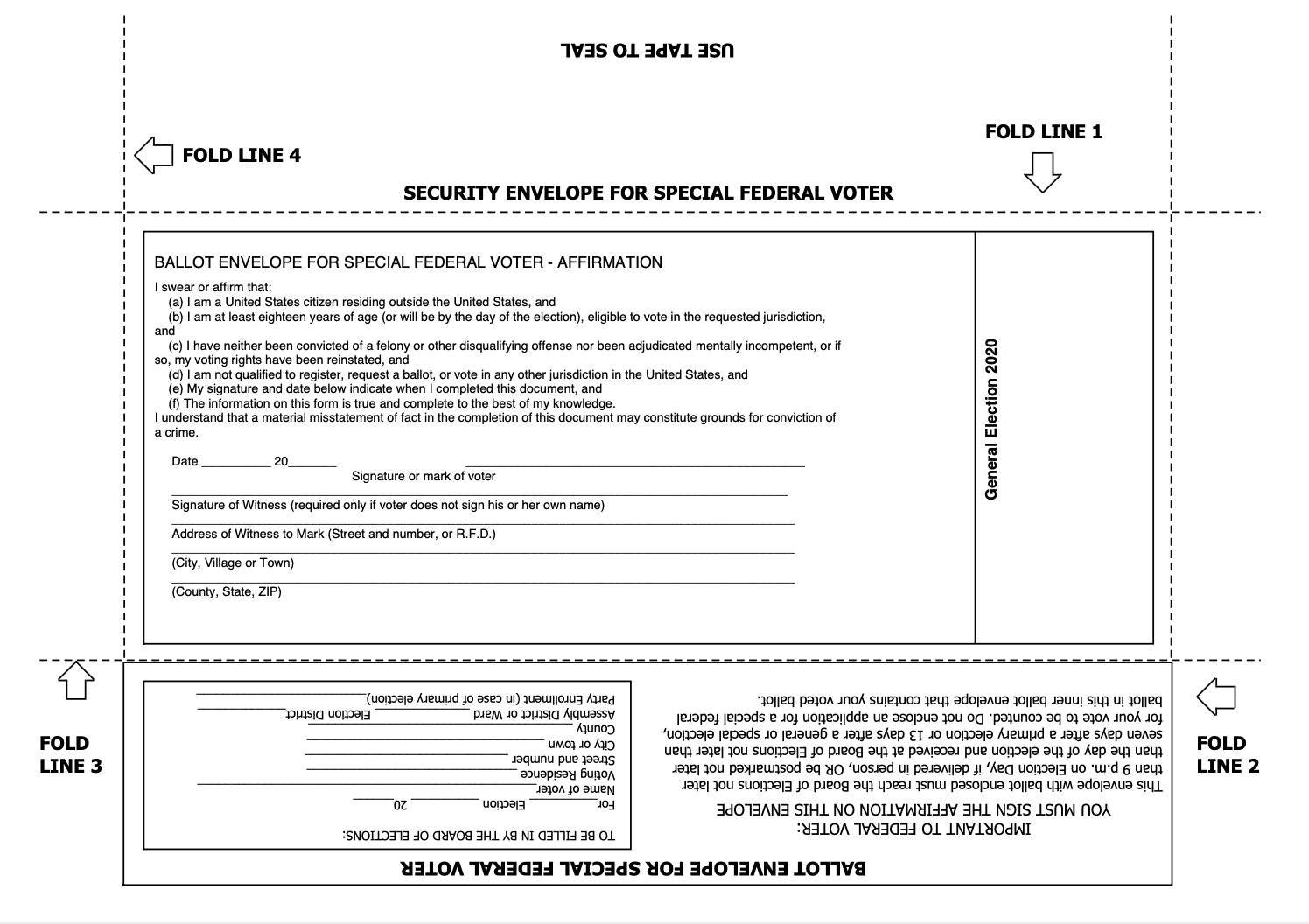
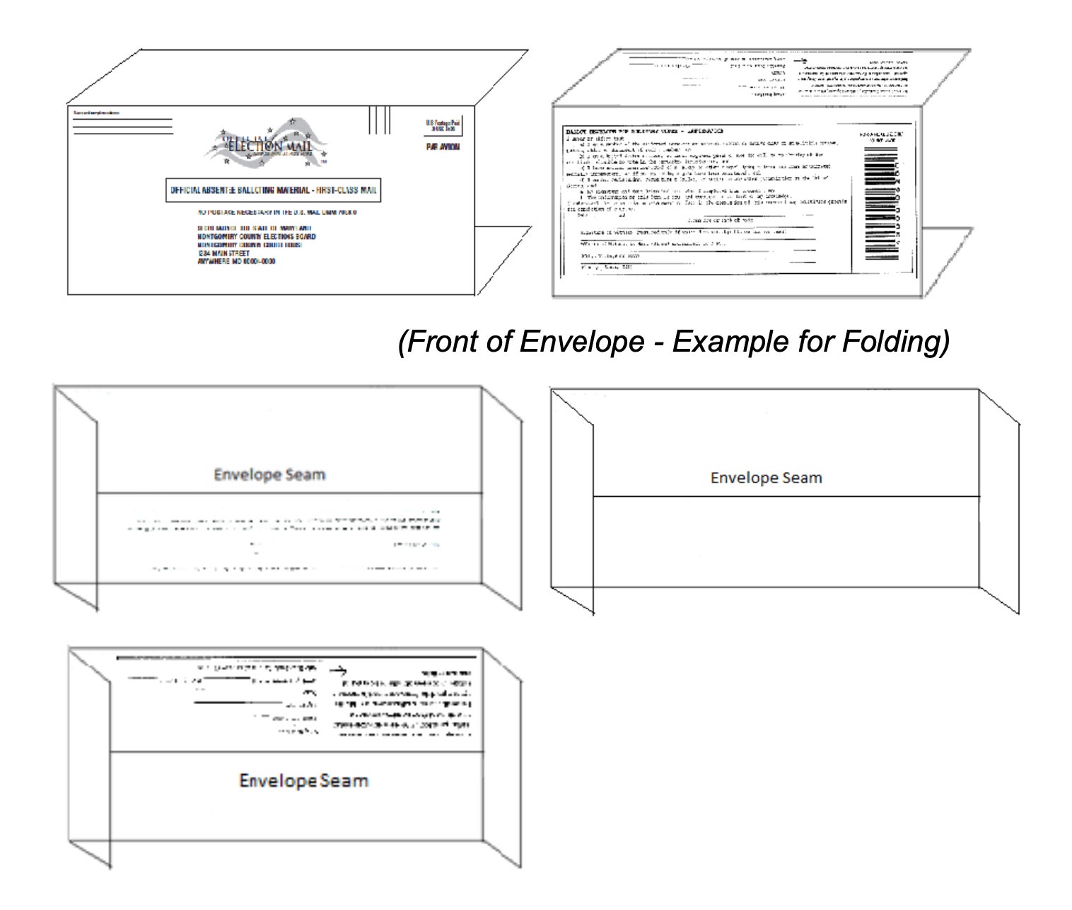
The problem is worse for Americans living abroad who receive absentee their ballots electronically. Without pre-printed forms, they’re required to not only parse the jumble of instructions, but to print the documents and complete a fairly involved origami project to construct the mail envelope. Sixteen states require voters to seal their ballot in a second envelope called the “secrecy sleeve.” Those who deviate from these instructions risk nullifying their vote.
The US Election Assistance Commission reports that more than 300,000 absentee ballots were rejected during the 2016 election cycle because they were incorrectly filled out. For this year’s presidential primary, more than 18,500 votes weren’t counted for the same reason, according to a study by the MIT Election Data and Science Lab.
The ballot’s dismal design is arguably more acute today, given that we’re so spoiled with great design interfaces everywhere—from intuitive tech devices to easy-assemble furniture and nimble mobile apps that allow us summon virtually any service instantly. UX designers, for better or worse, have excelled in eliminating hurdles or points of friction in every step of business processes.
This user-focused ethos somehow doesn’t translate to elections.
But if the paper ballots are so bad, why can’t states just start from scratch? Like so many aspects of the democratic system, making any tweak, much less an entire redesign, isn’t as simple as it sounds. “You’re changing laws, culture, procedures and voters,” says Whitney Quesenbery, executive director of the Center for Civic Design. “But it can be done.”
The scope of the problem: hairball x 50
To critique the American ballot, one must grapple with the extent of the problem. First, there’s not one consistent ballot template adopted across the country. Because the US operates under the distributed system, each state decides how they want to conduct elections, which has a direct bearing on the voting machines, procedures, and forms used.
“Ballots look like they do now because of laws,” explained Dana Chisnell, co-founder of the Center for Civic Design at a recent talk convened by AIGA. “Statute is the primary driver for ballot design and that includes things like type size and typeface, what the grid the ballot should follow, where things are placed, and what instructions say.”
Each state decides on the number of languages displayed on the form. In New York City, for instance, ballots in Brooklyn are presented in English, Spanish, and Chinese. Voters in Queens—the most ethnically-diverse urban area in the world—can also request ballots in Korean and Bangla.
The sequence of names on the ballot differs state by state too. In New York, names of Democratic candidates come first because the incumbent governor, Andrew Cuomo, is a Democrat. In Wisconsin, the party that garnered the most votes in the last general election is listed first, and the order of independent candidates is determined by lottery. In Louisiana, Maine, and Nevada, candidates are listed alphabetically by surname. (Sequence matters: a study by economist Darren Grant suggests that the order of names on the ballot often determines an election’s outcome, especially for lower-order races on the ticket like judges or state senators. Analyzing the results of the 2014 general elections, he found that the first name on the ballot often wins.)
Changing the paper ballot is also expensive. Any tweaks can involve upgrading a jurisdiction’s entire elections technology infrastructure. In a conversation with MoMA senior curator Paola Antonelli on Oct. 16, John Lindback, Oregon’s former director of elections, described how severely underfunded local elections are. Most local authorities have been depending on a $300 million fund donated by Priscilla Chan and Mark Zuckerberg to purchase basic items like PPE for poll workers. “This is so telling about how bad the situation is in terms of elections funding in this country—that we have to depend on wealthy individuals,” he said.
Not having a centralized civil registry complicates matters, adds Lindback. “There is no national ID so it depends on the initiative of the voter to go out and register to vote and to update their registration when they move or change their name,” he explained. “In most places in the world, that’s done for you through the civil registry.”
A history of typographic trickery
Studying the history of American ballots has made Alicia Cheng appreciative of the achievements in improving the voting instrument since the 1800s. “American individualism and independent thinking are partly why we’re here,” says Cheng, author of a new book about the history of election ephemera titled This is What Democracy Looked Like: A Visual History of the Printed Ballot.
In the 19th century, the task of printing ballots was left to political parties. Working with printers, parties produced a mind-boggling array of designs and deployed every graphic trick they could to gain an advantage. Voters were handed ballots, much like marketing flyers today, and voting entailed simply depositing the ticket of their chosen party into a box. “That type of free-wheeling spirit made for some delightful fodder for designy folks, but there’s just no regulation,” Cheng tells Quartz.
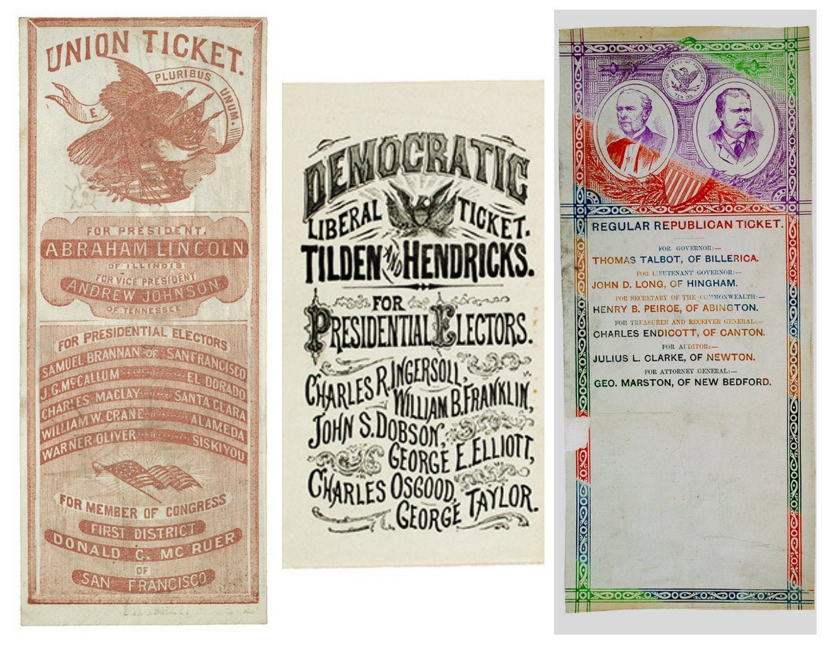
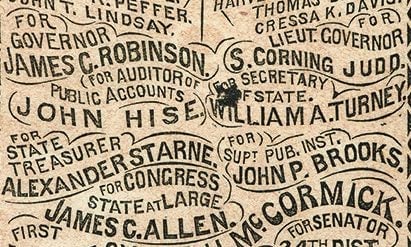
When voters began writing on ballots and swapping out names, political parties resorted to more typographic antics to foil them. This included using a gray background to make markings illegible, using very tiny fonts, or printing names along curved lines.
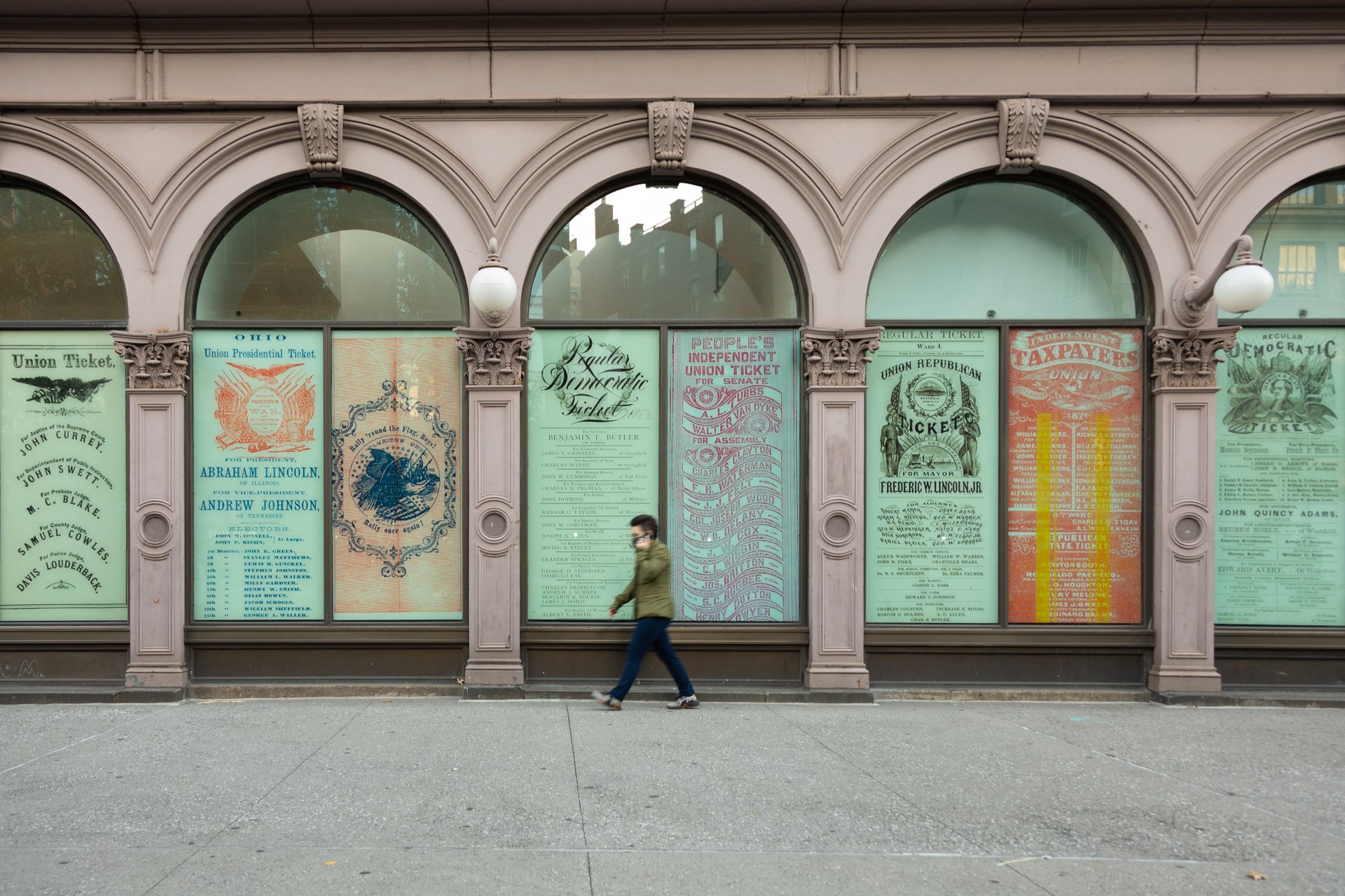
“It took a hundred years to get this boring and that’s progress,” says Cheng, referring to the statutes that govern contemporary ballot design. (Examples of these historical ballots in Cheng’s book are currently featured in an exhibition at the Cooper Union in New York City.)
“When I get aggravated by it, I calm down when I think about the scale we’re operating in,” she says. “It should hopefully galvanize us to be more patient, but also get in there and try to help.”
Designed by and for machines
In an attempt to introduce some consistency into the process, the US has experimented with all sorts of voting devices throughout its history—including brass balls, levers, tokens, and even beans and corn. In the 1970s, states began adopting computerized voting technology to improve their methods of tallying of votes. In the US, three types of machines are common: optical scanners; ballot-marking devices which produces a print-out based on choices logged on a screen; and direct-recording electronic technology where users register their votes via a touch screen.
Professional designers are rarely involved in designing ballots—or any aspect of the often chaotic voting procedures for that matter. Paper ballots are typically auto-generated by machines developed by vendors like ES&S (Election Systems & Software), Dominion Voting, and Hart Intercivic. Until recently, product developers haven’t been so attuned to design principles that would make it easy for humans to complete the forms. Ballots, in essence, were primarily designed by and for voting machines. The idea of creating a “voter-centered” experience is a fairly recent innovation.
Quesenbery, whose organization offers valuable design resources for election boards, says there’s reluctance over how much human designers ought to mess with machine-generated election forms. In the case of Los Angeles County, officials decided against making manual revisions for fear of inadvertently introducing human errors and inconsistencies. “One of the big mistakes we’ve seen on ballots involves someone trying to do a good thing,” she explains.
When designers get involved
Designers have a place in improving election design, beyond fiddling with fonts on a ballot form. Lindback cites the work of Marcia Lausen, a pioneer of the “design for democracy” initiative in response to the botched butterfly ballot incident. With her students at the University of Illinois at Chicago, she improved the ballots for Cook County, Illinois, and inspired a generation of designers to tackle projects in the public sector.
“The system would be so much better if design was integrated into to every step,” said Lindback, who was a member of the US Election Assistance Commission’s Standards Advisory Board. “I have yet to come across a situation where designers didn’t make things better.”
Quesenbery points to Los Angeles’s Voting Solutions for All People (VSAP), a multi-stakeholder effort to improve the voting experience for largest jurisdiction in the US, as an example of how this could happen. “It’s a big project but isn’t it worth a hundred people spending the time to do the work carefully so that millions of people can vote?” she says.
A key collaborator was IDEO, the global design firm credited for popularizing the “design thinking” methodology. Embracing the “human-centered approach” they’ve applied to the design of products to business processes, IDEO’s team worked alongside a range of experts to improve every facet of the LA’s voting system, which hadn’t been updated since 1968.
“I can’t imagine a more meaningful space to design in,” says Annetta Papadopoulos, an executive program director at IDEO who led the team that worked with Los Angeles County. “I think designers bring a passion and a certain comfort level with questioning assumptions and constraints people hold on to.”
For mail-in ballots, designers revamped the form with the user’s ease in mind. They condensed all the information in a single sheet of paper, which was a vast improvement on the error-prone system when voters had to read a booklet and mark their choices on a punch card. They selected a new font, Google’s Noto, which they found had the best language support for a free typeface. Designers introduced ovals after learning that filling in the shape was easiest for people with motor impairments. A secrecy sleeve was included in the packet because they found out that voter confidence increased when their ballots were sealed in a second envelope. They also promoted the use of plain language in communication materials. And perhaps most importantly, designers introduced the spirit of open exploration to the entire process.
“Those vote-by-mail ballots are well, just beautiful,” says Quesenbery. “It’s a glimpse of what could be for the rest of the country.”
Correction: A previous version of this story indicated that the $300 million fund came from Priscilla Chan and Mark Zuckerberg’s foundation, the Chan Zuckerberg Initiative. In was, in fact, a personal donation.