Where are all the great American user experience designers?
On this highly-anticipated US presidential election day, voters who showed up early to cast their ballots were dismayed to find polling stations in chaos. There’s the mess of directional signs, the retro design of the ballot printed in semi-legible condensed Engebrechtre fonts, a discombobulating succession of queues, and far too many people handing chits of paper failing to herd a confused crowd already anxious about the election as it is.
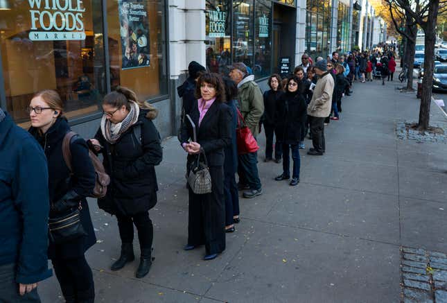
In my voting station in New York City, a long queue formed outside of a busy university lobby, with voters and students jostling to get into doorways. Line managers were handing out those coveted “I Voted” stickers on the street, way before we entered the voting station. They gave them out like free candy to appease the already antsy crowd, trying to vote and not miss any work meetings.
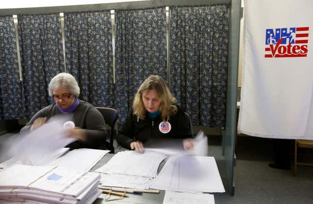
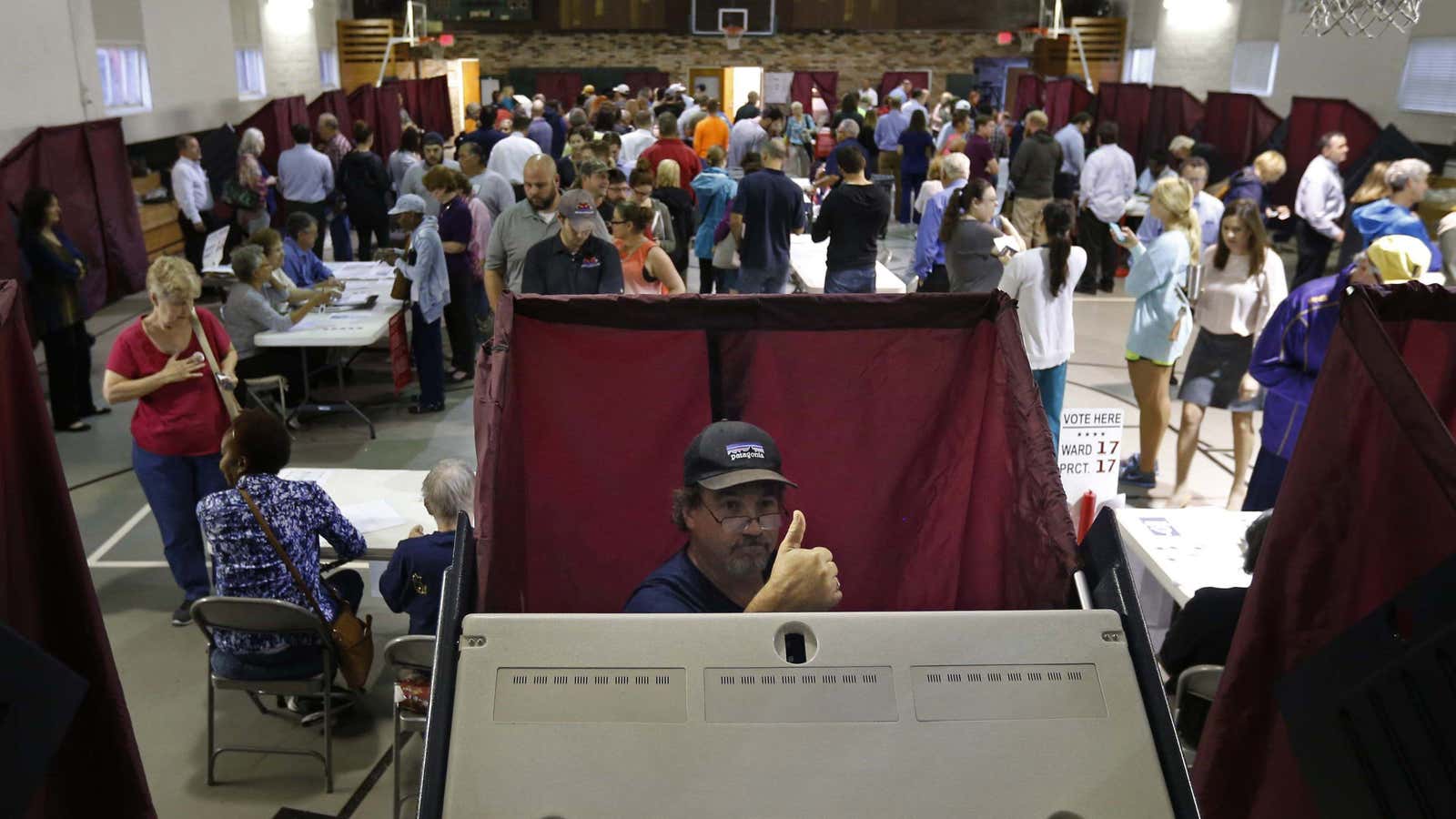
Once I finally made it inside, I joined another queue to wait for my moment with a harried voting clerk who has to manually thumb through a paper binder to find the name of every voter. He handed me a folder with no indication where to proceed next. There were not enough makeshift voting booths or cardboard “privacy screens,” so instead, many took it upon themselves to expedite the process by filling out their ballots while in line for the ballot scanning station.

After 30 minutes of milling around inside the voting station, it became clear that no systems designer, efficiency expert or crowd control wizard had ever been consulted. For a population that can Amazon Prime-Venmo-Uber anything, the US electoral experience feels anachronistic—like a disorganized bake sale with too many volunteers but not enough cash registers.
And after all that rigmarole, another queue formed for the lone working ballot scanner in the entire place. (The second one was on the fritz.) My heart skipped a beat when the screen attached to the flatbed scanner read “there are no discernible marks on your ballot. Your vote was not registered.” I turned to the friendly election official nearby, who smiled knowingly. “You just have to try it a few times.” We had to run my ballot through four times, as the line behind me grew and groaned. I wondered why there wasn’t a tech on standby. As I nervously waited for the glitchy machine to process my vote, I noticed a one-pager with the step-by-step voting procedure. It would’ve been much more useful near the entrance than here at the end, I thought.
After the long and emotional presidential campaign season, the voting experience is anticlimactic. Inside the polling station, there’s no time to savor the significance of casting the important ballot—you just have to do it and get out. Even after more than two centuries of organizing public elections since the first presidential election in 1788, US election officials still haven’t figured out an optimal process model for voting.
The key would be finding a good, user-tested standard to eliminate road blocks for all voters. If Americans can apply “design thinking” to ease airport security checkpoints, and work out better queuing systems for grocery stores, banks, and Apple retail outlets, why can’t we fix this defining citizen ”user experience”?

In my voting experience, the only thing that were obsessively-designed were those “I Voted” stickers, that, as persuasive as they can be, are essentially decorative flair. We need designers to tackle the hairball, not just put on a bow.
