What characteristic best predicts the share of people in a county that voted for Joe Biden in the US presidential election? One strong indicator is the proportion of residents who say their ancestry is “American.”
Most Americans tell the US Census Bureau that their heritage lies in another country—like England, Nigeria, or China. But about 6% simply answer that they are “American” (For their race, the vast majority of these people identify as White.)
Of the 151 ancestry types in the US with more than 50,000 people, a Quartz analysis found that the share of people in a county identifying as “American” was the most correlated with the anti-Biden vote share. In other words, the higher the number of people claiming “American” ancestry, the fewer votes Biden received.1
By contrast, in counties where an unusually large share of people say they are of “Eastern European” ancestry, Biden tended to do exceptionally well. The heritage data were collected from 2014 to 2018.
To understand which other characteristics were most positively and negatively correlated with Biden’s vote share, Quartz collected data from the US Census and US Bureau of Labor Statistics on the density of ancestries, industries, and occupations in US counties. While “American” and “Eastern European” stood out for ancestry:
- Grantmaking and giving services was the most positively correlated with the Biden vote among 243 industries we analyzed.
- The share working in the gasoline stations industry was the most anti-Biden correlated.
- Arts, design, entertainment, sports, and media occupations was the most pro-Biden correlation of the 25 occupational categories we examined.
- Installation, maintenance, and repair occupations was the most anti-Biden correlation of the 25 categories.
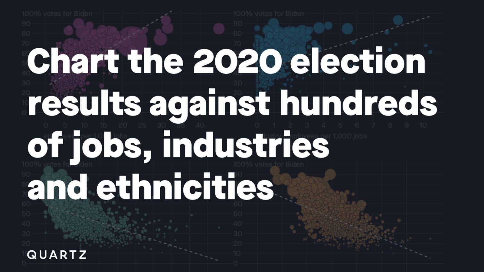
The interactive chart below allows you to explore how Biden’s vote share correlated with hundreds of these variables. The Census’s data are based on a survey of 5% of the US population. Therefore, the ancestry and occupation data are not exact. For these data, only counties with at least 50,000 people and categories with at least 50,000 people nationwide are included to ensure accuracy.2 The industry data are more precise as they are based on a census of nearly all companies. For these reasons, pay more attention to the trend of all of the counties, rather than any one specifically.
Similarly, remember that these data do not indicate how members of a certain profession, industry, or ethnic group, voted.3 They show how all the people in a county within certain populations voted.
