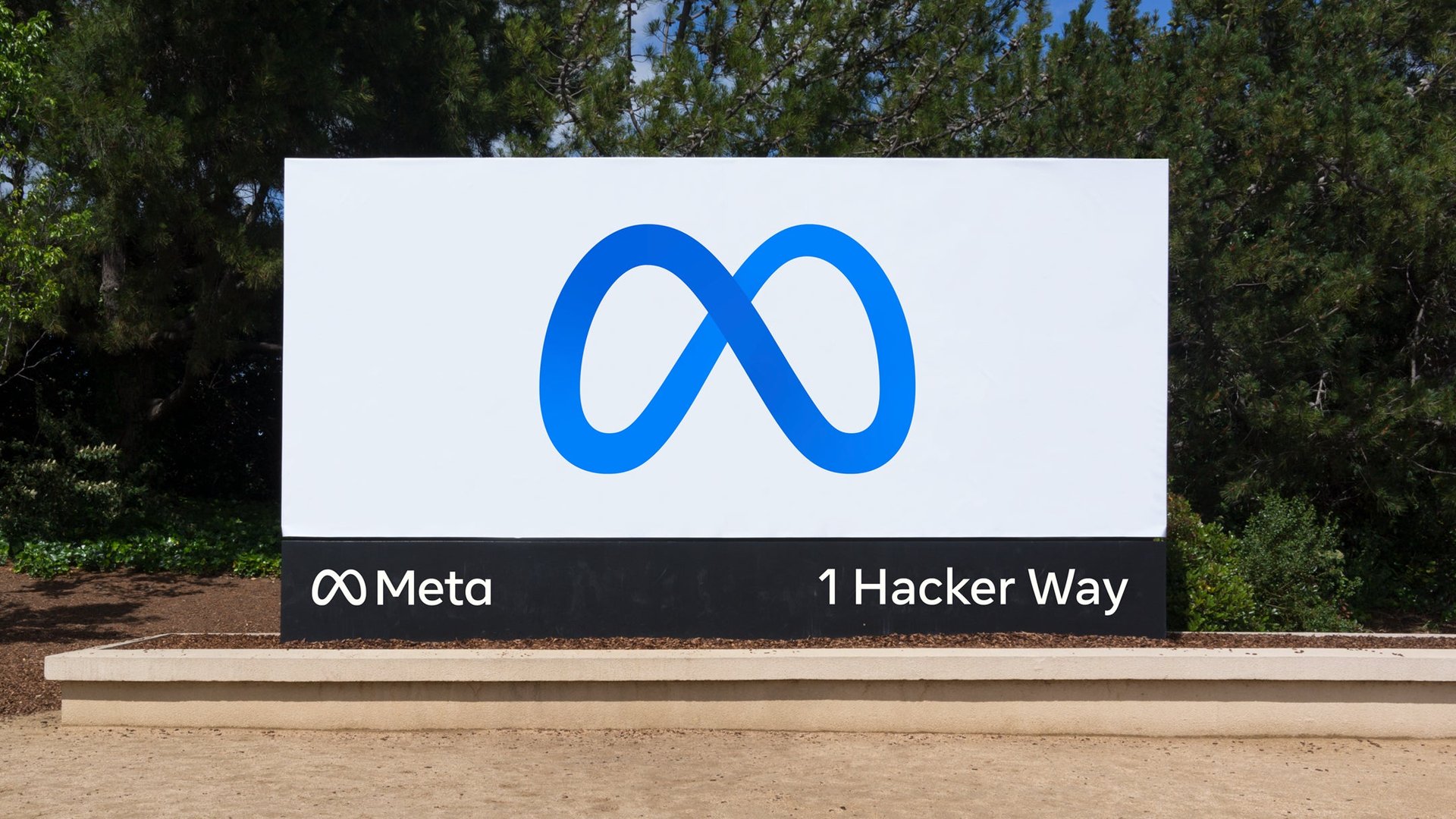
The Facebook rebrand to Meta brings with it a new stock symbol, new social media handles, and heavy critiques of the company’s new logo.
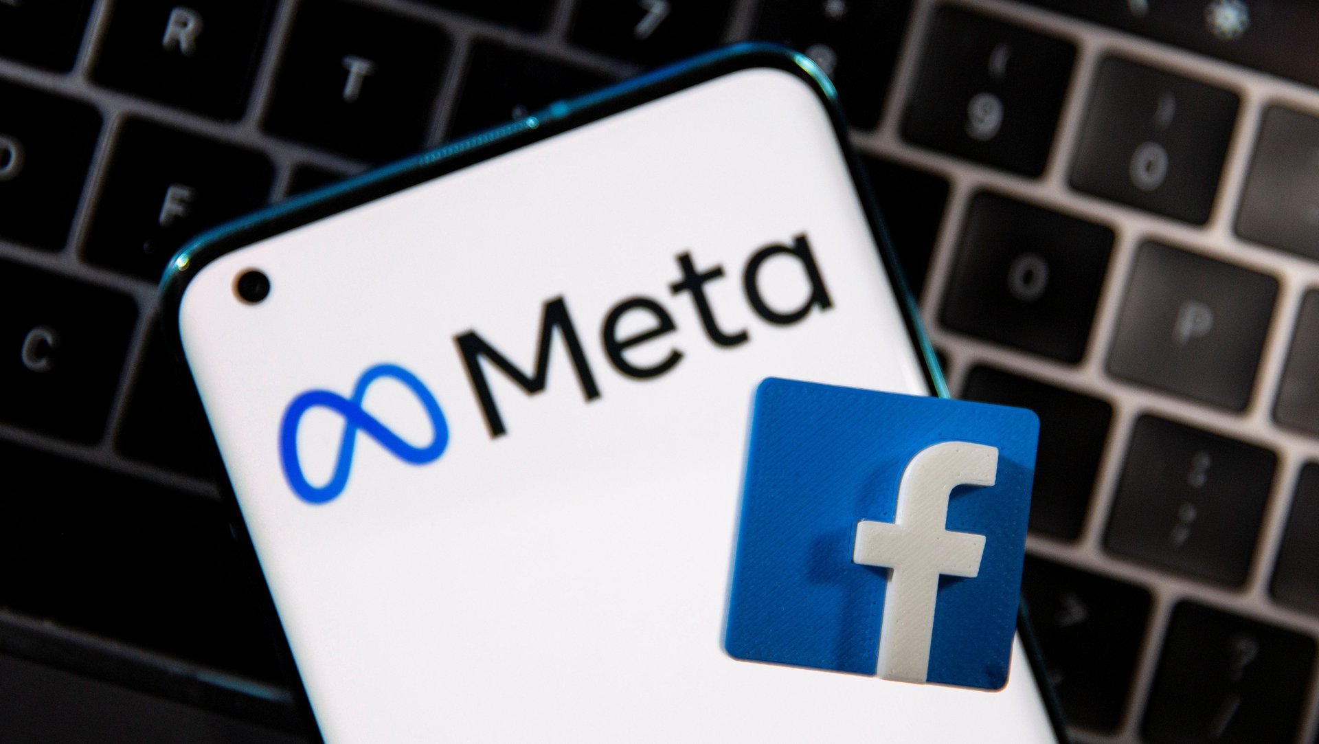
The Facebook $META rebrand to Meta brings with it a new stock symbol, new social media handles, and heavy critiques of the company’s new logo.
Graphic design critics were predictably abuzz as soon as CEO Mark Zuckerberg revealed the wordmark for Meta, Facebook’s new corporate brand, at the tail end of his 80-minute keynote at the Connect conference on Oct 28. “The word ‘meta’ comes from the Greek word [μετά] meaning ‘beyond,'” he explained, revealing an animated symbol that resembles an infinity symbol. “For me, it symbolizes that there is always more to build.”
Join 500,000+ readers who start their day with Quartz.
By subscribing, you agree to our Terms of Service and Privacy Policy.
The logo has already been compared to a pretzel, a Pringle chip, a thigh master, IBM $IBM’s design thinking loop, Microsoft $MSFT Visual Studio’s old avatar, and inevitably, a phallus.
Many also note its resemblance to virtual reality goggles, which would be a fitting nod to the company’s foray in immersive virtual realms or “metaverse,” as Zuckerberg calls it.

In a company blog post, Facebook’s—er, Meta’s—design team explained that the symbol is meant to perpetually morph:
“[T]he Meta symbol forms a continuous loop that works seamlessly between 2D and 3D contexts. It is designed to be experienced from different perspectives and interacted with. It can resemble an M for “Meta,” and also at times an infinity sign, symbolizing infinite horizons in the metaverse.”
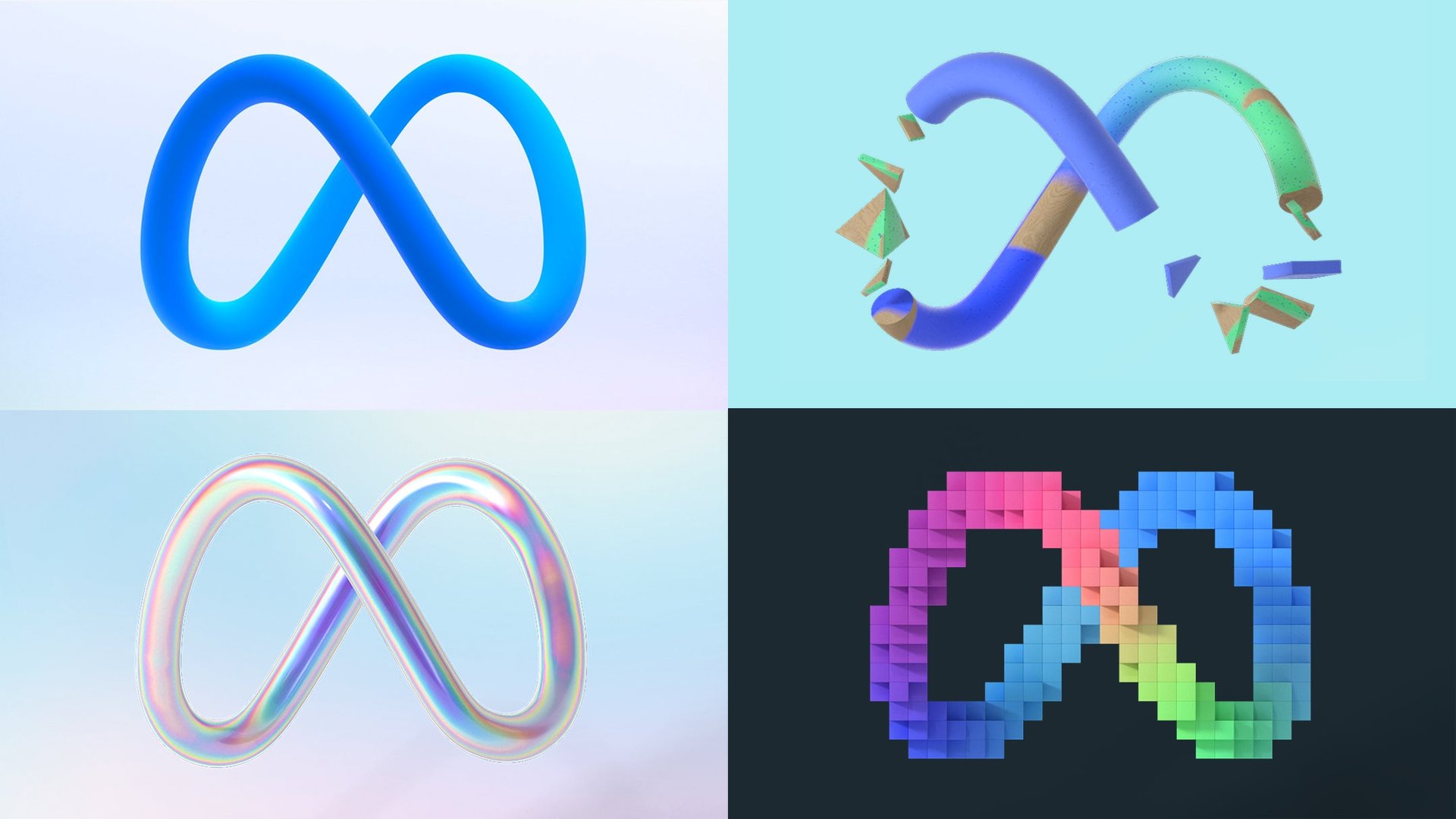
It’s futile to judge a logo’s efficacy at first glance, but early reactions are predictably snarky. Critics are fixated on the infinity symbol, complaining that it’s derivate and unoriginal.
Bill Gardner, who publishes an annual logo-design trend report, says he’s seen that infinity symbol or the “mobius strip” many times before. “[They’re] tropes that designers have pretty much had their way with over the years,” he explains.” Gardner says the idea of a single-line, continuous loop was trending in 2008.
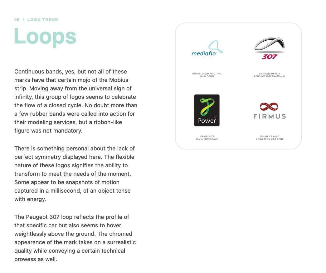
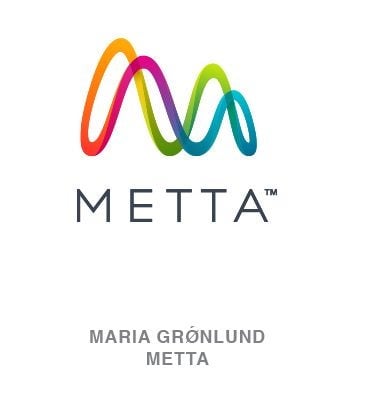
Performing a search on his logo research database LogoLounge, Gardner says he found nearly 1,200 logos that have featured a version of this graphic before. In fact, Danish graphic designer Maria Grønlund came up with a similar design for a startup that produces sleep trackers called Metta back in 2015.
Because of its ubiquity, Gardner predicts that Meta’s version will likely be the one to stick in people’s minds in the near future, saying, “Facebook’s [Meta] team will consume all the oxygen in the room when they implement this, and few folks will remember that anyone else was there first.”
Meanwhile, font fanatics can’t shake the name association with Meta, a celebrated sans serif typeface designed for the West German post office by Erik Spiekermann in the mid-1980s. The German designer recoiled that his work is now associated with Facebook.
At its core, a logo is a symbol—a container—for the network of associations and emotions customers feel about a company. The critical response to Meta’s logo is undeniably tethered to Facebook’s tarnished corporate reputation. It remains to be seen whether the logo will become an avatar for intellectual curiosity and positive human interactions, as Zuckerberg hopes, or yet another dispiriting capitalist symbol junking up all our interfaces.