This post has been revised and updated with comment from a Twitter spokesperson.
When companies tweak their designs, it often seems like little more than changing the drapes—or, literally, moving a few pixels around. But sometimes small changes reorient the user experience or quietly herald a shift in corporate strategy. So what to make of Twitter’s May 30 announcement that it was switching its main typeface from Neue Helvetica to Gotham?

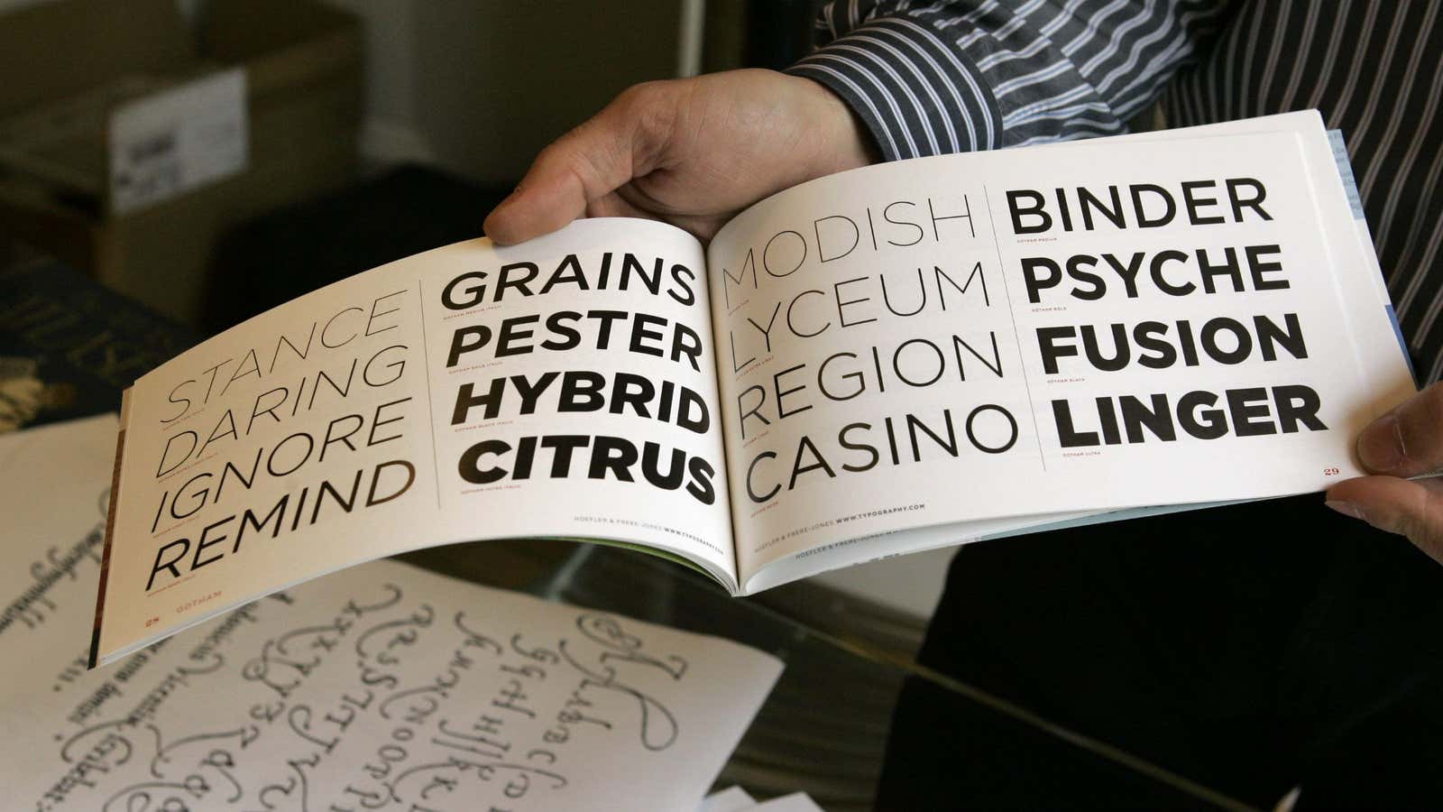
At first glance, Twitter’s typeface choice seems strictly practical in nature. Gotham’s roomier, more relaxed design makes it more comfortable than Helvetica to read on phones and tablets. (Contrary to Apple’s risible announcement yesterday that its upcoming OS X Yosemite will use Helvetica to improve legibility, the typeface isn’t easy to read on small screens.) Gotham is also familiar, having been used for everything from Saturday Night Live’s opening credits to Barack Obama’s 2008 presidential campaign. And for a “non-system” font—meaning, a font that’s not prepackaged in a given operating system—Gotham offers a decent ability to be rendered consistently among various platforms.
But not all platforms. In fact, maybe more interesting than what Twitter’s new type selection accomplishes is what it leaves out. Namely, most of the scripts used in the countries where it’s growing the fastest.
A big drawback to Gotham is that it lacks character sets for Arabic, Cyrillic, Indic, and other major non-Latin writing systems, says Stephen Coles, a typographer and the author of The Anatomy of Type. That’s despite the fact that these are increasingly popular on Twitter. Users who set their language to Arabic, Farsi, or Urdu will see tweets in Tahoma, a Microsoft typeface family that supports some but not all non-Latin scripts. (Indic, for instance, is left out.)
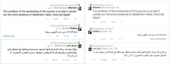
The result is a patchwork approach that reflects what Coles says is a scarcity of modern, well-designed, screen-optimized typefaces that cover the world’s major scripts. Take Arabic, for instance. Since Gotham hasn’t developed an extension for the script, people tweeting in Arabic will see Tahoma instead. But English speakers (or Twitter users who set their language to English but also tweet in Arabic) will see a mix of Gotham and Arial Unicode:

Here’s another view of how English-speaking or dual-language Twitter users will see a tweet in Arabic (again, with the English set in Gotham and the Arabic in Arial Unicode):

To typography experts like Coles, the visual clash between Gotham and Arial is jarring.
“The fallback for Arabic is a traditional calligraphic style, while Gotham is a very clean sans serif,” Coles told Quartz in an e-mail. “There are differing schools of thought on how to marry Arabic with Latin type designs (how much should you stiffen the Arabic to match the Latin?), but these two faces at least are certainly at odds with each other.”
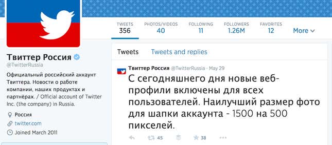
The clash is equally apparent with Cyrillic. Following the current fad for extra-thin typefaces, Twitter chose a light version of Gotham. The default for Cyrillic, Lucida Grande, is much more muscular in comparison:

It’s not that there aren’t other options. Coles says that Twitter could have chosen another contemporary, screen-friendly typeface that also provides non-Latin character support. Frutiger, for example, offers harmonious versions of Arabic, Cyrillic, and Indic. So does Fedra. (Better type support for Chinese, Japanese, and Korean is still a long way away.) Both Frutiger and Fedra also have the benefit of being less overexposed than Gotham, which has become nearly as ubiquitous as Helvetica in its heyday. Whether Twitter might one day choose a single type family that covers more of the world is anyone’s guess. A spokesperson for the company told Quartz, “Twitter can’t comment on future plans to standardize typefaces more comprehensively.”
Of course, grating typography isn’t the biggest deal in the world. But if it’s worth making the interface better for some Twitter users, why ignore the rest? Its selection of Gotham seems to suggest that Twitter isn’t directing attention and resources toward the users who make up the fastest-growing segment of its business. The message that sends could be trouble in the long term, no matter how pretty the face you put on it.
Update (June 5, 2014, 5:28 a.m. ET): This post has been updated to include a statement from a Twitter spokesperson as well as clarifications on how users’ language settings affect display typefaces.
