In 1933, Harry Beck introduced abstraction and simplicity to the world of transit cartography with his diagram for London’s underground system. Ignoring everything above the tunnels except for the Thames, Beck’s concept continues to influence subway diagrams to this day.
In 1933, Harry Beck introduced abstraction and simplicity to the world of transit cartography with his diagram for London’s underground system. Ignoring everything above the tunnels except for the Thames, Beck’s concept continues to influence subway diagrams to this day.
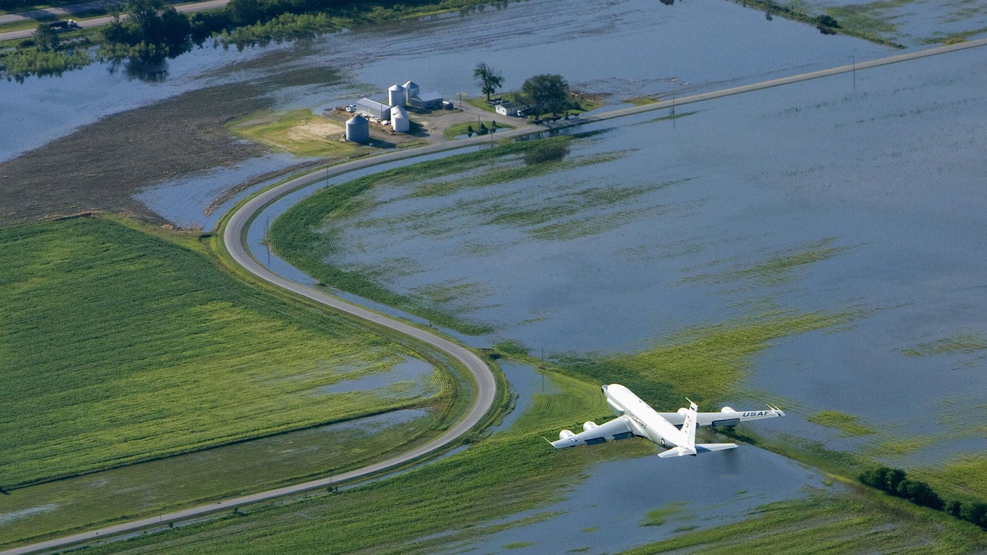
But what about maps for travel 30,000 feet above ground?
Join 500,000+ readers who start their day with Quartz.
By subscribing, you agree to our Terms of Service and Privacy Policy.
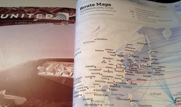
Open up an in-flight magazine or switch the monitor in front of you to the flight tracker and what you’ll likely see is a very literal interpretation of the ground below you: blue water, land that varies between beige and green, and mountains that keep their ridges. But since we already know where we’re going, why aren’t flight map designers stripping the details and looking to the likes of Beck or Vignelli for inspiration?
“They [traditional flight maps] are legitimately easier to use,” says Pentagram partner and designer Michael Bierut. “As opposed to locating your destination from an undifferentiated list of cities, you can do it by searching first for your destination continent, then country, then city,” he adds. “The additional information is clarifying rather than confusing.”
A map devoid of geographical details can still make clear to its users that Kansas City is nowhere near Miami—if it wants to. “The thing about flights,” says subway map enthusiast and designer, Max Roberts, “is that there’s no road or rails, so the maps can be as abstract as you like.” Unlike switching trains in a subway system, gate attendants prevent you from boarding a connecting flight to the wrong city, so referencing a map during a multi-stop flight is unnecessary.
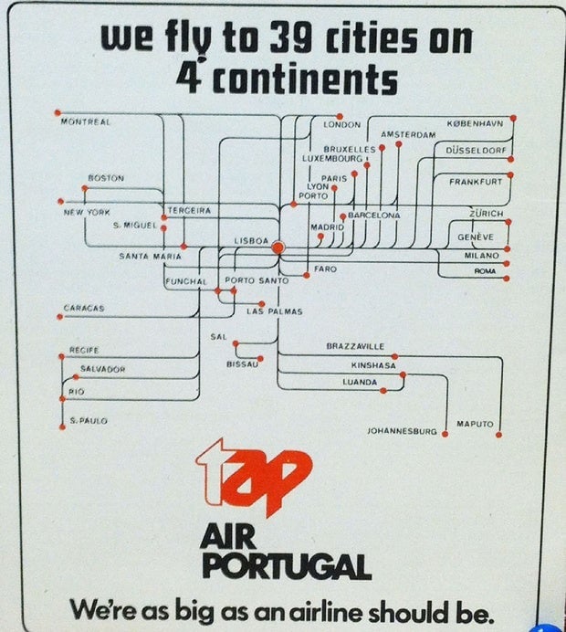
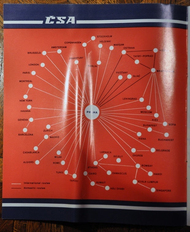
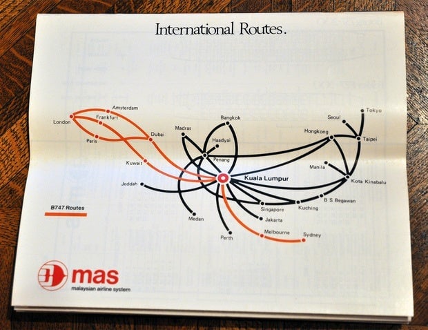
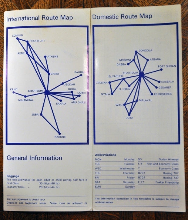
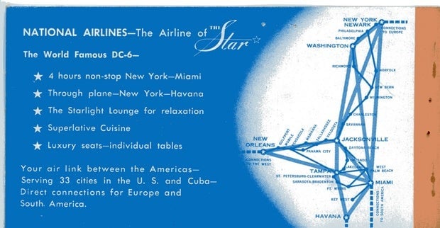
Some airlines have flirted with minimalism in the past. After inheriting a 1983 travel magazine of Portugal, which includes that shockingly restrained circuit diagram of TAP Air Portugal destinations you see above, I searched the internet for similar approaches—all of which were made before the 1990s. That’s probably not a coincidence.
Studying the TAP diagram, Roberts says that the design is interesting but he’d “likely then go to a travel agency and ask them to plan the journey and purchase the tickets” if he were looking at the map 30 years ago. An impulsive decision to travel from Montreal to Maputo would still mean having an agent remind you just how long and complicated the journey would be.
The average flight map we see today is as helpful to its readers as the airline. “A geographically accurate map allows the airline to dramatize its scope in a more vivid way,” Bierut says. “Think of those arcing lines connecting cities and the way they resemble flight paths. It’s advertising as much as it is information.”
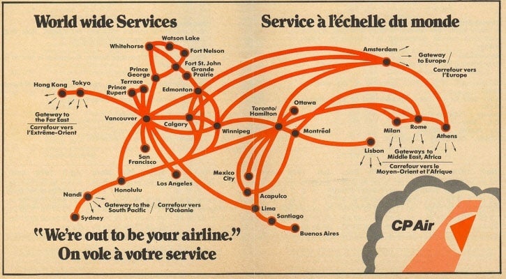
With minimalist cartography mostly left to rapid transit systems today, here are some examples of airlines trying out a similar approach in decades past:
Gentrification and the persistence of poor minority neighborhoods