The New York City subway of the mid-1960s was a chaotic mix of signage. With no overarching system to order them, decades of ill-matching signs fought for riders’ attention inside trains and subway stations, making for visual clutter and difficult navigation.
The New York City subway of the mid-1960s was a chaotic mix of signage. With no overarching system to order them, decades of ill-matching signs fought for riders’ attention inside trains and subway stations, making for visual clutter and difficult navigation.
Enter two young European designers, Massimo Vignelli and Bob Noorda. As I wrote earlier this year for the New Yorker’s Currency blog, in 1967 the New York City Transit Authority asked Vignelli and Noorda to create a uniform identity for the subway system that would clear aside the years of accumulated signs and give riders a firm sense of direction.
Join 500,000+ readers who start their day with Quartz.
By subscribing, you agree to our Terms of Service and Privacy Policy.
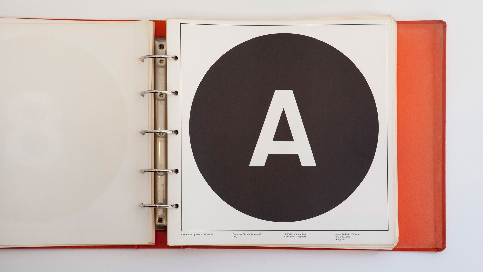
The result of their efforts, completed in 1970, was the NYC Transit Authority Graphics Standards Manual. It essentially created the face of the subway as we know it today, from the color-coded route discs to the modernist sans-serif typeface (originally Standard Medium, now Helvetica). The manual was distributed to signmakers, designers, workmen—anyone who needed guidance in building a piece of the subway’s sprawling identity.
To many designers, the manual became an exemplar of the form—and a design classic in its own right. But it was never intended for public consumption, and as the manual gave way to newer editions, the few remaining copies of the 1970 guide languished in filing cabinets or were thrown away. When Hamish Smyth and Jesse Reed, who work at the New York design firm Pentagram, stumbled across a copy a few years ago, it was buried under old gym clothes in a locker.
They digitized the manual, and now they’re reprinting it with the blessing of the MTA. A complete reissue, which includes a new essay on the manual’s history, is being sold on Kickstarter starting today, but only for a month. Part of Smyth and Reed’s deal with the MTA was that the book would be available for just a brief window. (Update, 3pm: If you’re in the US and wanted a copy, you’re out of luck. The 1,000 copies available were all claimed within a few hours. Some are still available for European shipping.)
In the meantime, their copy of the manual is showing its age. “Just last week we noticed a mouse took a bite out of one of the pages,” Reed and Smyth told Steven Heller at Print magazine. “Maybe he mistook Swiss style for Swiss cheese.”