The disappearance of Malaysia Airlines flight MH370 showed just how large the ocean is and how little we know of it. In fact, we know 100 times more (pdf, pg.121) about the topography of Mars than we do about the bottom of our oceans.
But we know a little more now: researchers from the Scripps Institution of Oceanography at UC San Diego and their partners were able to map the ocean floor in greater detail, coupling existing data with newly acquired gravitational measurements from the European Space Agency’s (ESA) CryoSat-2 and NASA’s Jason-1 satellites.
David Sandwell, the lead author of the study, tells Quartz via email that the improvements in mapping the ocean are akin to the difference between ordinary television and HDTV: “From a distance the two images look the same but as you get closer you can now see the seams of the football or the blades of grass in the HDTV but not the old analog TV.”
So what’s new? Previously, ships capable of mapping seabeds tended not to go to areas where there’s less biodiversity or older geological structures (like the southern hemisphere or away from seafloor ridges). So where information on those regions had been scarce, the satellites’ data was able to map them. Among never-before-seen seabed features, Sandwell and his team saw thousands of volcanoes on the seafloor and an 800-km extinct propagating ridge in the South Atlantic ocean.
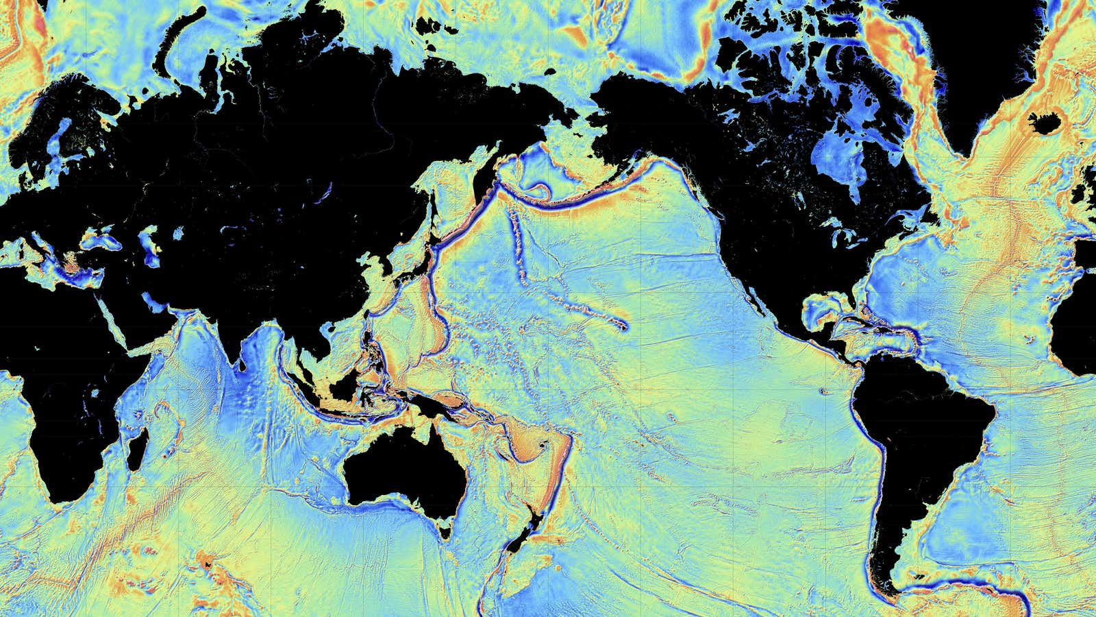
Here are some maps researchers created using data from the satellites:

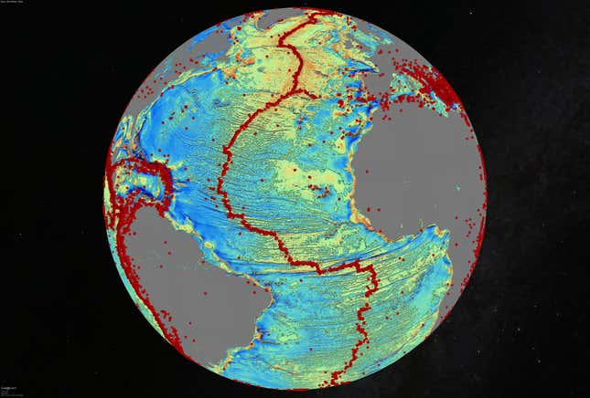
The image above is that of the North Atlantic seafloor and the colors represent the strengths of gravity’s pull, Sandwell tells Quartz. The blue areas have low pulls of gravity, green areas have a normal pull (pdf), and red areas—where earthquakes greater than a 5.5 magnitude have occurred and which follow seafloor ridges—have even greater gravitational pull. The colors also show where seafloor structures, like undersea mountains are located.

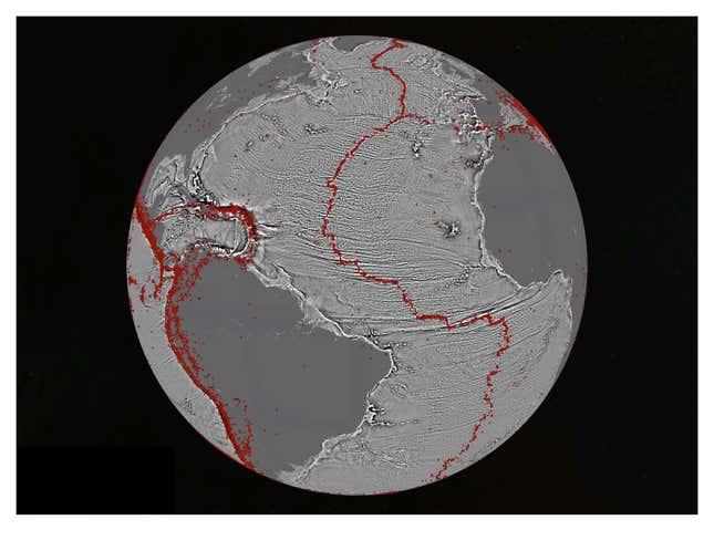
This is the vertical gradient version of the North Atlantic seafloor, which mainly reflects the topography of the ocean floor. The black and white creases are fracture zones created by seafloor spreading over 180 million years ago.

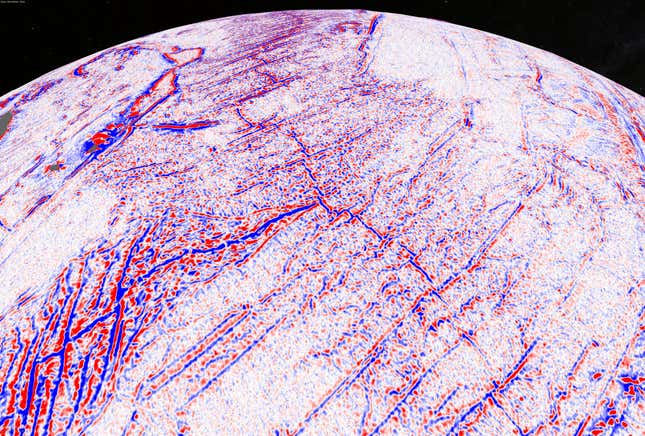
This image of the Indian Ocean “triple junction” shows the intersection of three major plates: the African plate (left), Australian plate (right), and Antarctic plate (bottom). Like the vertical gradient map of the North Atlantic seafloor, the red and blue colors represent fracture zones.
According to Sandwell, the new mapping capability is important for a variety of reasons:
- Public interest: The data will be used by Google Earth, which also shows views of the ocean, to provide information and a shape for what the ocean floors look like.
- Scientific discovery: The information is a breakthrough in understanding geological processes of the sea floor and allows others to remake the continental fragments of tectonic history.
- Military usage: The military could use this data for “inertial navigation” to correctly navigate where a missile or submarine is to go.
- Exploration potential: This data could be used as a reconnaissance tool for petroleum exploration by finding where the sedimentary bases are located.
