We make thousands of charts a year at Quartz, and when we receive complaints about them, it’s usually that the y-axis doesn’t start at zero.
Their point is that truncating the y-axis, as we often do in line charts, exaggerates what the data really say. Some people consider it a maxim that the y-axis should always be zeroed. They think to do otherwise amounts to lying.
But these complaints are wrong.
Charts should convey information and make a point. We make charts to illustrate ideas that have context beyond their x- and y-axes. Forcing the y-axis to start at zero can do just as much to obscure and confuse the point as the opposite.
Of course, there’s plenty of nuance to when it is and isn’t OK. Below are some guiding principles when it comes the y-axis.
Truncate the y-axis to emphasize what you’re trying to show.
Charts serve to illustrate ideas. If the price of a stock spiked upon news of an acquisition or plummeted on the rumor of a catastrophe, the chart should show a line that spikes or plummets.
A common complaint of this is that it gives the appearance of severity when none exists.
First, this is why charts have scales. Blaming a chart’s creator for a reader who doesn’t look at clearly labeled axes is like blaming a supermarket for selling someone food he’s allergic to.
Second, the degree to which the chart emphasizes certain aspects of the data is a judgement of storytelling not chart-making. Sure, this mindset can yield misleading displays, but how is that different than words? Charts should be fair, not impartial.
Truncate the y-axis when doing so is the norm.
Stock charts, especially intraday charts, use truncated axes. It’s a convention. The purpose of these charts is to show the tiniest fluctuations relative to where the price was moments ago, not relative to zero.
Truncate the y-axis when small movements are important.
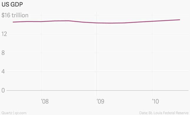
Which chart below is better at showing how the most recent financial crisis affected the US economy?

Can you look at the chart above and determine the low point of the recession? Can you determine how much US economic output shrunk? Of course you can’t, because plotting this on a zeroed axis at this aspect ratio obscures those ideas.
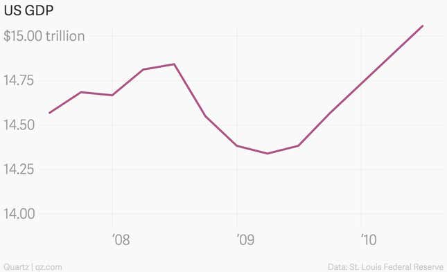
Now take a look at this chart. It’s the exact same data.

This chart clearly shows that the low point was in the second quarter of 2009, the result of a $0.5 trillion drop in economic output.
Edward Tufte, an expert in data presentation, agrees. “In general, in a time-series, use a baseline that shows the data not the zero point,” he wrote on his website, “don’t spend a lot of empty vertical space trying to reach down to the zero point at the cost of hiding what is going on in the data line itself.”
Truncate the y-axis when zero values are ridiculous.
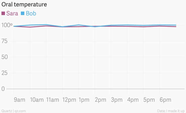
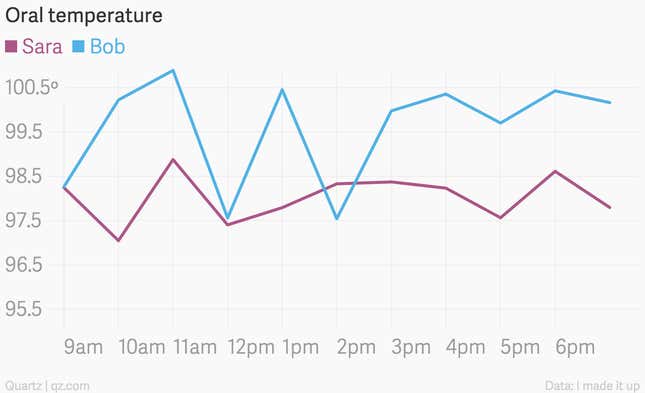
Charting is about being true to the data. Some data never falls to zero—the body temperature of a living person, for instance. Who has a fever, Sara or Bob?

Let me help by truncating the y-axis.

Feel better, Bob.
In other data sets, where zero values are technically possible, they are still worth omitting when the implication that it might reach zero is preposterous. Consider the labor force participation rate in the US, which is defined as:
All persons 16 years or older in the US classified as employed or unemployed as a percent of all persons 16 years or older persons who are not inmates of institutions, and who are not on active duty in the Armed Forces.
For this figure to fall to zero, every person in the US would have to either be younger than 16, out of work, not looking for work, furloughed, in the military on active duty, in prison, in a nursing home, or in a mental facility. (At which point, all of those facilities would have to be run by volunteers or members of the military.) The labor force participation rate has never been measured below 58%.
Real world example:
Real world criticism:
Putting a zeroed y-axis on this chart would suggest that it’s plausible that either every 15-64 year old in Europe could die or every person over 64 never had kids in their life. How’s that for upping the scariness?
Use a zeroed y-axis when it doesn’t matter.
None of this means you shouldn’t zero your y-axis. If doing so doesn’t obscure the point your chart is trying to make, or muddle the information, it’s often a good idea. The chart above works exactly as well with a zero axis as it does without it.
Always use a zeroed y-axis with column and bar charts.
Of course column and bar charts should always have zeroed axes, since that is the only way for the visualization to accurately represent the data. Bar and column charts rely on bars that stretch to zero to accurately mirror the ratios between data points. Truncating the axis breaks the relationship between the size of the rectangle and the value of the data. There is no debating this one (except for a few exceptions).
Never use a zeroed axis on a log scale.


