When you hear the word “luxury,” it’s easy to conjure up the colors gold, silver, and velvety purple; yet when it comes to typography, what we associate with wealth is less clear-cut. For the ancient Greeks, rare and precious purple ink came from sea snails found deep in the ocean, a dye so difficult to obtain it was reserved for kings. We don’t mine the sea for letters of the alphabet though, so what’s the typeface equivalent of purple ink, the fanciest looking font?
Writer and typographer Sarah Hyndman, whose last book explored the tastes we associate with different fonts, investigated the relationship between typography and cost in her latest survey at the V&A in London. Hyndman sought to find out whether a font can truly make a product appear more expensive, and also whether certain typographic characteristics have been consigned to the bargain bin.
After surveying over 368 people, the results suggest that bold typefaces with rounder terminals appear cheaper, whereas lighter weights, serifs, and contrasts are rated appear more expensive, with the modern Didot selected as the diamond of all fonts. This is perhaps, unsurprising; the serif is associated with fashion and you can find it on the mastheads of magazines like Vogue and Harper’s Bazaar.
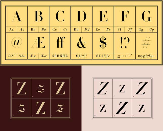
“I think cultural associations have a great deal of impact. We see these styles used repeatedly in a similar context, which reinforces the links,” says Hyndman of the results. Yet she also adds, “I imagine the delicacy of the detail is also associated with craftsmanship, skill, and quality.” For Hyndman, the trend was as expected because of the traditional associations between certain fonts and luxury goods, yet she was surprised to see that the Cocon Bold (bold with curved terminals, but a slight calligraphic feel) was rated as one of the cheapest. “I also hadn’t expected VAG Rounded Light to be rated as so cheap, as light weight typefaces generally score as nearer to the expensive end of the scale. Clearly the rounded terminals override the light weight of the typeface.”
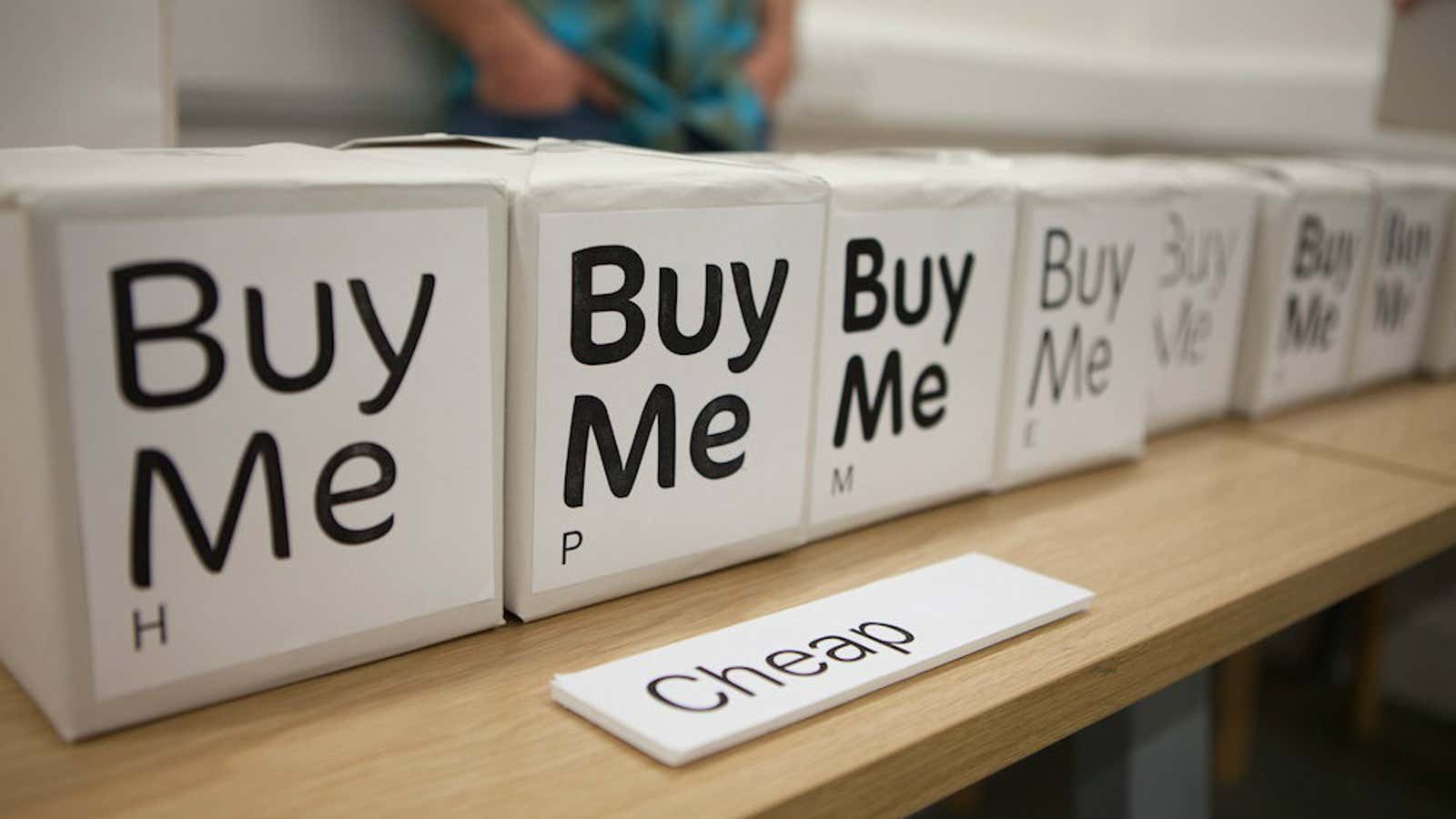
To determine what we associate with a certain typeface, the survey took place in a vacuum, with black fonts laid out against white paper, simply reading: “Buy Me.” Typefaces are rarely seen in such an isolated manner—adrift from any form of context—and I wondered whether the same associations come into play for a designer working on a luxury brand. Can a font or a group of fonts symbolize luxury, and therefore distinctiveness, if they’re commonly used? Creative director Roanne Adams of boutique agency RoAndCo sees luxury not as a static thing, but rather an “ever-evolving space” that a designer has the potential to mold.
“For a long time, thin, wispy, or high contrast serifs were common and seemingly only associated with luxury—think brands like Vogue, Ralph Lauren, DVF, etc.,” Adams tells me. “But as the industry evolved and looked for new customers, naturally a more subtle, less flashy aesthetic was born.” The look can’t stray too far from an embedded, inherited sense of worth, but it must look fresh and different.
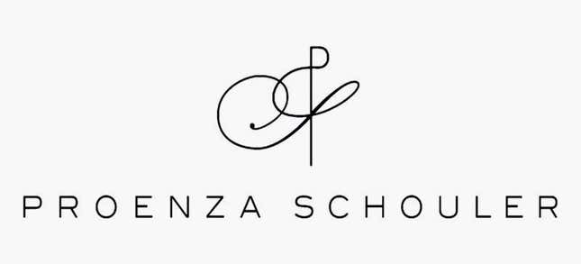
Adams points out brands like Celine, Proenza Schouler, and Acne, which have led the trend towards a more subdued, somewhat understated sans serif type system. The change suits the times. “Considering the digital space, the thin serif characteristics were hard to translate on screen, which has called for stronger, more usable and clear typography,” says Adams.
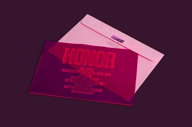
RoAndCo’s logo design for luxury brand Honor is a bold sans based on Compacta—not a typical “luxury” typeface. Yet it’s been carefully re-worked to generate the elusive associations of craft and essential uniqueness. The font was customized by thinning out the letters, and the symmetry of the brand’s name was emphasized by putting the H and R crossbars on a slant.
Perhaps the overall quality that creates a sense of luxury isn’t necessarily based on font characteristics, but rather the skill and craftsmanship behind the rendering of a final design.
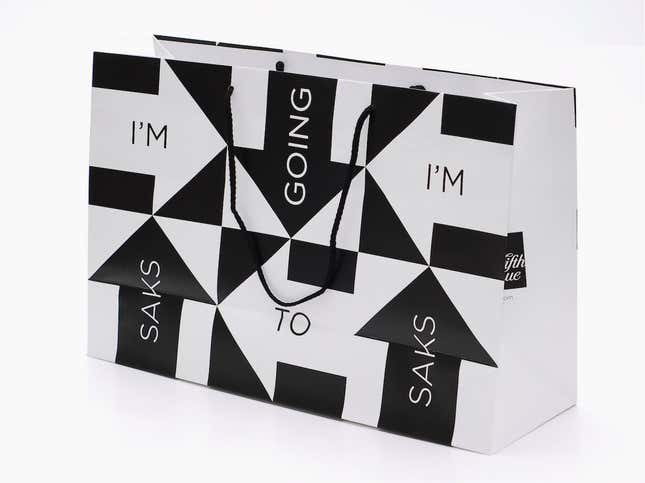
For type expert and designer Jonathan Hoefler, “the best fonts are those that can speak in different voices, and convey different things.” Hoefler tells me that at Hoefler & Co., they aim to evoke a range of feelings by supplying an array of flexible tools, and, as such, their fonts have been adopted by an assortment of brands. But context is everything. “This study’s results would suggest that our bold, sans serif Gotham typeface would be the darling of budget stores. But it’s based on the kind of lettering used by luxury brands from Chanel to Acqua di Parma, and it’s become the signature typeface of pre-eminent names from Saks Fifth Avenue to the Royal Opera House. Yet Gotham is also the signature typeface of Coca-Cola.” The idea of an expensive typeface, then, is difficult to pin-point; the same font can be equally effective for the most popular as well as the most exclusive brands in the world.
Perhaps there’s not an easy equation that relates a certain font’s characteristics to either value or luxury, but Hyndman’s survey shows that cultural associations are deeply engrained in the way we experience typography. Ultimately, whatever associations we might have, consumer trends and the context of a font can dramatically shift and change them. The budget end rips off ritzy, while discriminatory high style will compel those seeking exclusivity to head into less predictable territory, and come up with unexpected ways to denote the exceptional and select.
This post originally appeared at AIGA Eye on Design.
