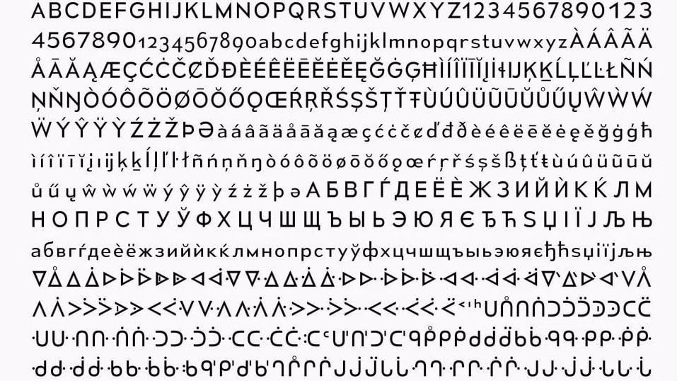
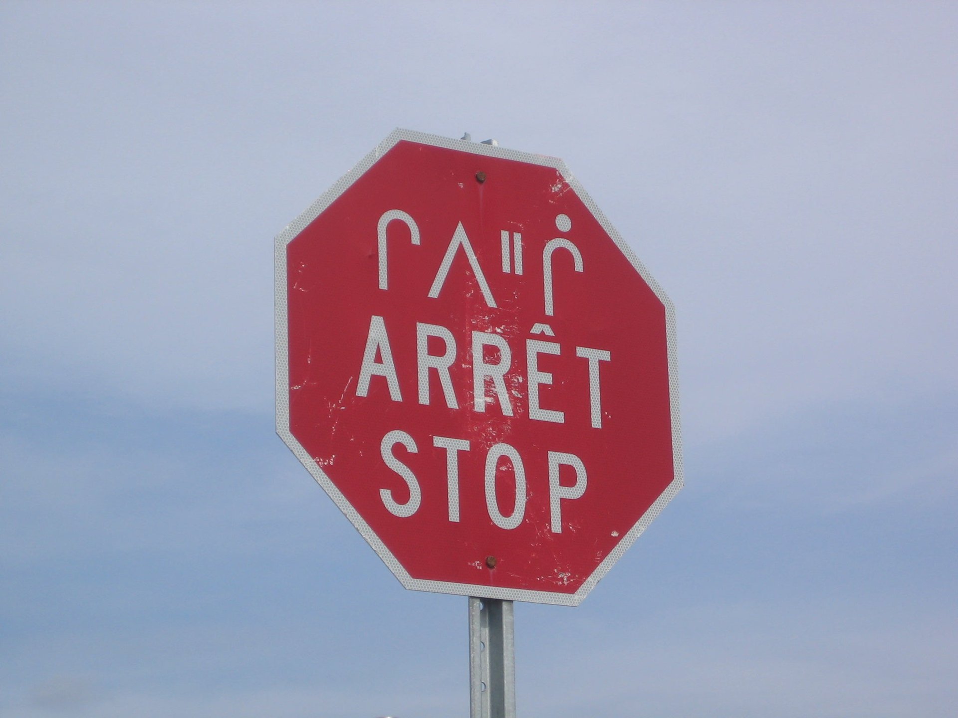
For the first time in its history, Canada has created a new “unified typeface” to represent not only its two official languages (French and English) but also its aboriginal languages.
For the first time in its history, Canada has created a new “unified typeface” to represent not only its two official languages (French and English) but also its aboriginal languages.
When the organizers of Canada’s upcoming 150th anniversary celebrations (in 2017) were looking for a font to use, they first checked the internet for a free solution. They found “Mesmerize,” a font designed by Canadian type designer Raymond Larabie. It wasn’t custom, but Larabie made it special—after being contacted by the government, the 45-year-old Ottawa native decided to update his angular sans serif type to be a little more inclusive.
Join 500,000+ readers who start their day with Quartz.
By subscribing, you agree to our Terms of Service and Privacy Policy.
Larabie added the typographic nuances of Canadian aboriginal languages like Cree, Inuktitut and Ojibway. “I’d brought up the idea with them to cover Canada’s first nations languages. They said they would have to discuss it and, y’know… I got the feeling bureaucracy was approaching,” Larabie tells Quartz. “So I just went ahead spent the next month adding all the first nations languages I could come up with.”
“It’s a chance to contribute to the 150-year development of Canada’s very own visual identity,” he wrote in a statement.
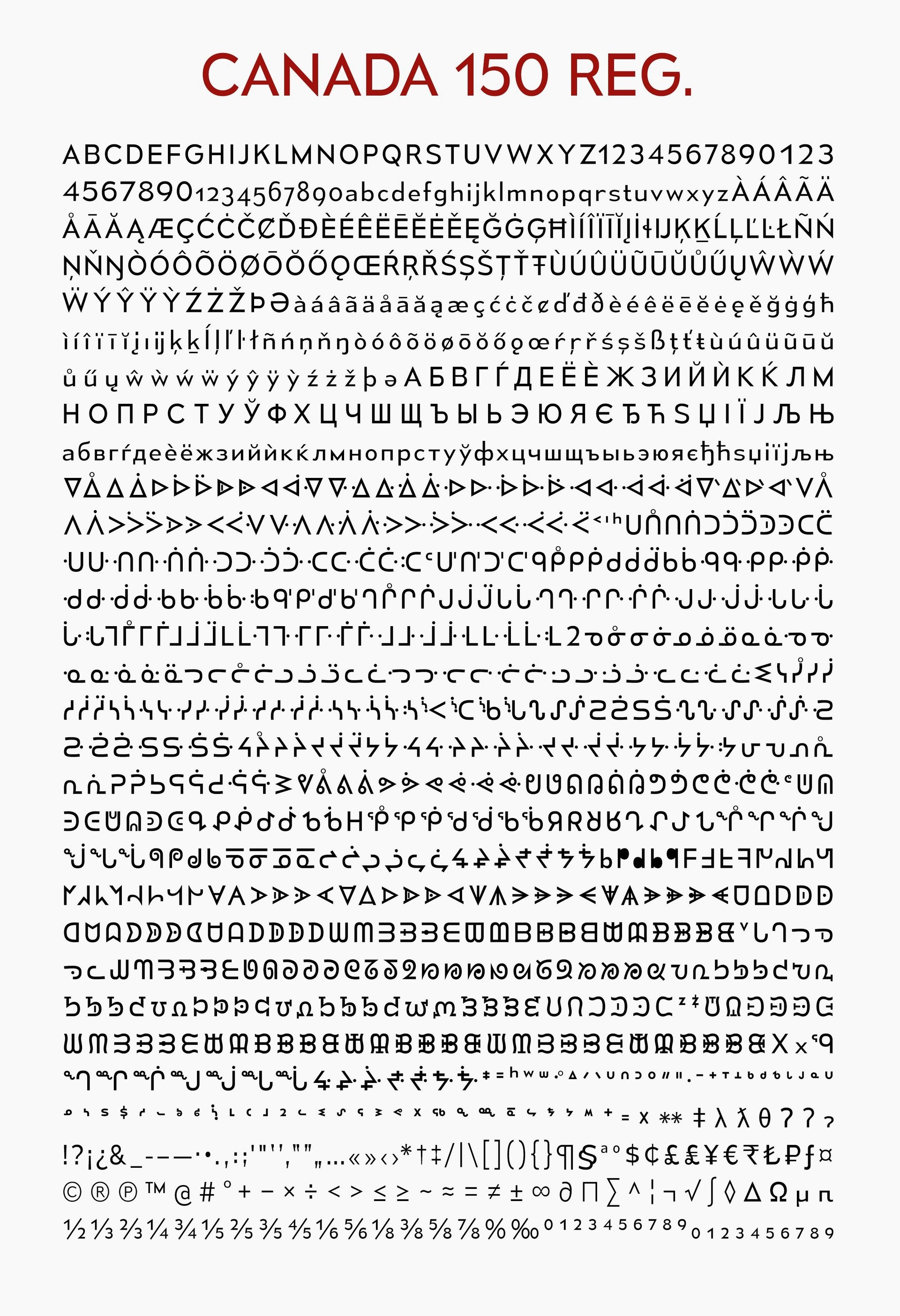
Larabie’s enhanced typeface, renamed “Canada 150,” is available in two weights, regular and light (notably, no bold or italics).
Here’s what the complete family looks like:
To get a further insight into Canadian Aboriginal Syllabics, Larabie studied pictures of handwriting samples and painted signs. He observed that the accents above letterforms are typically misplaced in most digital typefaces. “There are some aspects of the Latin alphabet that shouldn’t be imposed on other writing systems,” he says.
In the Latin alphabet, the letters E,L,T,Z are aligned horizontally, for example. In aboriginal languages, they’re aligned to the center. “I ran into the same problem with katakana writing in Japan: letting go of the idea of horizontal alignment…it’s hard to let go of something so ingrained in the Latin alphabet,” says Larabie, a former art director for video games who currently lives in Nagoya, Japan. Larabie now runs the type foundry Typodermic Fonts. (The logo for the game Grand Theft Auto uses one of his free novelty fonts.)
Announced on Dec 7, 2015, Larabie’s Canada 150 font will now be used by government agencies, but not without some controversy. The Canadian government, who has earmarked $210 million (approximately €140 million) for its sesquicentennial in 2017, paid Larabie zero dollars for his work. “They didn’t offer but I didn’t ask,” Larabie says.
That, with the creation of the nation’s new Canada 150 logo, designed by a 19-year-old student who was compensated $5,000 for the winning design, has raised eyebrows in the design industry. Many criticized the pre-Justin Trudeau administration under Stephen Harper, for requesting free spec work through the student competition and for excluding professional graphic designers from what is arguably the nation’s most new important branding project.