Fonts are used by all of us, yet understood by very few. Where do fonts come from? Who makes them? How do we know which one to use? And why are there so many?
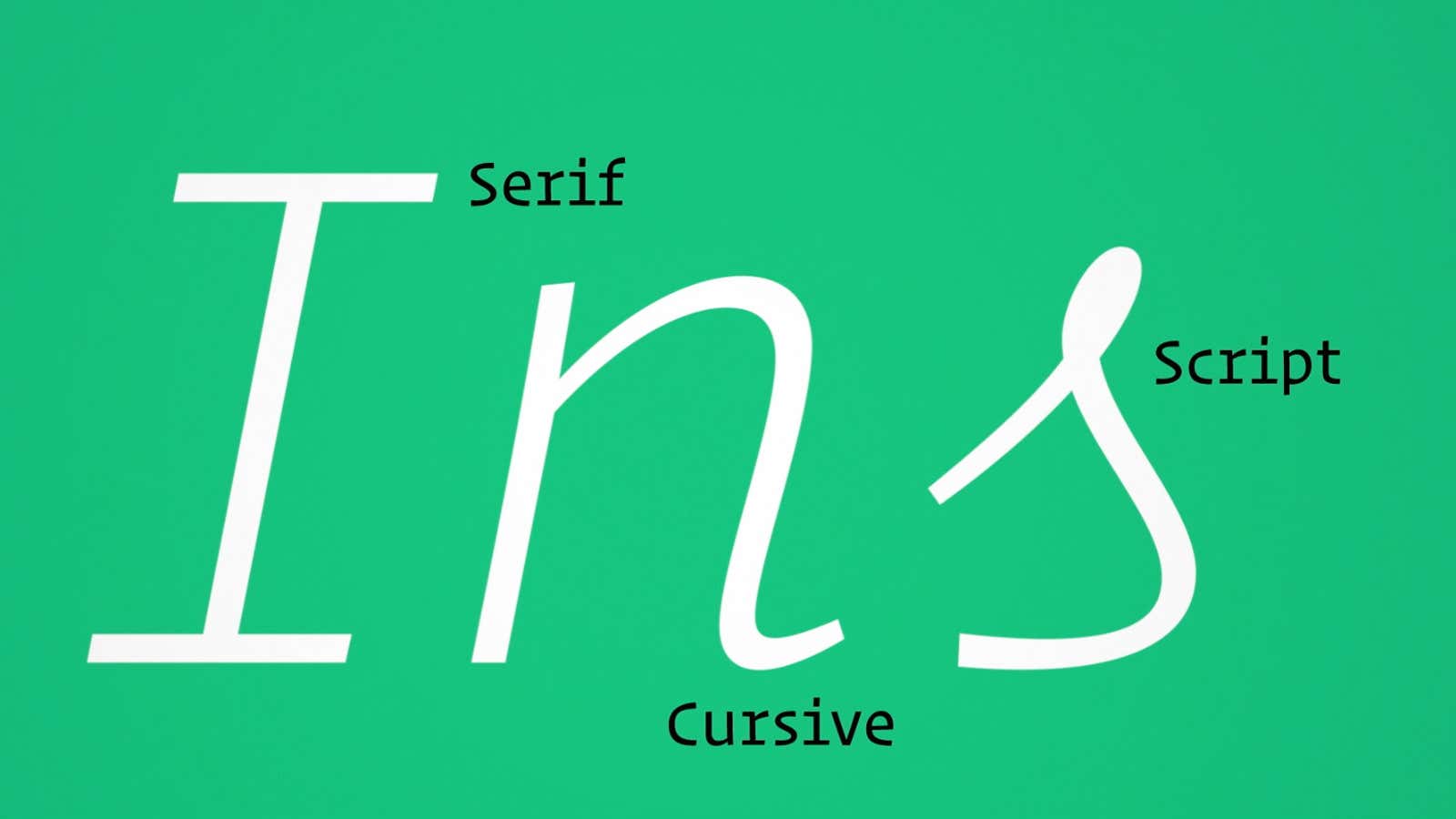
With the Feb. 9 release of a new typeface called Operator, renowned New York-based designer Jonathan Hoefler and his team at Hoefler & Co. have released a video that answers many of these questions. In four minutes, they explain the thinking behind their process through the case study of Operator, a modern take on a typewriter-inspired typeface. “Typewriter faces have become part of the aesthetic of journalism, fundraising, law, academia, and politics; a dressier alternative to handwriting, but still less formal than something set in type,” explains Hoefler in their company blog.
Most new fonts are designed to fulfill a specific business purpose or evoke a specific mood. With an efficient series of montages, Hoefler shows off Operator’s versatility for everything from programming code to composing love letters.
Among Operator’s unique qualities is its usefulness for coders. In other coding fonts (and even in the font in this post), the letters “l” and “I” is hard to distinguish from the number “1,” which can cause frustrating errors. Operator’s distinct italics, inspired by old IBM Selectric script letterforms, allow developers to efficiently highlight key words in their code and “color” or differentiate the syntax without actually using colors.
“It was an especially meaningful gesture to me, as someone who, like three hundred million others, is red-green colorblind,” Hoefler said.
The self-produced video, a first for the veteran designer, is also a clever marketing strategy to promote the font and his 25-year old practice. “The most challenging thing was finding ways to illustrate complicated concepts, like the difference between ‘fixed widths’ and ‘natural widths,’” explains Hoefler, who used some animation to unpack geeky typographic nuances for a general audience.
Type foundries compete fiercely to differentiate their fonts from the hundreds of thousands of typefaces available on the internet today, but they generally are less concerned about reaching the masses. (Unlike fashion designers, there are no regularly scheduled Font Weeks.)
Since majority of fonts are sold through third-party distribution channels, font makers’ sales pitches tend to be limited to commercial customers like graphic designers, advertising agencies, media outfits, or corporations who routinely pay hundreds if not thousands of dollars in license fees.
Hoefler & Co. sells their typefaces exclusively through their website, which allows Hoefler freedom to experiment with how to unveil his latest designs. Hopefully his experiments will continue to shed light on the hidden world of fonts for everyday users.
