Background
I created isitbrunchtimeyet.com a few years ago as a joke—one very much inspired by isitchristmas.com and isitlunchtimeyet.com. It has since been used mostly as a funny and/or slightly passive aggressive way to ask people to brunch. When I created it I arbitrarily set the brunch time to be 10:15am to 11:45am. It is that decision which leads us here—I want to do better than arbitrary.
Hypothesis
Twitter is a platform that allows users to “get real-time updates about what matters to you.” If we assume people generally tweet about things while they are doing those things then we can assume tweets containing “brunch” are generally happening while that person is actually having brunch. Therefore, if we collect enough tweets over a long enough period of time and analyze the time at which they were tweeted we could infer the specific time range in which brunch falls.
The data
We begin by using the Twitter Streaming API. This API allows us to subscribe to search terms, for example “brunch,” and get any tweet matching that term sent to our program in real-time. Not only did we collected “brunch” tweets but we also collected tweets containing “breakfast,” “lunch,” and “dinner” to use as controls (which we will review later). We allowed the program to run from 6/1/2015 to 5/31/2016 which yielded 100 million+ tweets for analysis. Twitter is global platform, so we have to do some additional work to understand the time of day a specific tweet is occurring. At the time of tweet we analyzed the timezone of the person tweeting, and any attached geolocation data (when available). Using this data we then made an informed estimate of the localized hour for each tweet.
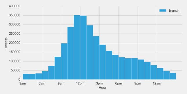
As a result, we are able to break down a count of tweets by localized hour:
Solution 1: The naive solution
Simply looking at the histogram above one will quickly notice that 11am is the most popular hour to tweet about brunch—which therefore means 11am to 12pm must be brunch time, right?
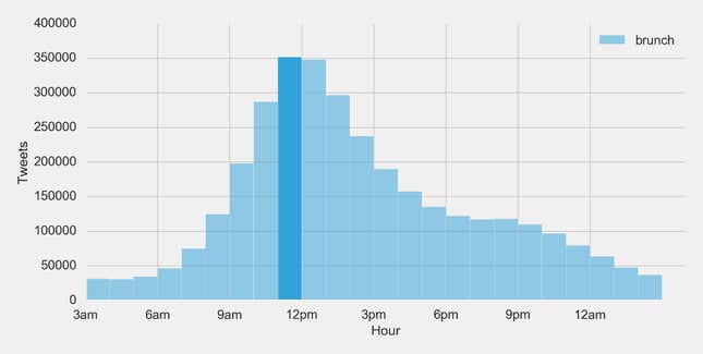
Well, that is a perfectly reasonable conclusion to draw. However, we think there is room for improvement. First, this solution lacks any real fidelity. It would seem unlikely that brunch starts exactly at 11am and ends exactly at 12pm. Second, if we look at the histogram again you can see that activity in 12pm is very close to 11am. This informs us that a lot of brunch activity takes place in the hours following 11am that this solution doesn’t take into account.
Solution 2: Probability density function
Since we are visualizing a histogram, it is logical for us to jump to a distribution function for further analysis. And since our data has a positive skew we will look to a probability density function (PDF). To start, we calculate the lognormal distribution PDF (the red line below) and locate the maximum point of that function (the mode). We chose the lognormal over the normal distribution because it appeared to fit the data better. We then identify the range in which a large portion, let’s say 1/4 (25%), of all tweets occur centered around that maximum:
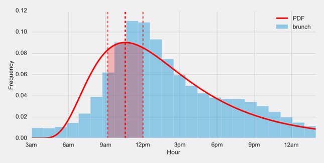
This strategy gives us a brunch time of 9:25am to 12:24pm. However, this strategy has a few drawbacks. First, the 25% occurrence is an arbitrary value. It’s no better than 30% or 20% or any other number. Second, the lognormal PDF heavily depends on how we think about the x-axis. In this example we start at 3am, which we only chose because it generally had the lowest tweet count of our data set (otherwise it would like slightly bimodal). If we instead started the x-axis at, say 12am, we would get a different curve. Third, looking at the graph it feels like it has a similar issue with our first solution in that it isn’t really capturing the long tail of activity in the early afternoon. Each of these arbitrary assumptions are unacceptable tradeoffs in our quest for an objective answer.
Solution 3: Spline interpolation
Splines allow us to create a smooth curve through many different points. Let’s make a curve through each hour and graph it:
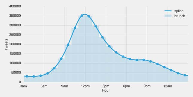
If we look at this curve we can see the maximum aligns very nicely with where we would intuitively assume brunch is occurring based on the histogram. Let’s give this maximum a name, how about Brunch Point? Brunch Point can be defined as: the exact time of day in which brunch maximally occurs. Based on our data that time is 11:56am.
Brunch Point — the exact time of day in which brunch maximally occurs

Now, that appears to be an excellent answer! However, we are looking for a time range, not just a point in time. So how can we calculate a range from the spline? Remember calculus from high school? This is the real-life-use case for calculus that was promised by your professors! Let’s look at the derivative:
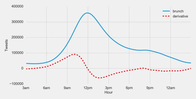
Don’t have your calculus books handy? What is a derivative? The derivative of a function will give us the rate of change (a.k.a. the slope, a.k.a. the m in y = mx + b) of a function at any given point in time. It helps us understand the acceleration of a function. Let’s find the tangent lines with the highest and lowest slope:
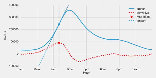
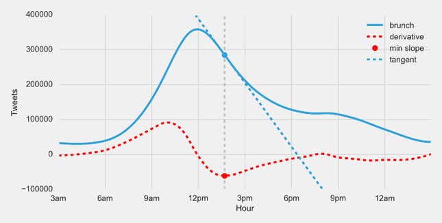
At that maximum slope, the number of brunch tweets is experiencing its highest positive rate of change: people are speeding up their tweets about brunch—pushing hardest on the gas pedal. At the minimum slope, the number of brunch tweets is experiencing its highest negative rate of change: people are slowing down their tweets—pushing hardest on the brake pedal. Using these two points we get a brunch time of: 10:01am to 1:40pm.
We like this method the most for several reasons:
- It appears to capture the “gut feeling” we had in our first solution—it feels correct when you visualize it.
- It uses a spline which will remain very consistent even if the x-axis is translated.
- It is based on concepts that we are very familiar with—acceleration and deceleration.
But how do we know if it’s correct? Let’s apply the solution to other terms and observe how it performs.
Comparing data
For comparison let’s look at the splines for “breakfast” and “lunch” tweets:
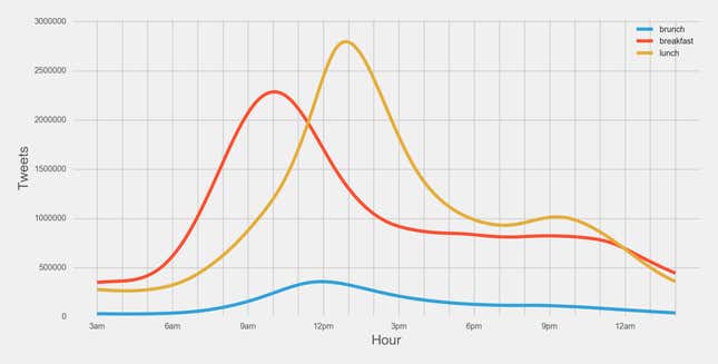
Since “breakfast” and “lunch” are more popular terms on twitter than “brunch” let’s modify these curves to be based on frequency—which makes it easier to see the distinctions between them. Then let’s also apply the solution above to get a sense of how they compare:
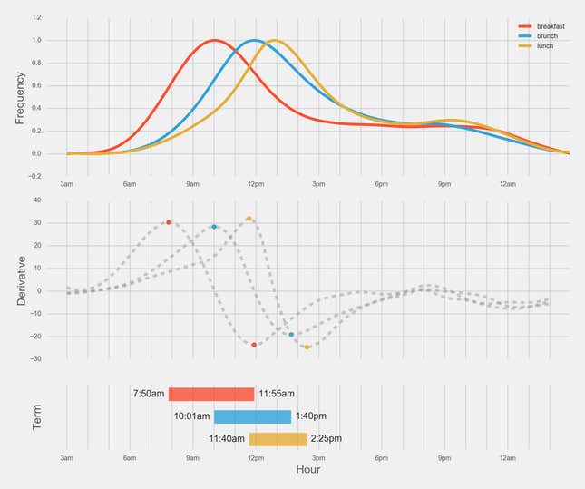
Finally, we have some results:
- Breakfast: 7:50am to 11:55am.
- Brunch: 10:01am to 1:40pm.
- Lunch: 11:40am to 2:25pm.
So that’s it—brunch is officially from 10:01am to 1:40pm. It is interesting that the end of breakfast and the beginning of lunch are within 15 minutes of each other. It’s also interesting that Brunch Point falls in that same time frame as well. Both of which give this solution at least a little bit of affirmation.
Now go eat some brunch!
tl;dr—Brunch is officially from 10:01am to 1:40pm, based on 100 million+ tweets and analysis.
All analysis and charts were done in python using pandas/matplotlib. Source code: https://github.com/bjacobso/brunch
This post originally appeared at Medium.
