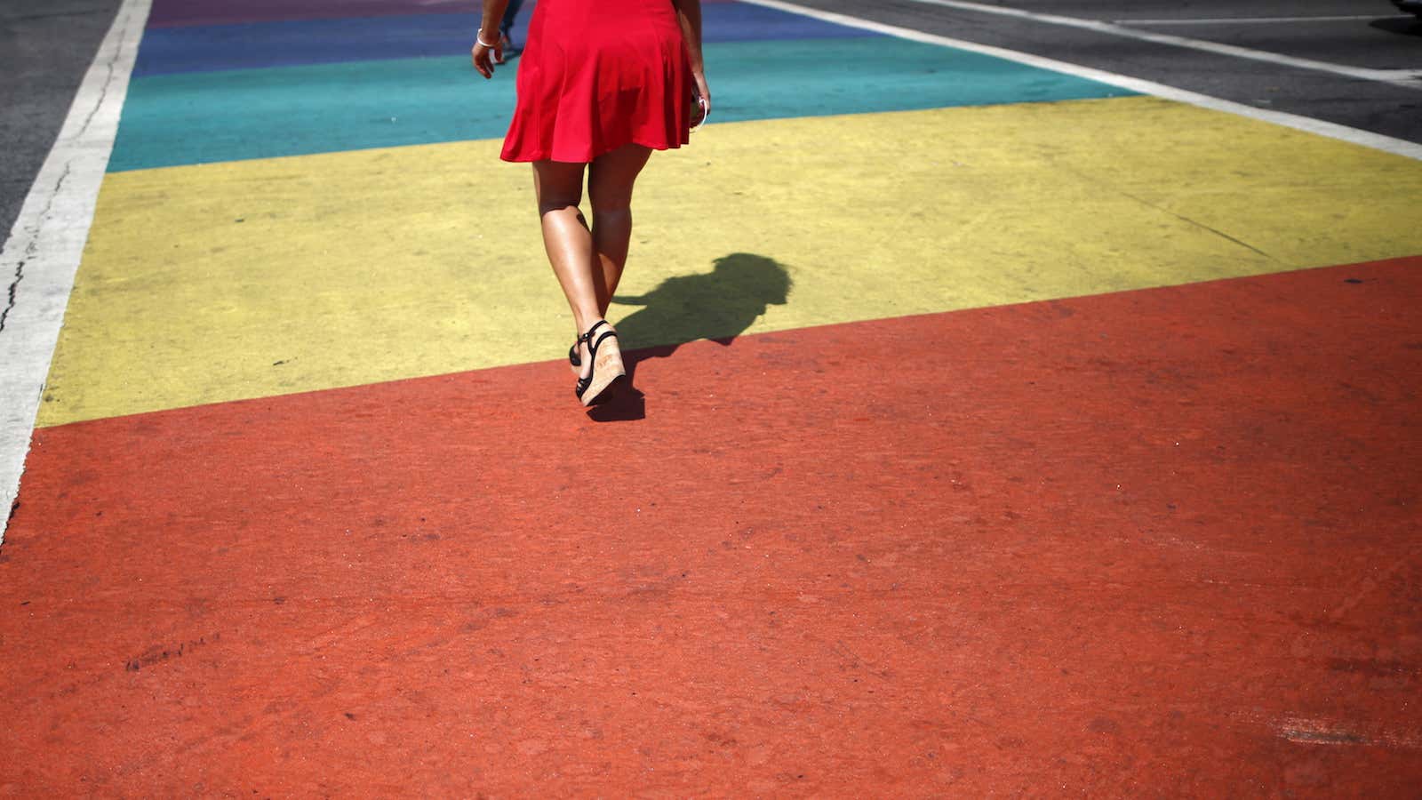
When we’re born, we emerge into a world of color, the light frequencies dancing across our newly exposed pupils. Over the course of our first year of life, our perception of color and depth sharpens. Over the course of our lifetime, colors guide us through a complex world and help shape our understanding of it. But colors are also constantly influencing our behavior, emotions, and physiology in ways we may not even be aware of, especially when it comes to the digital world.
Some theories suggest that our psychological color associations have evolutionary roots and are related to natural phenomena: We’re calmed by blue colors that remind us of water, warned by reds that remind us of blood, and encouraged by greens that remind us of healthy plant life. You can see this research at work in the use of blue in the Facebook logo, the red of a warning message, and the green of an affirmative call-to-action button. These innumerable small choices have given way to instinctive color associations that persist to this day—such as Tim Berners-Lee’s decision that these hyperlinks you’re currently reading would be blue.
Designers and researchers are now expected to A/B test and experimentally determine the “right color” for just about every element of a website or app. In this case, “right” means the color that is most likely to encourage users to complete a call-to-action. These experiments help designers create iconography that draws more people in, and convinces them to spend more of their time in that experience.
In this way, colors are engineered to get you to keep using an app, promote a game to your friends, or pay money for a service. Politicians, social networks, music streaming services, and dating sites all use these kinds of A/B experiments. And you probably don’t even realize it most of the time.
For example, remember how hyperlinks are blue? You may or may not have noticed that every now and then Google just slightly changes the color of links in your search results. They do this to analyze the different ways people respond to different shades of blue—and even black. Blue is the “most recent” color that humans have learned to distinguish, so there’s a lot of room for experimentation to understand how this color affects our behavior with technology.
But before we had blue logos luring us in and red buttons keeping us from unsubscribing, we had black and white.
In early cowboy films and television shows, the “good guys” wore white hats and the “bad guys” donned black ones. This was chosen as a convention of the black-and-white film medium without market research or psychological studies (which weren’t really a thing in 1903 when The Great Train Robbery came out). However, more recent studies have shown that this was more than an aesthetic choice: Soccer and hockey players in black uniforms are perceived as more aggressive (and thus receive more penalties) than their comrades in white.
When it comes to design, black and white form the foundation for contrast. While it may seem simple, contrast is responsible for our ability to read the content of our many screens and can be used to draw attention to the most important parts of a page—a “BUY” button, for instance. There are a number of minimalist websites that use only black and white: The site for Code and Theory is a particularly striking example of digital storytelling using these colors.
Meanwhile, red and blue are standard team colors both online and offline. It turns out that even this seemingly incidental binary often gives an advantage to whoever sports red.
In combat sports, martial artists of equal abilities are randomly assigned a red or blue uniform. Those who are assigned red are more likely to win, according to a 2005 study. In fact, red-clad combatants are more likely to be perceived positively by judges even when the same footage is shown with the clothing color digitally swapped. And in first-person shooter games, red teams statistically win more often than blue teams.
In digital design, red is used to scare us away from unwanted or irreversible actions. If we’ve already put in our credit card info, it’s likely that site will try very hard to discourage consumers from getting cold feet using the size and color of buttons guiding us toward our final purchase.
One theory for why this seems to work is that we hold associations with the color red as aggressive, bloody, and frightening. In competitive sports, this makes both the wearer and the perceiver feel powerful. Online, it makes us feel anxious and discouraged. (Kind of makes you wonder about red and blue being used to signify political parties, right?)
We increasingly see the world through a glass window. But this world of pixels is still made of color and light, and all that color is begging us to spend more time and find more information and buy more things and have more friends and find more time. In this game where more is always better than less, it’s helpful to be aware of how the rainbow in front of our eyes is influencing the unconscious decisions we make.


