There’s drama behind every designed object.
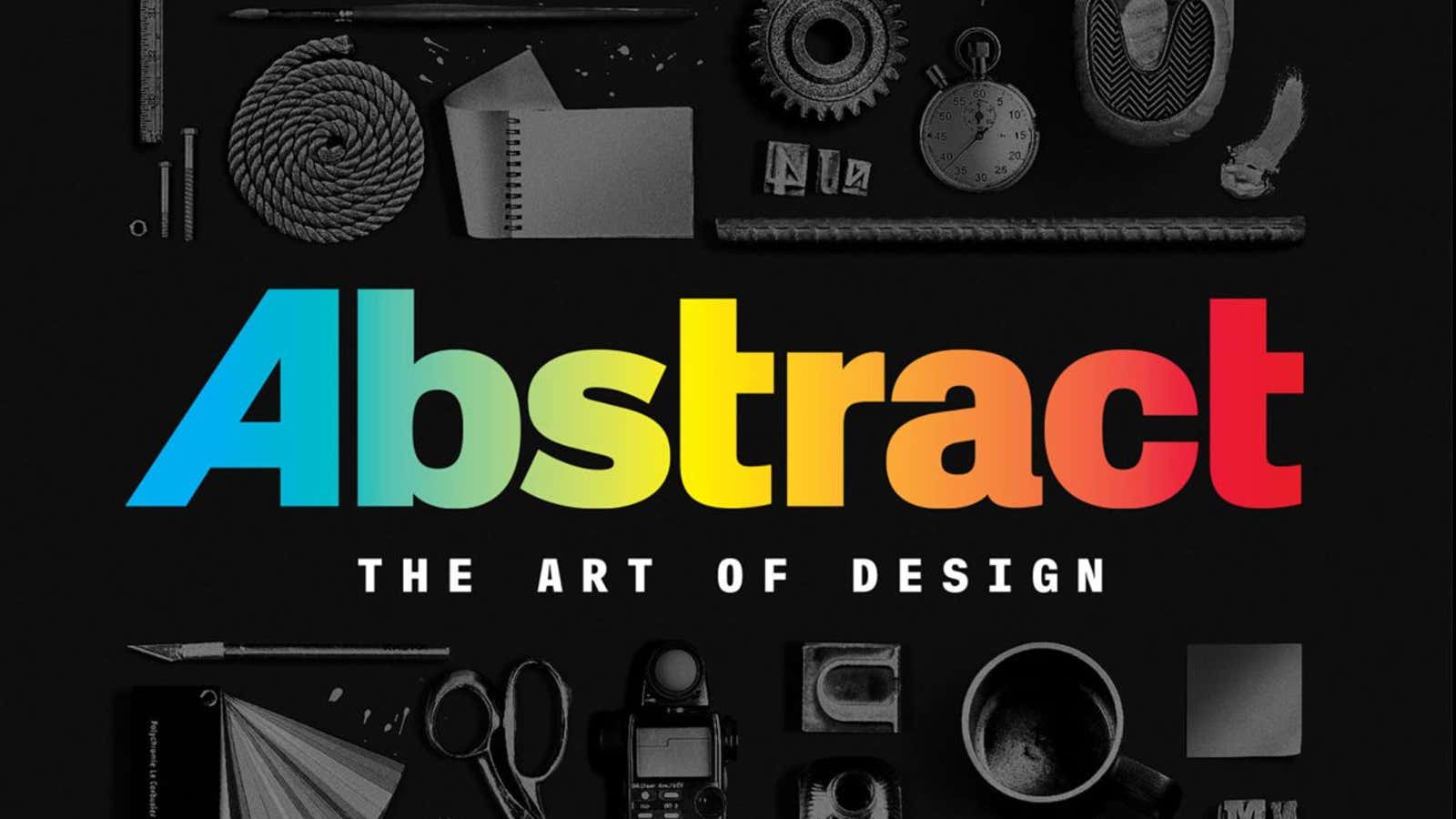
Design is the animating force behind brands, buildings and interfaces, and so an engrossing series that explains to a general audience what actually goes on behind the scenes was long overdue. Many designers hoped that Netflix’s Abstract: The Art of Design (released Feb. 10) would do for design what Chef’s Table did for food: Through a series of beautifully shot (if at times overly dramatized) profiles, Chef’s Table gave viewers a global sampler of the most creative minds working in the culinary industry.
But after a fortnight of trudging through the first season’s eight 40-minute episodes, I found Abstract puzzling and on the whole, tedious. It’s unfortunate because Abstract’s stellar cast of superstar designers—including graphic design legend Paula Scher, Nike shoe designer Tinker Hatfield, and architecture’s “wacky wunderkind” Bjarke Ingels—are some of the most winsome and articulate ambassadors for their specialization.
Abstract‘s biggest folly is its premise. It starts with the title. The word “abstract” is a term that aptly describes the evocative work of artists such as Jackson Pollock and Wassily Kandinsky, but is totally wrong for design. Designers, in fact, are obsessed with the concrete: specs, measurements, budgets, deadlines, and countless other details. A designer’s creativity is always directed—the quest is to materialize elegant ideas to beautiful forms.
And to equate design with art is lazy, and promotes an outdated myth. Romanticizing designers toiling at the proverbial “drawing board” undermines the breadth of tasks and hurdles they go through, beyond the inspiration stage. Abstract becomes most interesting when the designers featured on the show wiggle out of these artsy clichés.
For example, in episode six, graphic designer Paula Scher diagrams out the usual arc of client presentations, offering an astute insight on how to steer client meetings to your advantage. The secret, says Scher, is knowing when to end a meeting:
The meeting must end here. What will happen [if it goes on] is the counter rebuttal to your offer will go below the reasonable level of expectation and then come back just nearly above it and will continue on until you reach sudden death. They want proof that this is really, really going to work. The problem is that there isn’t proof—it’s how people see and perceive and accept things.
Then, in episode seven, photographer Platon (Antoniou) offers an unforgettable reflection on parenthood: “It’s funny because I’m actually the one who freezes time, so I know how precious every moment is. And I’m trying to squeeze it so dry every second.”
Over-designed documentaries
Abstract aspires to dazzle the audience with a visual feast. In a Wired article published in January, the show’s creator, Scott Dadich, promised a respite from the slow ”coffee table book” style of design documentaries. “If I may geek out for a moment, aside from the usual Steadicams and drones, we used anamorphic prime lenses—the best glass on the market—mounted on a Red Epic Dragon camera shooting 4K HDR,” wrote Dadich.
From the lively (if totally expected) opening credits that pay homage to Saul Bass to the spectrum of camera treatments it tries out, Abstract tends to punctuate every other point with a medley of special effects. In some episodes, directors even insert startling surrealistic moments that make the viewer question whether what they’re getting is still “socio-cultural documentary,” as Netflix describes the series.
In the first episode, the prodigious German illustrator Christoph Niemann enters a white visual field and interacts with his drawing, as if in an Apple commercial. In another, Ingels appears on the screen as a double image of himself; the right-hand Bjarke smirks as left-hand Bjarke confesses his angst. These stylistic reveries felt unnecessary. They might be pretty flights of fancy and fandom, but not only do they distract from the protagonists’ already compelling stories, they also undermine the truthfulness of the whole thing. Is this a serious documentary? Is this an infomercial? Is this a promotional video? Is it commercial art?
Same old, same old
After about 15 minutes into each episode, my attention would inevitably drift because there was a gnawing sense that I’ve heard all these stories before. Abstract falls short of captivating the general audience, and it’s also likely to lose professional designers, because it rides the usual design narratives we’ve all seen and heard in print, podcasts, and lectures.
Helmed by Dadich, Wired’s former editor-in-chief, the series is based on the magazine’s 2014 design conference, as outlined in a leaked 2015 internal memo. Perhaps this explains why most of plot lines broached by Abstract feel so familiar. Each episode feels like a highly-produced version of the same conference speeches these design luminaries have been giving. Same case studies, same jokes, same witticisms, and in some cases, even the same illustrations.
Translating a canned conference talk is easier than doing new research. It’s perhaps most disappointing for designers who avidly follow the circuit of design gatherings each year. The series offers scant new information, save from the thrill of seeing their idols lionized on film.
That Abstract calls on the usual roster of design stars also exposes the curatorial myopia of many big design events. Design is still all too often defined by a small coterie of designers—the majority of whom work in the US or Europe.
Blind hero worship is dangerous for any industry—especially for such a consequential profession like design. Telling a designer’s story without criticism is like creating a plot without the central conflict. By glossing over moments of friction, the series misses the chance to educate the public about the gnarly process of design—and earn our undivided attention.
For its next season, I’m hopeful that Abstract’s filmmakers will get over their obsession with camera tricks and dazzle us with original stories from new places. Design, especially when contextualized by history, politics, and science, is thrilling in itself.
