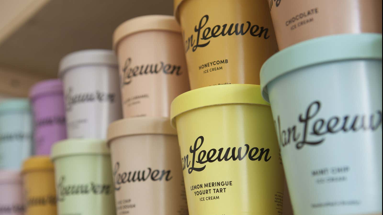
A curious thing happened when high-end ice cream brand Van Leeuwen redesigned their packaging: People began snapping pictures of supermarket freezers.
“Didn’t even crave for ice cream but just because of the cute packaging,” wrote a customer who shelled out almost $20 for a pink pint of strawberry and an amber-colored container of salted caramel. Such transactions driven by eye-candy, coupled with a new distribution and merchandising scheme, saw the nine-year old Brooklyn business boost sales by 50% since last fall.
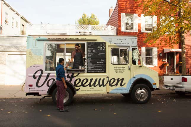
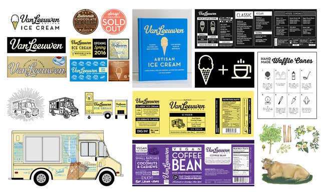
Redesigning packaging so it “looks good on social media,” is a deliberate strategy. Van Leeuwen co-founder Laura O’Neill and partners Pete and Ben Van Leeuwen worked closely with storied design firm Pentagram to make their pints and trucks ”very Instagrammable,” says O’Neill.
Investing in beautiful and distinctive food wrappers, cups and containers has proven to be a boon for small businesses and mom and pop coffee shops. Even with no advertising budgets, their products reach a wider audience through foodie Instagram feeds. The classic example is Mast Brothers, the Brooklyn-based chocolate shop who wrap their subpar chocolate bars in beautiful patterned papers. When the French bakeshop Maman first opened, they gained renown not for their delicious nutty chocolate chip cookies, but for the patterned blue-and-white coffee cups. Co-owner Elisa Marshall says they attract 80% of new customers from Instagram.
The emphasis on aesthetics over flavor is flipping the formula for food start-ups. O’Neill explains that since the rebrand, they’ve been getting feedback like “we bought this because it looks pretty, and it tastes great!”


In the $10 billion-a-year ice cream industry, the key to Instagram-success is simplicity. Pentagram partner Natasha Jen advised Van Leeuwen to eliminate the usual hokey motifs associated with ice cream—cows, fruits, milk gallons—and reduce their brand elements to colors and hip typography. “I think the shape and form of an ice cream pint, first of all, is a universal language…that already says ice cream,” explains Jen.
To keep the focus on Van Leeuwen’s brand, Pentagram retained their familiar logo. The charming script created by graphic designer Cathe Holden also lends an approachable, nostalgic aesthetic that prevents their new minimalist package from looking too er, cold. The plain background also allowed them to display a larger logo on pints to help Van Leeuwen stand out in the increasingly crowded artisanal ice cream freezer section.
Expanding on Van Leeuwen’s original creamy pale yellow brand color, the design team focused on the “agonizing” exercise of assigning hues to each flavor.”We thought the best way to express flavor and create a kind of deliciousness and increase people’s appetite is through these pastel colors,” Jen explains. Because Van Leeuwen doesn’t use food coloring, it wasn’t a matter of simply matching the color of the ice cream to the outer package. Sampling every flavor and looking at color swatches, the team debated weighty matters like, Is earl gray blue? Is vanilla yellow?
“We’ve had agonizing color processes since the beginning,” laughs O’Neill, explaining that when they founded the company, she and her co-founders scoured Pantone books before finding their signature yellow from a vintage General Motors car color book.
After stripping away all visual elements, Van Leeuwen kept one line on the face of their ice pints as a nod to their heritage as a pioneer of the mythologized New York hipster food movement. In small sans serif type, it reads, “Handcrafted in Brooklyn.”
