When indie rock band OK Go releases a new music video, people are prepared to be amazed. The 19-year-old group is a reliable factory of startling and sublime visual spectacles, churning out new releases that feature everything from treadmills to zero-gravity chambers, trained dogs, optical illusions, and paint bombs.
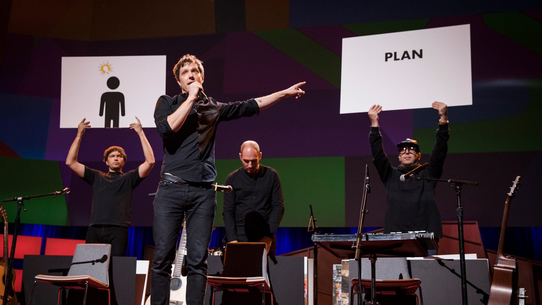
So what’s the secret to their creativity? Obsessive planning, according to the band’s lead singer and guitarist Damian Kulash. Introducing “The One Moment,” a single-take 2016 video filmed in the span of 4.2 seconds, Kulash said that he spent a full month putting together a giant spreadsheet to map out the choreography of color bursts, water bombs and exploding guitars. ”My play space was 400 lines long and 25 columns wide,” he said during an April 24 performance at the TED conference in Vancouver.
Kulash has directed several of the band’s most popular videos, including 2014’s “The Writing’s On the Wall“ as well as “The One Moment.” He explains that because OK Go uses very little CGI and does minimal post-production work, they have to be meticulous in their approach. For 2010’s “This Too Shall Pass,” they constructed a Rube Goldberg machine, with a 130-object domino sequence, filmed in a single take. “So your chance for success is literally one in a million,” he said. “That’s not a gamble I want to take.”
The OK Go co-founder laid out several other principles that inform his band’s approach to creativity:
For OK Go, creative spontaneity happens in the beginning of the process. The band heads straight to each music video’s location, using it as a laboratory for ideas.
“We try to find a sandbox and we gamble a whole lot of our resources on getting in that sandbox and playing,” said Kulash. ”We have to trust that the process in the sandbox will reveal to us which ideas will not only be surprising but surprisingly reliable.”
For 2012’s “Upside Down & Inside,” for example, the band spent a week and a third of their production budget inside a Russian Il-76 aircraft, bouncing around ideas in the zero-gravity “vomit comet” at the Yuri Gagarin Cosmonaut Training Center in the outskirts of Moscow.
Bucking the trend for slick computer-generated animation, the most thrilling OK Go videos showcase the charming and surprising live-action choreography of analog causality. “What happens in that room is real, and we want them [the audience] feel that it’s real and see that it’s real,” he said.
Flashing a picture of the collaged walls of his teenage bedroom, Kulash said that he thrives in “visual maelstroms” and loves finding unexpected connections between objects. A former graphic designer who worked on banner ads for the Pillsbury Doughboy campaign, Kulash told Quartz that he found the template-based production design job deadening. “Making a banner ad with a color I hate and a font I hate for a character I’m not particularly inspired to work with … at the end of an eight-hour day as a graphic designer in that capacity, I was wrecked,” he said.
Kulash’s rebellion against templates is also apparent in his work as a songwriter. ”When I’ve tried to write songs for other people, if I’m inspired with what they’ll do with it, I can write a great song. But I’m not the best person [to write a song] when they’re like, ‘We want something that sounds like Spoon but it’s gotta have a little more Beatles.’ When people ask me to write to spec, it is no longer fun for me. I get bad at it.”
Kulash loves “tight, nerdy design” such as Swiss grids, stripes, and clean typography. He’s particularly prickly about the correct use of fonts. “I hate it when people misuse Bell,” he said, referring to the sans serif typeface specially commissioned for AT&T $T phone books. Bell (Gothic and Centennial) is a classic example of strategic design: Tiny notches were intentionally cut into letterforms to catch the swell of ink when small letters were printed in the phone books. Without the notches, the ink would spread into the letterforms and made the text harder to read. But some careless designers have used the font for big headlines or mastheads, magnifying the font’s notches, which are not intended to be seen at a large scale.
“It’s a beautiful font, but if you’re gonna use it—the t’s and the i’s—just fix it,” says Kulash sounding very much like every other font snob. “Those aren’t stylistic things, those are functional things!”
But perhaps the real key to OK Go’s boundless capacity for “wonder and surprise” is their refusal to rest on their laurels.
“People think that every time we make a video that it’ll be seen by millions of people, but everyone has to succeed on the same [merits],” Kulash told TED curator Chris Anderson. The band doesn’t expect views just because of its reputation for wizardry.
“Most people are not like ‘Wow, it’s an OK Go video,'” Kulash said. Rather, when audiences see the band’s gravity-defying tricks in “Upside Down & Inside Out,” “They’re like, ‘Who are those dudes in the sky?’”