Here at Quartz, we love data and we appreciate the power of a good graph. In fact, we like them so much that our newsroom produced 1,271 of our own as of Dec. 22, 2021!
A few weeks ago, we asked our readers about the charts that best helped them understand the world this past year. We gathered the best ones, along with a few of our own favorites, and compiled them here for you to enjoy.
—Amanda Shendruk, Things reporter
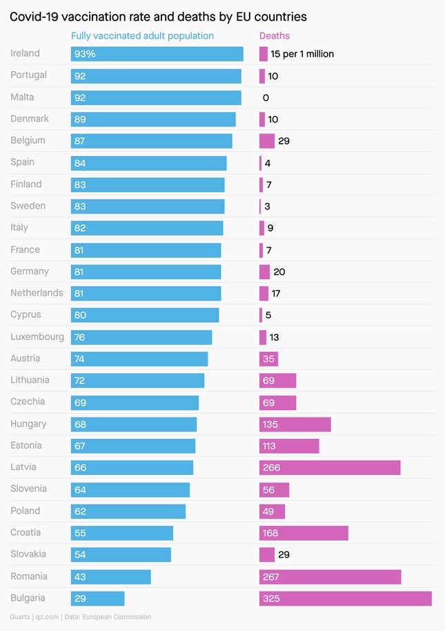
1.Covid-19 vaccination rate and deaths by EU countries
We’re not done with the pandemic yet, but the rollout of vaccines provided some relief. A chart that shows the inverse relationship vaccination rates and deaths is powerful stuff.
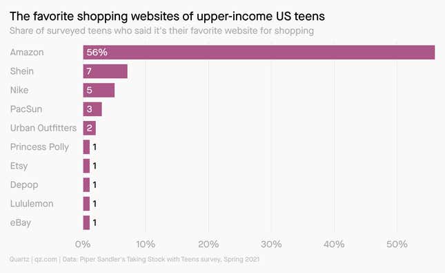
2. The favorite shopping websites of upper-income US teens
US teens loving Amazon? That tracks. But beyond that, they are flocking to a Chinese e-commerce site that you may not have even heard of.
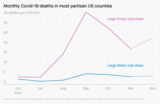
3. Monthly Covid-19 deaths in most partisan US counties
If the rollout of effective vaccines was a bright spot in the pandemic, their uptake across party lines has been a real bummer (albeit not much of a surprise). Originally published in the New York Times, the chart is yet another reminder of how politicized vaccination has become.
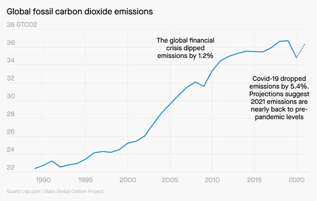
4. Global fossil carbon dioxide emissions
Despite a global shutdown, the pandemic barely made a dent in the huge rise in carbon emissions since 1990.
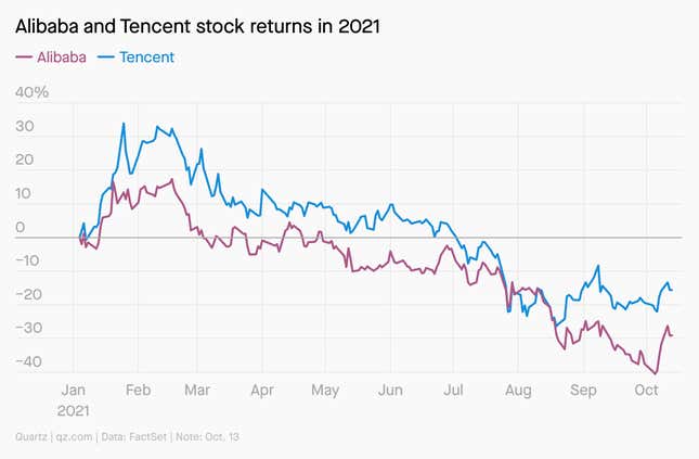
5. Alibaba and Tencent stock returns in 2021
When Alibaba and Tencent went public in 2014 and 2004 respectively, they did so to great fanfare. Now, though, the sheen has worn off as China’s tech crackdown chills markets.
6. Estimated US energy consumption in 2020
The Lawrence Livermore National Laboratory has been producing charts that articulate the sources and consumers of US energy for nearly half a century. As the world focuses more on sustainability, its revelations are even more important.
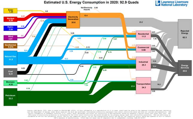
Source: Lawrence Livermore National Laboratory
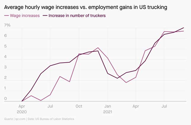
7. Average hourly wage increases vs. employment gains in US trucking
When trucking companies raise wages, employment goes up. It makes us wonder: Is there really a shortage of US truck drivers?
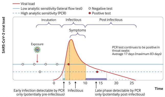
8. PCR and lateral flow tests detect Covid-19 at different stages of infection
The British Medical Journal is here to remind you that a negative test doesn’t necessarily mean the tester isn’t infected with coronavirus.
Source: The British Medical Journal
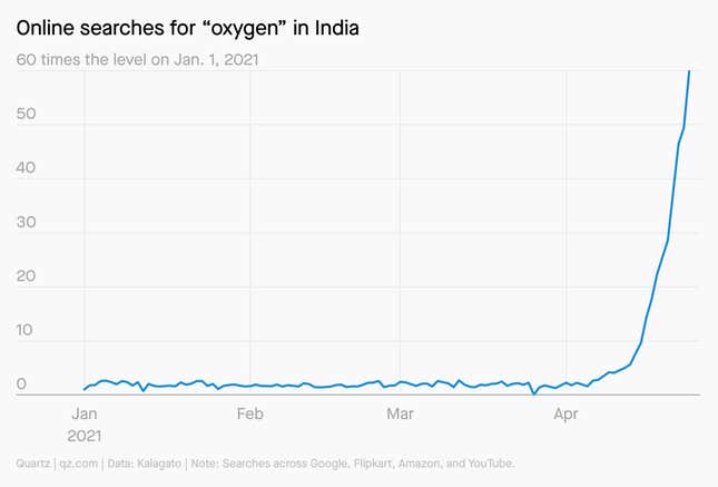
9. Online searches for “oxygen” in India
Internet search trends in India reflected people’s desperation for oxygen during one of the country’s most devastating waves of covid-19.
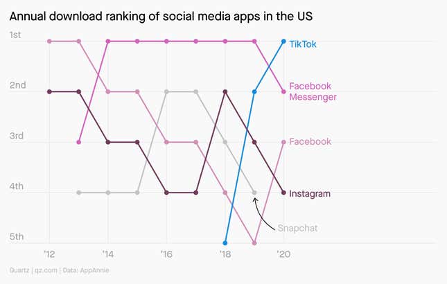
10. Annual download ranking of social media apps in the US
Silicon Valley is losing its grip on the US social media market as TikTok downloads surge
