In January of 2015, three friends—design writers and curators, the sorts of women who wear cool cover-ups, interesting sunglasses, and hats that have never been unevenly squashed inside a suitcase—went to the beach together in Malibu.
One of them, Eviana Hartman, pulled out an accessory that was just hideous.
“I had brought an ugly, sort of blob-shaped glass pipe,” recalled Hartman, a design writer and magazine editor, describing the sort of vessel used for smoking pot. “We started talking about how ugly it was, and how we knew so many designers who could make something better.”
Nine months later, the three women had launched Tetra, an e-commerce platform for high-end smoking accessories, ranging from $150 speckled stoneware pipes to a $2,000 gold-plated ashtray that’s displayed with a cobalt porcelain pipe resting on its edge. Tetra also manufactures a signature line of glass pipes carried at Opening Ceremony and ABC Carpet and Home, and has a sister creative studio that consults for “plant-based brands.” The e-commerce platform has been profitable since its first year.
“It was kind of sparked by a design problem,” said Hartman.
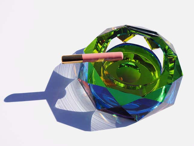
It’s a business that seems long overdue. Stoners—whether they consider themselves aesthetes or not—have a tendency to obsessively appreciate the details, whether in the electric melon shade of an evening sky, a cascading guitar solo, or the cool, tongue-coating taste of a fresh mint milkshake. And yet for decades, many have kept paraphernalia as hideous as that fateful “blob-shaped glass pipe” hidden in their junk drawers.
Now, with a legal marijuana market worth nearly $7 billion in 2016 in the US (growth rates researchers have compared to broadband internet), and California just weeks away from becoming the fifth state to legalize recreational use, Hartman is part of a wave of US entrepreneurs who recognize a new market for high-end design. And they’ve created a trove of innovative products with elegant branding, the familiar markings of luxury, and a little winking humor.
As the stigma surrounding marijuana fades, these shopkeepers, designers, and manufacturers are making getting high feel desirable, approachable, and, well, normal. For some cannabis-curious consumers, good design just might be the ultimate gateway drug.
The magazine: Anja Charbonneau, Broccoli Magazine
Anja Charbonneau, a Portland, Oregon-based magazine editor, said she saw how dramatically recreational legalization in Oregon in 2015 opened up marijuana use to a more mainstream audience.
“A lot of people just weren’t okay with it until they were given permission,” said Charbonneau. “And even then, you want it to look comfortable and familiar. So that’s an interesting role that design has played in normalizing cannabis overall.”
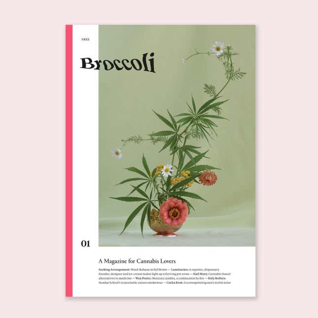
Charbonneau, a former creative director at Kinfolk Magazine—the ur-lifestyle publication that spawned countless “austere, homespun-yet-elegant” imitators—has applied her expertise to Broccoli, a new cannabis-themed magazine for women that marries spare design with the humor and girl power-enthusiasm of Cherry Bombe. Some 20,000 copies of the first issue landed in mailboxes, dispensaries, and boutiques in November, and Charbonneau says she’ll order a 20% increase for the next issue in April, based on demand. Meanwhile, Gossamer, an online publication and newsletter founded by veterans of Lucky magazine and Digg, has launched to examine lifestyle stories “through a green lens.”
“It was clear that there was still room for something really fresh and beautiful on the publication side,” said Charbonneau. ”Going into dispensaries here, you see stacks of free magazines, and it looks like very, bro stoner culture—which I think is what people kind of expect to see. Knowing how to make a magazine, I was like, ‘Oh, well I want to do this my way.'”
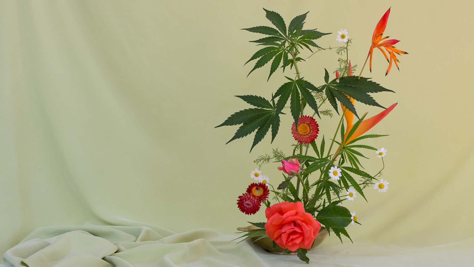
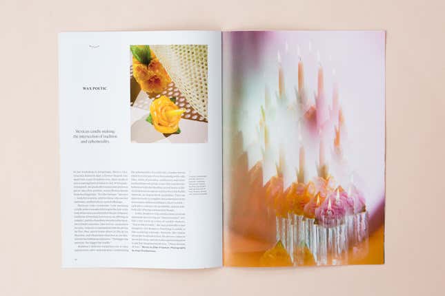
Broccoli’s pages provide some indication of how a post-legalization design boom could shape up: minimalist apple-shaped pipes rendered in white porcelain; marijuana leaves included in still-life photographs of ikebana-style floral arrangements; and faded bubble-gum color palettes that feel cheerful and modern, with just a hint of psychedelia.
With the neon tie-dyes and hemp necklaces of the head shops many of us grew up with firmly in the rearview, Charbonneau says she’s looking forward to watching the aesthetic movement develop past the “very minimal white spaces, marble, with plants” that prevail today in Portland’s chic dispensaries and accessory shops. “I’m excited to see it get a little weirder as people are ready to get to the next level … a little more into the aesthetics beyond just clean—a little bit more playfulness.”
The brick-and-mortar: Ariel Stark-Benz, Mister Green
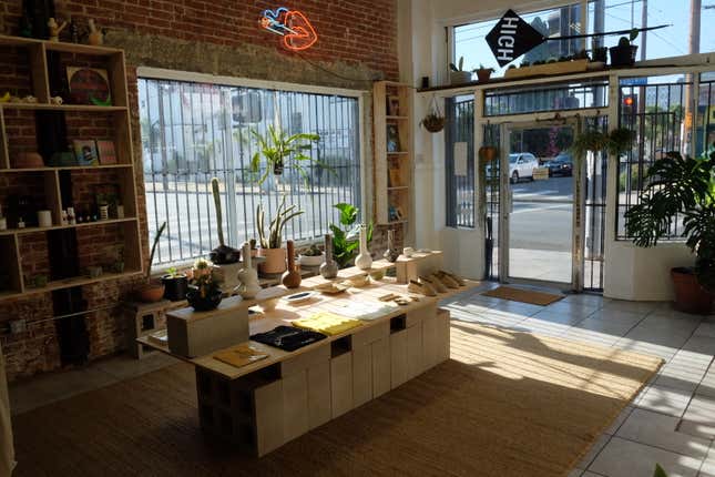
Mister Green, a concept store and clothing brand, delivers playfulness in spades. Ariel Stark-Benz, a creative director and designer who has worked with brands including the Ace Hotel and Creem Magazine, launched Mister Green as an e-commerce brand in January of 2016, and opened his store in the Echo Park neighborhood of Los Angeles this year, after he, like Charbonneau and Hartman, felt the market lacked a brand he and his friends could identify with.
“Half the people I knew in New York smoked on a fairly regular basis. But why was it that despite that, they still had to follow these really tired stereotypical tropes?” he said. “In a way, my favorite tool forever was the one-hitter that looked like a cigarette. It was unobtrusive … and it was also kind of funny as well.”
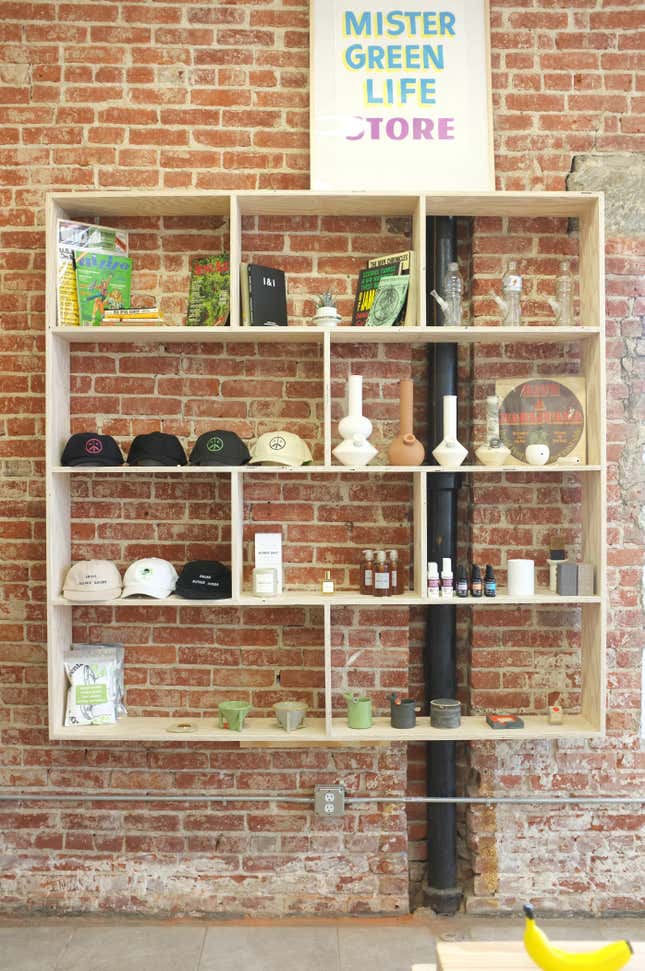
In Stark-Benz’s sunlit store, unobtrusive-and-funny is the driving aesthetic. One wall displays an array of 1980s-era running shorts in primary colors, embroidered with buds and the words, “THE HEAT IS ON,” along with nylon hooded jackets and cotton tees screen-printed with Mister Green’s subtly leafy peace sign logo. Another holds a shelf of “Gatorbeugs” (a $85 glass re-enactment of a classic dorm-room-style Gatorade-bottle bong), ceramic diner mugs that read “Bong Water,” and vintage books like High On the Campus and The Drug Bug.
In addition to the silly stuff—all stylishly rendered in high-end materials—Stark-Benz also carries vintage Tiffany lighters by Elsa Peretti and midcentury modern ashtrays, hearkening back to another era when designers put their stamps on smoking culture.
The experience: Scott Campbell, Beboe
Scott Campbell, a tattoo artist, cofounded Beboe, a line of rose gold cannabis vaporizers and peach-tinned pastille candies that The New York Times dubbed “The Hermès of Marijuana.”
“I’ve always really admired people who took on fragrance branding, because it’s so wide open,” he said. “And this is definitely similar, in that it’s taking an experience or a sensation like weed and giving it a story and a personality.”
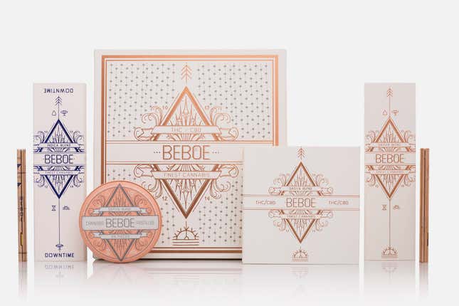
Beboe’s story is a personal one: He tells of the pot brownies his grandmother Bernice “Be” Boe made when his mother was suffering from cancer, to help ease her pain and calm her nausea. The packaging’s iconography recalls both Campbell’s fine-lined tattooing style and vintage apothecary labels, and it subtly integrates phrases like “Victory through compassion” and “Give more expect less.” It’s an homage to his mother and his grandmother, Campbell says, though the meaning may not be easily apparent to the audience.
What’s important, he said, is that it conveys the care that went into the products themselves—especially in an area where people may be unfamiliar with the landscape, and dipping a toe into cannabis for the first time.
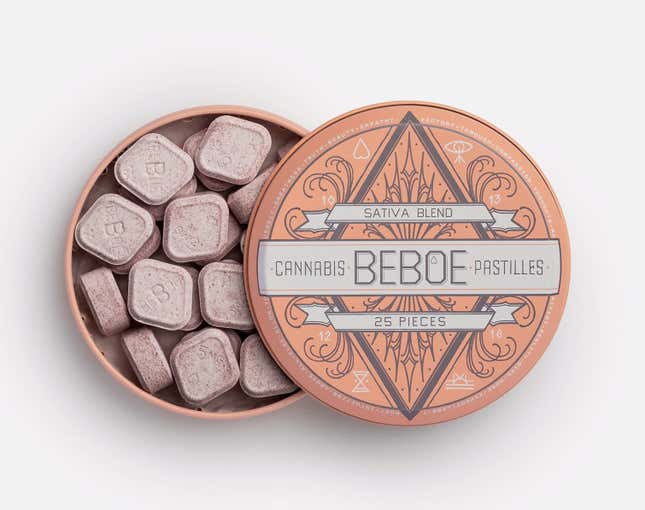
“Trust is a big issue,” said Campbell. “Even if you don’t understand our products, or if you don’t understand the weed world, if you hold our boxes and you open them, it’s obvious that whoever made it put a lot of care and energy into the presentation and into the exterior. I think it does make it easier to trust us.”
It’s slightly more expensive than standard fare (a rose gold vaporizer is $60 and a tin of 25 pastilles is $25), but what’s inside are organically derived cannabis extracts that Campbell says are the “cold-pressed juice of weed”—created through a cold-water extraction process that’s slow, expensive, and aims to preserve as much of the plant’s subtleties as possible. The high itself, promises Campbell, is designed to be similarly subtle, whether it’s delivered via a drag or two from a vaporizer or in an organic maple sugar-sweetened pastille—his personal favorite.
“The whole experience of this product is designed very selfishly,” says Campbell. “I’m a high-functioning adult with two kids and several full-time jobs. It might be once a week where I have a window where I can just be in the studio, I don’t have to worry about picking the kids up from school or anything, when I can indulge in cannabis. So if I only have once a week when I can enjoy that, I cannot risk having a bad experience. I don’t really care how much how it costs. I need it to be the best product I can get… It’s grown-up drugs.”
The packaging: Pentagram, Emily Oberman and DJ Stout
As marijuana continues to flood the mainstream and Sharpie-labeled sandwich baggies and pill-containers become a vestige of the past (and the black market), more cannabis companies are turning to professional branding agencies to help them reach wider, higher-paying audiences. All of the aforementioned entrepreneurs offer brand consulting services in addition to their products, and now mainstream designers are integrating marijuana branding into their offerings.
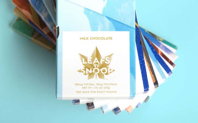
“It was underground for such a long time that there’s that sort of ‘Cheech and Chong’ look that’s just horrible,” said DJ Stout, an Austin, TX-based designer at Pentagram, the mega-design consultancy with clients including brands ranging from Van Leeuwen’s ice cream to Mastercard. “It’s because everything was done on the cheap, and behind closed doors.”
Over the last several years, Pentagram has developed what Stout calls a “cottage industry” of cannabis packaging design. It began in 2009 when Pentagram started work for Advanced Nutrients, a Vancouver, Canada-based hydroponics company, and made headlines in 2015 when Emily Oberman, a partner in the agency’s New York office, conceived of the bright boxes and gold leaf logo for Leafs by Snoop, Snoop Dogg’s line of flowers and edibles. In 2016, Stout toured nearly a dozen Denver, CO dispensaries with a new client, Harmony Extracts, before creating a logo and packaging for the company’s highly concentrated extracts.
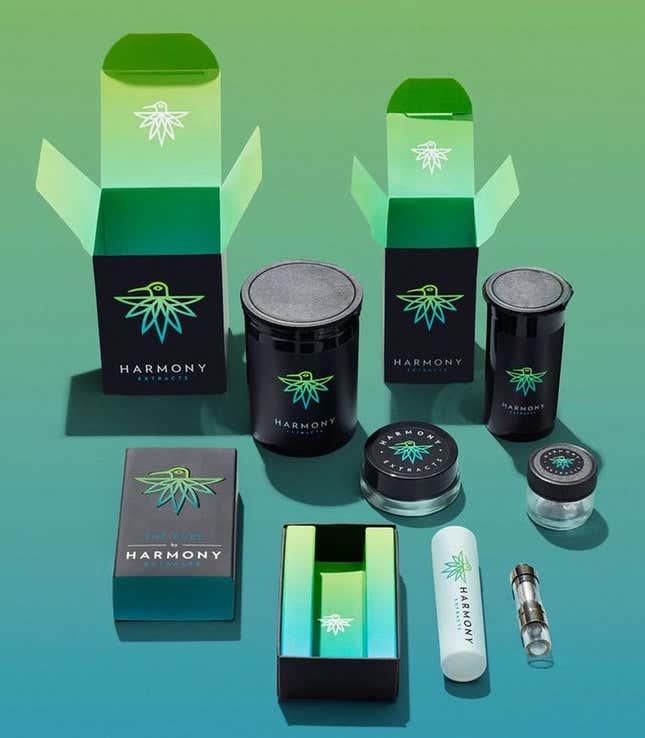
The logo Pentagram landed on is a hummingbird—a nod to the bird’s role as a natural extractor—with a tail that resembles a marijuana leaf. Stout said he explored rendering the logo in colorful brushstrokes or artistic pencil drawings before choosing the final design: a clean, graphic representation with a modernist font, printed on black boxes with a soft-touch texture.
“Like any design that we do, we really wanted it to stand out by being simple and clean and sophisticated,” said Stout, comparing it to say, tea or beer. But unlike those categories, he emphasized, there’s the excitement of a blank slate, and unknowable potential. He’s just finalized the designs for a new line of Woodstock-branded extracts for the music festival cofounder Michael Lange, and said he has at least three proposals out to other cannabis companies at the moment.
“It’s really ripe for designers to get in to make a difference,” said Stout. “I think it’ll just grow.”
